A QR code that gets scanned is not just attractive; it is technically reliable, context-aware, and easy to trust at a glance. Designing effective QR codes means balancing visual branding with scan performance, placement, contrast, size, and the user’s reason to engage. This matters because the best campaign idea fails if people cannot scan the code quickly or hesitate because it looks suspicious. In mobile-first marketing, packaging, events, menus, product manuals, storefronts, and direct mail all depend on frictionless scanning. I have tested QR codes on labels, posters, and checkout displays, and the same lesson repeats: a beautiful code that breaks under real-world conditions performs worse than a plain one built to standard. To design a QR code that gets scanned, you need to understand structure, error correction, destination experience, and print or screen context.
A QR code is a two-dimensional matrix barcode that stores data such as a URL, contact card, Wi-Fi credential, or app link. Static codes contain fixed data and cannot be changed after creation. Dynamic codes point to a short redirect URL, allowing destination edits, scan tracking, and campaign management without reprinting the code. Effective design starts with that choice, because dynamic codes are usually better for marketing, while static codes fit permanent uses like equipment labels or offline credentials. Key terms also matter. Quiet zone means the empty margin around the code; without it, scanners struggle to detect boundaries. Error correction refers to redundant data that allows recovery if part of the code is obscured. Module size means the individual square elements that make up the pattern. If these fundamentals are ignored, styling choices become irrelevant.
The hub topic of designing effective QR codes covers more than colors and logos. It includes how contrast affects camera recognition, why call-to-action text improves scan rate, how placement influences user behavior, and what happens when too much data creates a dense code. It also connects to adjacent mobile QR code practices: destination page speed, analytics, UTM tracking, print production, accessibility, and security cues. People often ask one simple question: what makes a QR code easier to scan? The direct answer is high contrast, adequate size, a clean quiet zone, short encoded data, sensible error correction, and placement where a phone can see it without glare or awkward angles. Every design decision should support those conditions while reinforcing the brand and the user’s intent.
Start with scan reliability, not decoration
The first rule in designing effective QR codes is to protect scanability before adding style. QR codes are machine-readable symbols, and phone cameras decode them by identifying finder patterns, alignment patterns, and the contrast between dark and light modules. If you distort those signals, scan time increases or the code fails outright. In practice, that means using dark modules on a light background, preserving the quiet zone on all four sides, and avoiding low-contrast combinations such as pastel gray on white or navy on black. ISO/IEC 18004 defines the QR Code specification, and while most designers never read the standard directly, the practical takeaway is clear: maintain the geometry and contrast that scanners expect.
In campaigns I have reviewed, the most common failure is over-styling. Rounded modules can work, embedded logos can work, and custom colors can work, but only when tested across multiple devices and lighting conditions. A code on glossy packaging may scan perfectly in the studio and fail under supermarket lighting because reflections wash out the module edges. A code on a restaurant table tent may look sharp on screen and then print too small after final layout adjustments. Reliability improves when you encode a short URL, use a dynamic code platform, and keep the visual modifications conservative. If branding matters, place your brand around the code first, then inside the code only within the tolerance allowed by error correction and testing.
Choose the right data type and error correction level
One overlooked design decision is the amount and type of data encoded. A QR code containing a long URL with multiple parameters becomes denser, which means smaller modules and harder scans at the same printed size. That is why experienced teams use short redirect links and dynamic QR codes for most public campaigns. The user sees one code, but the destination can be updated later, and analytics can report scans by time, location, and device. For physical environments, that flexibility is valuable. A flyer can be reused, a product insert can point to a new support article, and a poster can redirect to a current promotion without reprinting inventory.
Error correction has four standard levels: L, M, Q, and H. Higher levels recover more damage but increase code density. That tradeoff matters. If you plan to place a logo in the center or expect dirt, creases, or light surface damage, Q or H is often appropriate. If the code will be displayed cleanly on a screen or in controlled print, M is usually sufficient and keeps the code simpler. Designers often assume the highest setting is always best, but a denser code can hurt performance when space is limited. The right choice depends on usage conditions, code size, and styling. Test each version on current iPhone and Android devices, from both native camera apps and common third-party scanners, before locking artwork.
Use size, placement, and calls to action to increase scans
People do not scan QR codes just because they exist. They scan when the code is visible, reachable, and paired with a clear reason. A practical size rule is at least 1 inch by 1 inch for close-range use, then scale up with distance. A common field guideline is a scanning distance to code size ratio of roughly 10:1, so a code intended to be scanned from 10 feet away should be about 1 foot wide. This is not absolute, because camera quality and code density matter, but it is a dependable planning benchmark. On packaging, I prefer larger than the minimum because curved surfaces and hand movement reduce capture stability.
Placement shapes behavior. Put a QR code where a user can pause safely and hold a phone perpendicular to the surface. Avoid placing codes too low on shelves, behind reflective glass, on moving vehicles unless parked, or in areas with weak mobile signal unless the destination is cached or lightweight. In retail, end-cap signage often outperforms lower shelf tags because sightlines are cleaner. At events, codes near entry bottlenecks fail when people feel rushed. On direct mail, codes near the primary offer and above the fold usually draw more attention than codes hidden in footer space. Just as important, add a short call to action that says what happens after the scan: “View the menu,” “Watch the 30-second demo,” or “Register for pickup.” Specificity consistently lifts scan rates because it answers the user’s immediate question.
Style for brand recognition without breaking the code
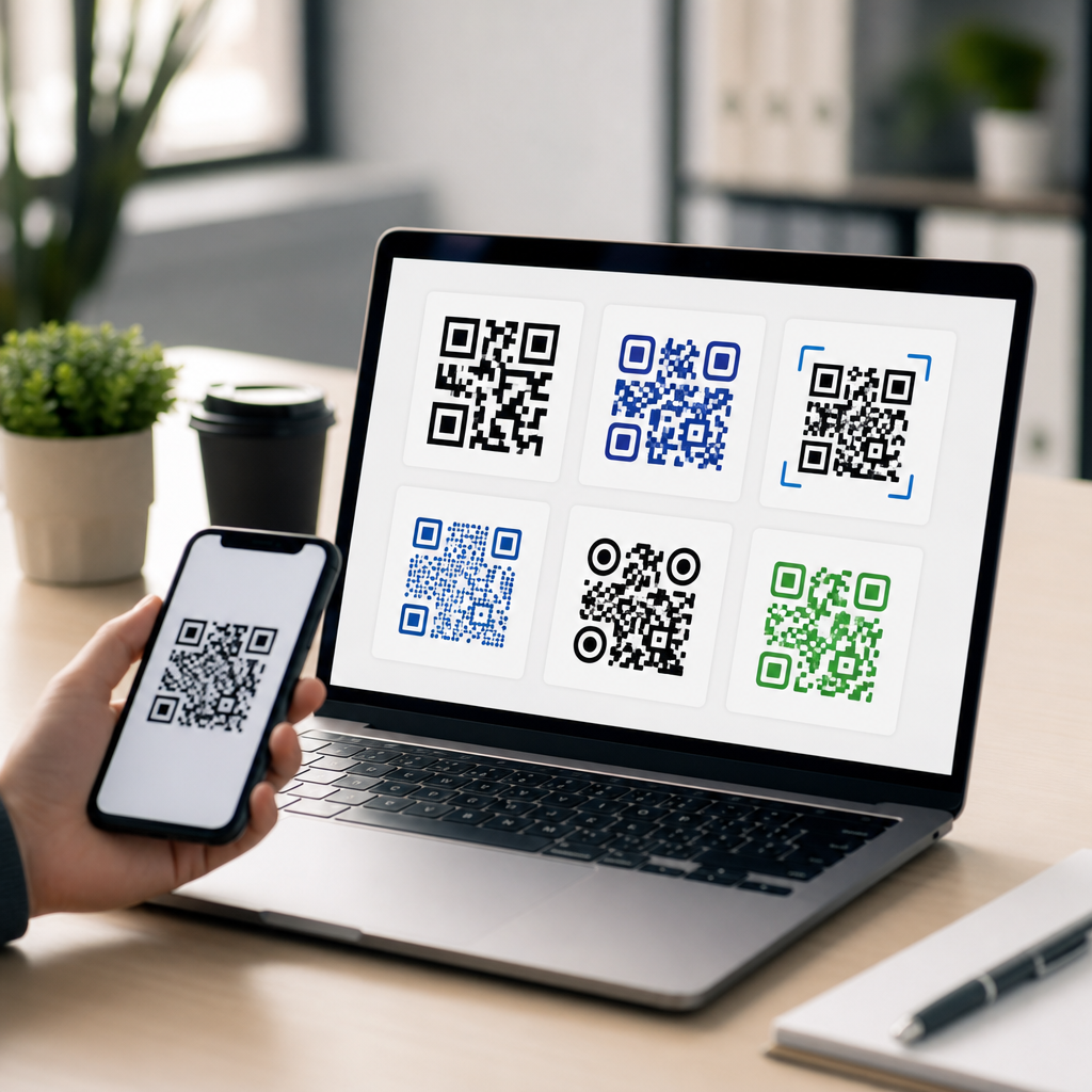
Branding a QR code is useful when it improves recognition and trust. A subtle logo, a brand color with strong luminance contrast, or a custom frame can make the code feel intentional rather than generic. The safest approach is to keep the finder patterns visually distinct, preserve the quiet zone, and avoid reversing the code unless testing proves reliable performance. White modules on a dark background can work, but many low-quality print conditions reduce edge clarity, so conventional dark-on-light remains the strongest default. Gradients are risky because they create inconsistent contrast across the symbol. If you use them, confine them to surrounding artwork rather than the modules themselves.
Trust signals matter as much as aesthetics. Users are more likely to scan a code when the surrounding design looks professional and the destination seems predictable. On product packaging, pairing the code with brief explanatory text such as “Scan for setup guide and warranty” reduces hesitation. On posters, including the brand name or recognizable domain beneath the code helps users assess legitimacy. Avoid visual gimmicks that make the code look like clip art or camouflage it inside complex illustrations. Good QR code design is not about showing how much you can alter the symbol. It is about preserving immediate recognizability while fitting cleanly into the overall mobile journey.
Test across real environments and devices
No QR code design is finished until it has been tested in the conditions where people will actually scan it. I recommend a checklist that includes different phone models, different camera apps, low light, bright light, glare, motion, and varying distances. Print prototypes at final size, on final materials, and with final coatings. A code printed on matte cardboard behaves differently from one printed on metallic film or displayed on an OLED screen at low brightness. Real-world testing also reveals operational issues beyond scan recognition, such as slow landing pages, broken redirects, or forms that are hard to complete one-handed.
| Design factor | Best practice | Common mistake |
|---|---|---|
| Contrast | Dark code on light background | Low-contrast brand colors |
| Quiet zone | Clear margin on all sides | Text or graphics too close |
| Encoded data | Short dynamic URL | Long parameter-heavy link |
| Size | Scaled for scan distance | Using the minimum size everywhere |
| CTA | Explain the value after scan | Showing the code without context |
| Testing | Check print, glare, and devices | Approving only from a desktop mockup |
Measurement should continue after launch. Dynamic QR platforms from providers such as Bitly, QR Code Generator, Beaconstac, and Flowcode can report scans, timestamps, rough location, and device type. Add campaign parameters to destinations, then review engagement in analytics platforms. If scans are high but conversions are low, the problem is usually the landing experience, not the code itself. If visibility is high but scans are low, revisit placement, CTA clarity, and trust cues. Designing effective QR codes is therefore an iterative discipline: build to standard, test in context, measure behavior, and refine.
The best QR code design combines technical discipline and user-centered thinking. Start with a dynamic short URL when possible, choose an error correction level based on actual conditions, maintain strong contrast and a proper quiet zone, and size the code for the expected distance. Place it where people can scan comfortably, and tell them exactly what they will get after scanning. Add branding carefully, only to the extent that performance remains strong across devices and lighting situations. Then test the full journey, from camera recognition to landing page completion, using real materials and real environments.
As the hub for designing effective QR codes within a broader mobile QR strategy, this topic should guide every related decision: code styling, CTA copy, print production, analytics, destination optimization, and security communication. Teams that treat QR codes as both visual assets and functional interfaces consistently outperform teams that focus only on appearance. If you are building or refreshing a mobile QR program, audit your current codes against these principles and update the weakest points first. Better design does not mean more decoration; it means more successful scans, more completed actions, and a smoother mobile experience.
Frequently Asked Questions
What makes a QR code more likely to get scanned?
A QR code gets scanned more often when it combines technical reliability with immediate clarity for the person looking at it. First, the code must be easy for a phone camera to detect, which means strong contrast, a clean background, an adequate size, and enough quiet space around the edges. If the code is too small, too decorative, low-contrast, glossy, or crowded by nearby design elements, scan performance drops quickly. Just as important, people need a reason to scan. A short call to action such as “Scan to view the menu,” “Scan for setup instructions,” or “Scan to get 10% off” removes ambiguity and tells users what they will get in return.
Trust also plays a major role. Many people hesitate when a QR code looks unfamiliar, overly stylized, or disconnected from the surrounding brand. A code placed on branded packaging, a storefront sign, event signage, direct mail piece, or product insert should visually belong to that context. Consistent brand colors, a recognizable logo used carefully, and supporting text nearby help reassure users that the scan will lead somewhere legitimate. In practice, the most effective QR codes are not the fanciest ones. They are the ones that load fast, are easy to notice, are clearly explained, and work instantly in the environment where they are being used.
How much can you customize a QR code without hurting scanability?
You can customize a QR code quite a bit, but only within limits that preserve the code’s underlying structure. The finder patterns, alignment, data modules, and quiet zone all need to remain recognizable to phone cameras and scanning software. This means that visual branding should support readability, not compete with it. You can often change colors, round some module shapes, add a frame, or place a small logo in the center, but the code still needs strong contrast between foreground and background. Dark code elements on a light background are usually the safest choice. Reversing that relationship or using gradients, metallic finishes, or low-contrast brand colors can make scanning inconsistent across devices and lighting conditions.
A good rule is to treat customization as a controlled layer rather than a redesign of the symbol itself. If you add a logo, keep it modest in size and generate the code with sufficient error correction so the scanner can still read the data. Avoid covering the corner detection patterns, shrinking the quiet zone, or embedding the code in a busy photograph. Before publishing, test the code on multiple phones, from different distances, under bright and dim lighting, and in the actual material where it will appear, such as print packaging, laminated menus, window decals, or mailers. The best branded QR code is one that still scans instantly on the first try.
What size should a QR code be for print, packaging, signage, and other real-world uses?
QR code size should be determined by viewing distance, scan environment, and the amount of data encoded. In general, a code that works on a product box at arm’s length may fail on a poster viewed from several feet away. For close-range uses such as business cards, product manuals, menu inserts, or direct mail, the code needs to be large enough to be comfortably captured by a mobile camera without forcing the user to move awkwardly. For packaging, labels, and tabletop materials, erring slightly larger is usually better than trying to save space. The more complex the code content, the denser the pattern becomes, and the more space it needs to remain readable.
For larger formats like storefront signs, event graphics, transit ads, or trade show displays, the code should scale with expected scanning distance. A practical design mindset is to ask where the user will stand, how quickly they are moving, and whether they can pause to focus the camera. A code placed in a shop window, for example, may also need to account for glare and reflections, while a code on a poster in a hallway may need to scan while someone is walking past. Size cannot be evaluated in isolation. It works together with contrast, placement height, surrounding clutter, and material finish. Whenever possible, print prototypes and test them in the real setting before full production.
Where should a QR code be placed to maximize scans and reduce friction?
Placement is one of the most overlooked factors in QR code performance. Even a perfectly generated code will underperform if people cannot comfortably see it, approach it, and understand why they should scan it. The best placement is usually where the user already expects to take action. On packaging, that may be near setup instructions, product benefits, authenticity information, or recipes. On menus, it should be visible before the user starts searching for alternatives. In storefronts, event venues, and trade show booths, the code should be positioned where people naturally pause, not where they are rushing by or blocked by foot traffic. The code also needs to be physically reachable by a phone camera without awkward angles or excessive distance.
Environmental factors matter just as much as physical location. Avoid placing QR codes on curved surfaces that distort the image, on reflective materials that create glare, behind glass where lighting causes hotspots, or too close to edges, folds, seams, and other graphics. Give the code room to breathe so it stands out immediately. Supporting text should be close enough to explain the value of scanning, and the landing page should match that promise exactly. If someone scans a code labeled “View installation guide” and arrives at a generic homepage, trust drops fast. Strong placement aligns the code with user intent, visibility, and the next step in the customer journey.
How do you build trust so people feel confident scanning a QR code?
People scan QR codes more readily when the experience feels safe, relevant, and predictable. Trust starts before the scan happens. If the code appears in a credible context, such as branded packaging, a restaurant table tent, a product insert, a service technician’s manual, or a clearly identified event sign, users are more likely to believe it is legitimate. A visible brand identity, a straightforward call to action, and a concise explanation of what happens next all reduce hesitation. For example, “Scan to register your warranty,” “Scan to download the user guide,” or “Scan to see today’s specials” tells the user exactly what they will get. Vague prompts like “Scan me” create uncertainty and usually perform worse.
Trust continues after the scan. The destination should load quickly, be mobile-friendly, and feel consistent with the source material. If someone scans a QR code from premium packaging and lands on a slow, generic, or poorly formatted page, confidence drops immediately. Using a short, clean URL preview where possible, avoiding suspicious redirects, and keeping branding consistent all help reinforce legitimacy. It also helps to avoid over-designing the code to the point where it looks unfamiliar or tampered with. The goal is not just to attract attention, but to remove doubt. The most effective QR code design communicates, at a glance, that scanning is easy, useful, and safe.