
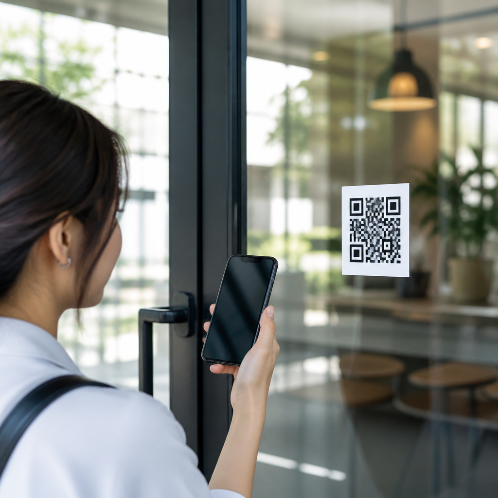
QR code placement can determine whether a campaign gets scanned or ignored, because even a perfectly generated code fails when people cannot see it, reach it, trust it, or scan it in the moment. In mobile-first marketing, placement means the exact physical or digital location of a QR code, the surrounding context, the distance from the scanner, and the conditions under which a person encounters it. QR code placement strategies therefore combine design, user experience, print production, lighting, traffic flow, and analytics. I have seen brands blame low scan rates on “bad QR performance” when the real issue was simple: codes were mounted too high on retail signage, buried in cluttered packaging, or shown too briefly on a screen. Getting placement right matters because the scan is not the goal; the goal is the next action after the scan, whether that is opening a menu, downloading an app, registering for an event, authenticating a product, or completing a payment. Good placement reduces friction, improves scan rate, and protects campaign ROI across posters, product labels, direct mail, storefronts, menus, kiosks, trade show booths, and social video frames.
A practical definition helps. A successful placement gives users enough time, contrast, distance, instruction, and confidence to scan with an ordinary smartphone camera in ordinary conditions. It also accounts for accessibility, glare, motion, network conditions, and the landing page experience. This hub article covers the most common QR code placement mistakes to avoid and the strategies that consistently improve usability. It also serves as a foundation for deeper pages on poster QR codes, packaging QR layout, digital screen timing, retail signage, menu QR accessibility, and event wayfinding. If you need one rule to remember, it is this: put the code where user intent is strongest and friction is lowest.
Placing QR Codes Where People Cannot Comfortably Scan
The most frequent mistake is choosing a location based on available space instead of scanning behavior. A code may fit on a billboard, shelf talker, bus shelter, or product carton, but that does not mean a person can scan it safely or easily. In stores, I have repeatedly found codes placed near the floor on endcaps where shoppers must crouch, or above eye level on hanging signs where users need to raise a phone at an awkward angle. Both reduce completion. The better strategy is to match placement to natural viewing zones: chest to eye level for standing users, tabletop level for seated users, and hand level for packaging people hold directly.
Distance also matters. A small code on a large poster forces the user to step too close; a code on a highway billboard asks for a scan when the viewer is moving too fast. Industry guidance varies by printer and scanner, but a reliable rule is to size the code so the viewing distance is roughly ten times the code width. A 2-inch code is best read from about 20 inches away, while a 6-inch code can work from several feet. Placement strategy must therefore be tied to expected scanning distance, not just aesthetics.
Ignoring Context, Intent, and the User’s Next Action
QR code placement works best when it appears exactly where the next step makes sense. On restaurant tables, the code should be near the menu prompt, not on a distant window decal. On product packaging, it should sit near ingredients, setup instructions, warranty details, or authenticity markers, depending on the promised outcome. On event signage, codes perform better at decision points such as entrances, registration desks, session doors, and transit junctions than in random decorative areas. This is because users scan when they perceive immediate value.
A common mistake is forcing one generic placement across every asset. For example, a retailer might put the same code in the lower-right corner of every sign, whether the sign promotes loyalty enrollment, product comparison, or in-store navigation. That creates habit for the designer, not clarity for the customer. Placement should follow intent. If the code answers “How do I buy this?” place it near price and product information. If it answers “How do I get help?” place it near setup, support, or service messaging. The most effective QR code placement strategies align the code with a single, explicit task and a nearby call to action that explains the benefit in plain language.
Using Poor Surroundings: Clutter, Contrast, Curves, and Glare
A QR code does not scan in isolation. Its surroundings determine how easily a camera detects the finder patterns and resolves the image. Busy backgrounds, decorative frames, dense text blocks, reflective laminates, and curved surfaces are among the most expensive placement errors because they survive into print and are hard to fix later. I have seen excellent codes fail on glossy restaurant menu covers under overhead spotlights and on shrink sleeves wrapped around bottles where the symbol bends across the seam. In both cases, the code itself was valid; the placement environment made it unreliable.
Keep a clean quiet zone around the symbol, preserve strong contrast, and avoid placing the code across folds, perforations, embossing, bottle shoulders, or package corners. Matte finishes usually outperform glossy finishes under mixed lighting. Flat surfaces outperform curved ones. On digital screens, avoid placing the code over video motion or patterned imagery. Camera systems on iPhone and Android devices are robust, but they still need a stable target with clear edges. If a user must tilt the phone repeatedly to defeat glare, the placement is wrong.
| Placement scenario | Common mistake | Better strategy |
|---|---|---|
| Retail poster | Code at bottom near floor display | Place at chest height beside price or offer copy |
| Product packaging | Code on curved edge or sealed flap | Use a flat panel near instructions or authenticity text |
| Digital screen | Code appears for two seconds over animation | Hold for at least several seconds on a static high-contrast frame |
| Restaurant menu | Code printed with glossy finish in dim light | Use matte stock and position near ordering prompt |
Forgetting Mobile UX, Accessibility, and Trust Signals
Placement is not only physical; it is psychological. People decide in seconds whether a QR code looks safe and worth scanning. A code without context can feel suspicious, especially in public places where phishing awareness is rising. I advise clients to place a short explanation directly adjacent to the code: “Scan to view ingredients,” “Scan to pay securely,” or “Scan for installation guide.” That microcopy increases trust because it sets an expectation before the camera opens. Branded landing domains and visible brand marks nearby also help.
Accessibility is another neglected factor. Users with limited reach, low vision, or mobility constraints need codes placed within comfortable viewing angles and paired with readable text alternatives. In hospitality and healthcare environments, relying on one tiny code alone can exclude people. Good placement includes redundant paths such as a short URL, NFC tap option, or staff-assisted route. The landing page must also be mobile-ready, because a well-placed code that opens a slow, desktop-only page still fails the experience. In practice, placement and destination quality should be reviewed together during testing.
Making Screen-Based Placement Too Fast, Too Small, or Too Dynamic
QR codes on presentation slides, connected TV ads, social video, and digital out-of-home displays introduce timing issues that print does not. One of the biggest mistakes is displaying the code too briefly. Users must notice the code, understand why they should scan, unlock the phone if needed, open the camera, frame the code, and wait for the link prompt. That sequence takes time. In most real campaigns, a fleeting code on a moving background underperforms a static end card with a clear call to action and generous dwell time.
Size must match both viewing distance and screen resolution. A code tucked into the corner of a webinar slide may be technically present but practically useless for viewers watching on laptops across a room. Likewise, compression artifacts in social video can soften edges enough to reduce recognition. The fix is straightforward: give the code a dedicated area, keep the frame still, preserve high contrast, and test from the farthest realistic viewing point on common devices. For presentations and live events, I routinely test from the back row, not from the operator’s desk, because that is where placement errors become obvious.
Skipping Real-World Testing, Analytics, and Iteration
The final mistake is assuming placement is correct because it looks balanced in a mockup. QR code placement strategies should be validated in the environment where scanning will happen: under store lighting, through a shop window, on a moving train platform, at a crowded booth, or on the actual package material. Test with different phones, camera apps, ages of devices, and network conditions. Scan while standing where users will stand. Time how long it takes from first glance to successful page load. That is the measurement that matters.
Use dynamic QR codes where appropriate so you can track scans by asset, location, and time. Platforms such as Bitly, QR Code Generator Pro, Beaconstac, and Uniqode can help identify which placements outperform others. If a poster near checkout gets triple the scans of the same poster near the entrance, that is placement insight, not just campaign data. Pair scan analytics with on-page behavior in tools such as Google Analytics 4 to see whether scans turn into completions. Over time, strong teams build a placement playbook by format: ideal height ranges, minimum code sizes, finish recommendations, dwell times for screens, and approved call-to-action patterns.
QR code placement mistakes are avoidable when teams treat scanning as a user journey rather than a graphic element. The essentials are consistent across formats: place the code where intent is highest, keep it within a comfortable viewing zone, protect contrast and quiet space, avoid glare and curved surfaces, explain the benefit clearly, and test in real conditions before launch. When placement supports the user’s moment of need, scan rates rise and downstream conversions improve. Use this hub as your starting point for better QR code placement strategies across packaging, print, retail, hospitality, events, and digital screens. Then audit your current assets, fix the most obvious placement friction, and measure the difference.
Frequently Asked Questions
What is the biggest QR code placement mistake marketers make?
The most common mistake is treating placement as an afterthought instead of a core part of campaign performance. Many teams focus on generating the QR code, designing the landing page, or printing the materials, but they place the code wherever there is leftover space. That usually leads to poor visibility, awkward scanning angles, or situations where people notice the code too late to interact with it. A QR code can be technically perfect and still fail if it is positioned where users do not naturally look, cannot easily reach, or do not have enough time to scan.
Effective placement starts with the user’s real-world context. Ask where the person will be standing, how far away they will be, whether they are moving, what device they are likely using, and what distractions are present. A code on a product package may be scanned from inches away under indoor lighting, while a code on a poster may need to work from several feet away in a busy public space. A code on a bus stop ad might perform well because people have time to pause, but the same code on a roadside billboard may be nearly useless because drivers cannot safely scan it. The biggest mistake, in short, is ignoring how people actually encounter the code in the moment.
Why do QR codes fail when they are placed in hard-to-scan physical locations?
QR codes often fail in physical environments because scanning depends on more than visibility alone. People need a clear line of sight, a comfortable scanning angle, enough physical proximity, and adequate time to open their camera and focus on the code. When a code is placed too high, too low, behind reflective glass, around a corner, on a curved surface, or in a dimly lit area, it becomes inconvenient or impossible to scan. Even if someone is interested, friction at the point of interaction is often enough to stop them from trying.
Distance is another major factor. If a code is too small for the viewing distance, smartphone cameras may struggle to detect it quickly. Placement on large-format materials like posters, trade show signage, menus, retail displays, and window graphics should always account for the expected scanning distance. The farther away the user stands, the larger the code generally needs to be. At the same time, location matters just as much as size. A well-sized code can still underperform if it is positioned in glare-heavy lighting, near visual clutter, or in a spot where people have to physically strain to reach it.
Good physical placement removes barriers. Put the code where a person can comfortably notice it, approach it, and scan it without rushing. Test placement under real conditions before launch, including the actual lighting, print material, and likely viewing angles. What looks fine on a design proof may behave very differently in a storefront window at noon or on a glossy sign under overhead lights.
How does surrounding context affect whether people trust and scan a QR code?
Context has a direct impact on scan rates because people decide in seconds whether a QR code feels relevant, safe, and worth their attention. A code placed without explanation often gets ignored, especially now that users are more cautious about unfamiliar links. If people do not know what the code does, where it will take them, or why they should scan it, many will simply move on. Placement is not just about coordinates on a page or surface; it also includes the text, branding, offer, and visual cues around the code.
For example, a QR code placed next to a clear call to action such as “Scan to view the menu,” “Scan for installation instructions,” or “Scan to claim 15% off” gives users a reason to engage. Trusted branding nearby also helps reduce hesitation. If the code appears disconnected from the rest of the design, buried in clutter, or printed in a suspicious-looking context, people may worry about security or assume it is irrelevant. In mobile-first marketing, users expect fast, purposeful experiences, so the placement should make the value obvious immediately.
The best results come when the QR code is supported by concise copy, clean design, and a visible payoff. Avoid placing codes in isolated corners with no explanation. Instead, integrate them into a clear user journey. When users understand what will happen after the scan and why it benefits them, they are much more likely to act.
What digital placement mistakes reduce QR code performance on screens and online materials?
Digital placement can be just as problematic as physical placement, especially when marketers forget that a QR code shown on a screen must still be easy to capture with another device. One common mistake is placing the code too small within presentations, digital signage, email graphics, social posts, or video frames. If users cannot pause long enough or enlarge the screen content, the opportunity is lost. Another issue is poor contrast or busy backgrounds, which make the code harder for cameras to read even when it is technically visible.
Timing also matters in digital environments. In videos or slideshow presentations, QR codes often disappear too quickly. Users need enough time to notice the code, process the call to action, raise their phone, and complete the scan. If a code only appears for a second or two, most viewers will miss it. Similarly, placing a QR code near the edge of a screen, in a crowded layout, or over animated content can reduce clarity and make scanning inconsistent.
There is also a strategic mistake that happens often in mobile marketing: showing a QR code to an audience that is already viewing content on their phone without offering an alternative tap option. If someone is on a mobile device, they may not be able to scan the code from the same screen. In those cases, placement strategy should include a clickable button or short link alongside the QR code. Good digital placement means thinking through the device context, screen size, display duration, and user behavior, not just inserting the code into the design.
How can businesses test and optimize QR code placement before launching a campaign?
The best way to avoid placement mistakes is to test QR codes in the exact conditions where people will encounter them. Start by printing or displaying the code at final size, on the actual material, and in the intended location. Then test it with multiple smartphone models, both iPhone and Android, from the expected scanning distance and angle. Check performance in different lighting conditions, including bright daylight, indoor artificial light, and any reflective environments that could interfere with readability.
It is also important to test the full user experience, not just whether the code scans. Observe how quickly someone notices the code, whether the call to action is understandable, how naturally they can approach it, and whether the destination page loads well on mobile. If users hesitate, ask why. You may discover that the code is technically scannable but poorly positioned relative to eye level, hidden by surrounding graphics, or unsupported by enough context to motivate action.
After launch, optimization should continue through performance tracking. Use scan analytics, campaign-specific URLs, or dynamic QR code tools to compare placements across locations, formats, and designs. If one placement generates significantly more scans than another, study the environmental differences: visibility, traffic flow, dwell time, lighting, and user intent. Strong QR code placement is rarely accidental. It comes from testing, observing real behavior, and refining the code’s location so it fits naturally into the moment when the user is ready to engage.





