
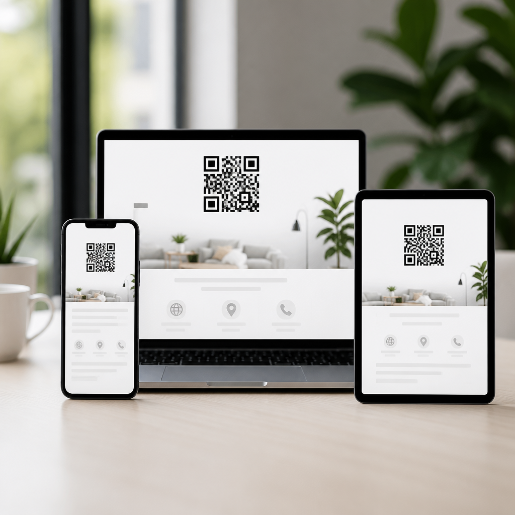
Responsive design tips for QR code landing pages start with one practical reality: the moment someone scans, your page has only a few seconds to prove it was worth opening. A QR code landing page is the mobile-first destination reached after scanning a printed, on-screen, or product-based code. Responsive design means that page adapts fluidly to screen size, orientation, browser behavior, and touch input without forcing zooming, horizontal scrolling, or guesswork. In QR campaigns, that flexibility is not a nice extra. It directly affects bounce rate, form completion, coupon redemption, booking volume, and sales.
I have worked on QR experiences for restaurant menus, event check-ins, retail packaging, field service instructions, and direct mail promotions, and the same pattern appears every time: teams obsess over the code itself, then lose conversions on the page after the scan. Mobile QR Code Design and UX succeeds when the entire path feels continuous. The landing page must match the promise on the sign, package, poster, or card; load almost instantly on cellular connections; present one clear next step; and remove every obstacle caused by small screens. If any part of that chain breaks, scan intent evaporates.
Best practices for mobile UX on QR code landing pages matter because scan contexts are usually distracted contexts. People scan while standing in aisles, walking through airports, sitting in waiting rooms, or trying to complete a task fast. They may be on weak Wi-Fi, using one thumb, outdoors in glare, or sharing attention with staff, traffic, or checkout lines. Good responsive design accounts for those constraints. It uses touch-friendly controls, concise copy, readable type, resilient layouts, accessible contrast, and predictable interactions. This article serves as a hub for the full subtopic by covering the design, performance, accessibility, analytics, and testing decisions that make QR destinations convert on real phones, in real environments.
Start with scan intent, context, and message match
The highest-performing QR code landing pages begin with intent mapping. Before choosing a layout, define why someone scanned and what they expect to do next. A restaurant table tent usually points to menu browsing or payment. A product package may point to setup instructions, warranty registration, or reorder flow. A real estate sign may lead to listing photos, price, and agent contact. Responsive design works best when the page has one primary action aligned to that moment. If users must hunt through a generic homepage, mobile UX fails even if the page is technically responsive.
Message match is the next nonnegotiable. The headline, hero image, and call to action should mirror the wording near the QR code. If the sign says “See today’s lunch specials,” the landing page should open with today’s lunch specials, not a broad brand introduction. I have seen campaigns raise conversion rates simply by replacing vague hero sections with task-specific headlines and removing top navigation. Consistency also builds trust. Include brand colors, recognizable product names, and plain confirmation that the user landed in the right place.
Keep the page architecture shallow. A strong QR destination often works as a focused microscreen: headline, proof, action, and support details. When multiple tasks are necessary, prioritize them visually and avoid equal-weight buttons competing for taps.
Build mobile-first layouts that are easy to scan, tap, and read
Responsive design for QR code landing pages should be mobile-first, not desktop pages squeezed downward. Start from common viewport widths, then scale up. Use a single-column layout for most experiences because it reduces cognitive load and eliminates awkward wrapping. Set generous spacing between elements so thumbs can move without accidental taps. Apple Human Interface Guidelines and Google Material guidance both support comfortable touch target sizing around 44 to 48 CSS pixels. Buttons smaller than that create friction immediately.
Typography must survive poor lighting and fast scrolling. In practice, body text below 16 pixels often forces zooming on older devices or feels cramped on dense screens. Line height around 1.4 to 1.6 improves readability, and headings should communicate meaning even if users only skim. Keep paragraphs short. Front-load important words in headings and buttons. “Download setup guide” consistently outperforms generic labels like “Learn more” because the action and outcome are explicit.
Navigation should be minimal. Most QR pages do not need a full site header, mega menu, or promotional carousel. Sticky bars can help when the action is important, such as “Order now” or “Get directions,” but they must not consume too much vertical space. Forms should ask for the minimum information needed. Autofill, proper input types, and masked formatting reduce abandonment.
| UX element | Recommended practice | Why it helps after a scan |
|---|---|---|
| Primary CTA | One prominent button above the fold | Reduces decision friction in distracted settings |
| Touch targets | 44–48 px minimum height | Prevents mistaps on small screens |
| Layout | Single-column mobile-first structure | Improves readability and scrolling flow |
| Typography | 16 px body text minimum | Avoids zooming and supports quick scanning |
| Forms | Few fields with autofill-enabled inputs | Raises completion rates on phones |
Prioritize speed, stability, and technical responsiveness
Performance is a core part of mobile UX, especially for QR traffic coming from cellular networks. Google’s Core Web Vitals remain useful benchmarks because they track perceived load speed, interactivity, and visual stability. Largest Contentful Paint should happen quickly, Interaction to Next Paint should stay responsive, and Cumulative Layout Shift should be low enough that buttons do not jump as assets load. On QR pages, every unnecessary script and oversized image increases the chance that users abandon before seeing the offer.
Use responsive images with modern formats such as WebP or AVIF when supported, and serve appropriately sized assets through srcset. Compress aggressively without ruining legibility, especially for product labels or instruction diagrams. Delay nonessential JavaScript, remove bloated tag managers, and audit third-party widgets. I often find chat tools, A/B frameworks, and social embeds adding more weight than the entire core page. For QR destinations, simplicity usually beats feature richness.
Technical responsiveness also means handling device quirks. Test portrait and landscape orientation, soft keyboard behavior, safe area insets on modern phones, and browser UI changes that affect viewport height. Use fluid CSS units carefully and validate that sticky footers, consent banners, and modals do not block the main action. A page can pass desktop QA and still fail in the exact moment a customer scans from a shelf or poster.
Design for accessibility, trust, and frictionless conversion
Accessible design improves conversion because it makes the page easier for everyone to use. Color contrast should meet WCAG guidance, especially for buttons, price text, and instructions shown outdoors or under fluorescent lighting. Never rely on color alone to convey status. If a coupon is active or a field has an error, include labels and icons. Alt text, semantic headings, and screen-reader-friendly form labels matter for compliance, but they also improve machine understanding and content extraction.
Trust signals are especially important because QR codes can trigger security concerns. State the brand name clearly, use a secure HTTPS domain, and avoid suspicious redirect chains. If the page requests personal information, explain why and how it will be used. For payments, reservations, or registrations, show recognizable indicators such as secure checkout language, privacy links, customer support access, or integration with established systems like Stripe, OpenTable, Calendly, or Shopify. These details reassure users that the scan did not take them somewhere risky.
Conversion design should remove hesitation. Put the key value proposition near the top, support it with one or two proof points, and place the CTA where thumbs naturally rest. If the task is longer, break it into short steps and show progress. Confirmation screens should be immediate and useful, with next actions such as saving a pass, calling support, or returning to product instructions.
Measure real-world behavior and keep improving the hub
Analytics for QR code landing pages should track the whole post-scan journey, not just pageviews. At minimum, measure scans by source, device category, page load time, bounce rate, CTA clicks, form starts, form completions, and downstream outcomes such as purchases or bookings. UTM parameters, dynamic QR platforms, and event tracking in GA4 or Matomo can connect offline placements to digital results. Heatmaps from tools like Microsoft Clarity or Hotjar can reveal where mobile users stall, rage tap, or abandon.
Segmentation matters. A code printed on product packaging behaves differently from one shown on a conference screen. Packaging scans often happen at home with more time for reading, while event scans are fast and time-sensitive. Build landing pages and templates around those contexts. This hub within Mobile QR Code Design and UX should also connect readers to deeper articles on form optimization, QR menu design, mobile accessibility, responsive performance, analytics implementation, and trust signals, because effective mobile UX is a system rather than a checklist.
Finally, test in the field. I do not consider a QR landing page ready until it has been scanned on multiple iPhone and Android devices, under weak connectivity, from the actual printed placement, by people who were not involved in building it. Lab testing catches defects; field testing catches reality. When the page is fast, readable, accessible, trustworthy, and tightly matched to scan intent, responsive design stops being a technical requirement and becomes a conversion advantage. Audit your current QR destinations, simplify the path after the scan, and turn more mobile visits into completed actions.
Frequently Asked Questions
Why is responsive design especially important for QR code landing pages?
Responsive design matters more for QR code landing pages because the visitor arrives with immediate intent and very little patience. Unlike a user who browses through a website menu or researches a brand over time, a person scanning a QR code is taking a quick action in a real-world moment. They may be standing in a store aisle, walking through an event, looking at product packaging, or viewing a poster from several feet away. If the landing page loads awkwardly, forces pinching and zooming, displays tiny text, or breaks on mobile, that momentum disappears almost instantly.
A responsive QR code landing page adapts to the user’s screen size, orientation, and device behavior so the experience feels effortless from the first second. Content should fit naturally within the viewport, buttons should be easy to tap, forms should be short and usable, and images should scale without creating layout issues. The goal is to remove every possible point of friction. When people scan a code, they expect a fast, focused, mobile-friendly interaction. Responsive design is what turns that expectation into a smooth experience that supports engagement, conversions, and trust.
What are the most important elements to prioritize on a mobile-first QR code landing page?
The most important elements are clarity, speed, readable content, and a single obvious next step. Start by making sure the page immediately confirms that the user landed in the right place. A strong headline, a short supporting message, and branding that matches the QR code’s surrounding context help reassure visitors that the scan was successful and relevant. This is especially important for print ads, packaging, menus, direct mail, and in-store displays where the page should feel like a seamless continuation of what the user just saw.
From there, prioritize one primary call to action above the fold whenever possible. That could be downloading an app, viewing a menu, claiming a discount, watching a demo, or completing a purchase. Keep navigation minimal so users are not distracted by unnecessary links. Use large tap targets, legible font sizes, generous spacing, and high-contrast buttons to support mobile usability. If forms are necessary, ask for only essential information and use mobile-friendly inputs. Images and video should support the conversion goal without slowing the page down. In short, every element should help users understand the offer quickly and act on it without friction.
How can page speed affect the performance of a QR code landing page?
Page speed has a direct impact on whether a QR code scan leads to engagement or abandonment. QR scans often happen in fast, distracted environments, and users expect near-instant access after opening the link. If the landing page takes too long to load, many people will simply close it before the content appears. That means slow performance can waste campaign spend, reduce conversions, and make the overall QR experience feel unreliable, even if the offer itself is strong.
To improve speed, use compressed images, modern file formats, lightweight layouts, and minimal scripts. Avoid bloated page builders, unnecessary animations, and large autoplay media files that delay rendering. Prioritize the content that appears first on screen, and make sure hosting, caching, and content delivery are configured properly. It is also wise to test performance on average mobile networks, not just fast office Wi-Fi. A page that feels acceptable on desktop may still be frustrating on a phone using cellular data. For QR code campaigns, speed is not just a technical metric; it is a major part of conversion optimization and user satisfaction.
What responsive design mistakes commonly hurt QR code landing page conversions?
Some of the most common mistakes include desktop-first layouts, oversized pop-ups, difficult forms, inconsistent branding, and content that does not match the promise of the QR code. A landing page may technically load on a phone while still being hard to use. For example, text might be too small, buttons may sit too close together, columns may stack awkwardly, or key information may get pushed too far down the page. These issues create friction at exactly the moment when users are deciding whether to stay or leave.
Another major mistake is overloading the page with too many choices. QR code traffic tends to convert better when the page is focused and intentional. Sending users to a generic homepage, burying the main offer under banners, or presenting multiple competing calls to action can reduce results significantly. Designers should also avoid relying on hover states, tiny links, or interactions that work better with a mouse than with touch. Finally, failing to test across different devices, operating systems, and browsers can leave serious usability gaps unnoticed. The best responsive design is not just visually flexible; it is built around real user behavior in mobile scanning scenarios.
How should businesses test and optimize responsive QR code landing pages over time?
Testing and optimization should be ongoing because QR campaigns operate across many devices, contexts, and user expectations. Start by testing the landing page on multiple screen sizes, including small smartphones, larger phones, and tablets. Check both portrait and landscape orientation. Make sure headlines remain readable, images scale properly, forms are easy to complete, and buttons remain prominent without overlapping other elements. It is equally important to test on different browsers and operating systems because rendering and input behavior can vary more than many teams expect.
Beyond technical testing, businesses should monitor analytics tied specifically to QR traffic. Track page load times, bounce rates, conversion rates, scroll depth, and completion of the primary call to action. If users are dropping off early, review whether the page is loading too slowly, asking too much too soon, or failing to align with the message near the QR code itself. A/B testing can help refine headlines, button copy, page length, imagery, and form structure. The strongest results usually come from incremental improvements guided by real usage data. For QR code landing pages, responsive design is not a one-time checkbox; it is an ongoing process of simplifying, speeding up, and aligning the page with how people actually scan and act.





