
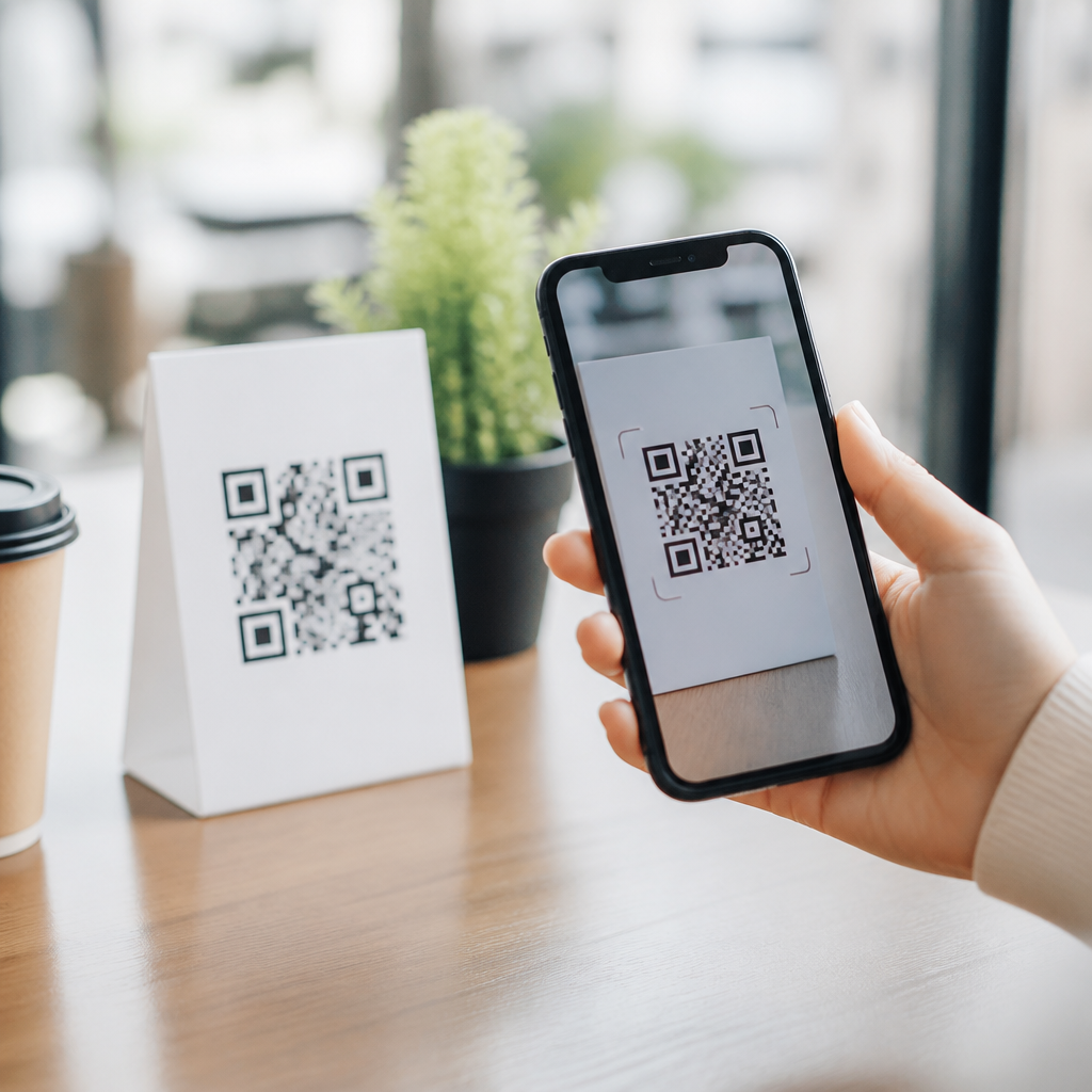
Designing mobile-first experiences for QR codes means treating the phone, not the printed square, as the primary product. A QR code is only the trigger; the real user experience begins when someone scans it on a mobile device, waits for the destination to load, decides whether to trust it, and attempts to complete a task with one thumb and limited attention. In practice, mobile-first QR code design combines QR code placement, scanning context, landing page performance, interaction design, analytics, and accessibility into one connected system.
This matters because most QR code interactions happen on smartphones in fast, distracted environments such as store aisles, event venues, restaurant tables, transit stops, packaging, and direct mail. In campaigns I have worked on, the difference between a high-performing QR code and an ignored one was rarely the code image itself. Success came from reducing friction after the scan: fast page speed, obvious next steps, short forms, readable content, and destinations tailored to the user’s immediate intent. Mobile-first design improves scan-to-completion rates, lowers bounce, and turns curiosity into measurable action.
Best practices for mobile UX around QR codes are especially important because scanning creates a fragile moment. Users are making a rapid trust decision: Is this safe? Is it worth my time? Will it work on my phone right now? If the answer is unclear, they leave. A strong mobile-first experience answers those questions immediately with clear labeling, secure links, responsive layouts, and content that matches the promise made next to the QR code. This article serves as a hub for designing those experiences well, from the physical scan moment to conversion and measurement.
Start with scan context, intent, and placement
The first rule of mobile QR code UX is to design for the environment in which the code will be scanned. A QR code on product packaging serves a different user need than one on a conference badge or bus shelter. Packaging often supports research, product verification, tutorials, or warranty registration. Event signage may drive agenda viewing, lead capture, or app downloads. Restaurant table tents often point to menus, ordering, or loyalty sign-ups. Good mobile-first design begins by mapping probable intent at the exact moment of scan and then matching the destination to that intent.
Placement affects whether users can scan comfortably with one hand, under glare, at a distance, or while moving. Codes should sit where a phone camera can frame them without awkward angles, and they need enough quiet zone, contrast, and print size to scan reliably. ISO/IEC 18004 defines the technical standard for QR code structure, but usability decisions go beyond compliance. If a poster is viewed from several feet away, the code must be larger. If it appears on glossy packaging, reflections must be tested. If it is used in low-light venues, surrounding design should support quick camera focus rather than hide the code in decorative graphics.
Instructional copy next to the code is also part of mobile UX. “Scan to see the menu” performs better than “Learn more” because it tells users exactly what happens next. Specificity reduces hesitation and raises intent alignment. Include a visible fallback URL where practical, especially in accessibility-sensitive or poor-connectivity environments.
Design landing pages for speed, clarity, and one-thumb use
Once the scan succeeds, the destination page determines whether the experience feels seamless or broken. The best QR code landing pages are purpose-built for mobile, not generic desktop pages shrunk to fit a small screen. They load quickly over variable cellular connections, keep the primary action above the fold, and avoid anything that interrupts the immediate task.
Core mobile UX principles matter here. Use responsive design, compress images, minimize third-party scripts, and monitor Core Web Vitals, especially Largest Contentful Paint and Interaction to Next Paint. A QR code on a storefront may be scanned outdoors on 4G with low battery and screen glare. Heavy pages fail in those conditions. I have repeatedly seen conversion improve when brands replaced multipurpose campaign pages with stripped-down mobile landing pages focused on one action, such as “view specifications,” “claim offer,” or “start order.”
Thumb-friendly interaction is equally important. Buttons should be large enough to tap accurately, forms should ask for minimal information, and text should remain readable without zooming. Keep navigation shallow. If users scan for a menu, do not send them to the website homepage and expect them to hunt for it. Deep link directly to the menu. If the goal is app installation, explain why the app is useful before sending users to the App Store or Google Play.
| QR Code Use Case | Best Mobile Destination | Common UX Mistake |
|---|---|---|
| Restaurant table | Fast-loading menu or order screen | Homepage with multiple competing links |
| Product packaging | How-to guide, authenticity check, or support page | Desktop PDF that requires pinching and zooming |
| Retail display | Offer page with inventory or coupon details | Auto-playing video that delays the offer |
| Event signage | Agenda, map, or registration form | Long form with unnecessary required fields |
Build trust immediately after the scan
Trust is the hidden conversion factor in QR code design. Because malicious QR codes exist, users are right to be cautious. Mobile-first experiences should reassure people before and after the scan. The safest baseline is an HTTPS destination on a recognizable domain, ideally one that matches the brand shown near the code. Avoid suspicious-looking short links when a branded short domain is available. If using dynamic QR code platforms, configure custom domains rather than default vendor URLs whenever possible.
The content surrounding the QR code should preview the value and destination. For example, “Scan to register your appliance at brandname.com” signals legitimacy better than a standalone code with no explanation. After the scan, the landing page should reinforce trust with consistent branding, clear headings, contact information, and privacy cues. If collecting personal data, say why it is needed and how it will be used. If requesting payment, use familiar checkout patterns and recognized processors.
There is also a practical trust issue with app prompts and permissions. Do not force app downloads for tasks that can be completed on the web unless there is a compelling reason. Likewise, do not trigger intrusive pop-ups immediately after load. Users who scanned a code for speed expect a direct path, not a gauntlet of consent banners, newsletter overlays, and chat widgets.
Match content format to mobile behavior
People scan QR codes to solve immediate problems, not to browse endlessly. Content should therefore be concise, scannable, and structured around task completion. Short paragraphs, descriptive headings, bulletproof calls to action, and visual hierarchy all support mobile consumption. If the content is instructional, front-load the answer. If it is transactional, move the action closer to the top. If it is educational, use expandable sections rather than overwhelming walls of text.
Different formats work for different intents. A product setup page may need step-by-step visuals or a short captioned video. A loyalty enrollment page should prioritize a brief form and instant confirmation. A coupon page should show expiration terms, redemption steps, and store applicability without forcing a PDF download. QR code user experience improves when the format respects the user’s likely context: standing, waiting, comparing products, or talking with staff.
Localization is often overlooked. If a code appears in multilingual settings, route users to language-specific pages based on the printed environment or device preferences. Time-sensitive experiences also benefit from dynamic content. A single code can lead to breakfast, lunch, or dinner menus by time of day, or to store-specific inventory by geolocation, provided users are informed clearly and privacy expectations are respected.
Optimize forms, flows, and conversion paths
Many QR code campaigns fail at the final step because the post-scan flow asks too much. Mobile forms should be ruthlessly simplified. Use autofill-friendly fields, numeric keyboards for phone numbers or codes, address lookup where appropriate, and progressive disclosure for nonessential questions. Every additional field increases abandonment. For lead generation, asking for name and email usually outperforms demanding company size, job title, budget, and phone number at the first touch.
Checkout, booking, and registration flows need the same discipline. Show progress clearly, preserve entered data, and provide obvious error states. If a coupon or code must be redeemed in person, design the success state for the user’s next action: a bright barcode, claim button, wallet pass, or screenshot-safe confirmation. I have seen in-store redemption rates rise when brands replaced text-heavy confirmation pages with large, cashier-friendly screens that worked under pressure.
Measurement should be baked in from the beginning. Use dynamic QR codes, UTM parameters, and event tracking in platforms such as Google Analytics 4, Adobe Analytics, or Mixpanel to distinguish scans from successful completions. Track scan-to-load rate, bounce rate, click-through, form completion, purchase, and retention. These metrics reveal whether the problem is poor placement, low trust, slow performance, or a weak conversion path.
Test accessibility, device compatibility, and real-world conditions
Mobile-first QR code design is incomplete without accessibility and field testing. Pages should meet WCAG guidance for contrast, text scaling, focus states, link clarity, and screen reader compatibility. Users with low vision may scan successfully but still fail if the destination relies on tiny text or color-only cues. Captions are essential for video content, and forms need proper labels and error messaging.
Device compatibility testing matters because scan experiences vary across iPhone and Android models, camera apps, browsers, and in-app scanners. Test on older devices, slower networks, and different lighting conditions. Verify deep links, app store routing, redirects, and cookie consent behavior. Also test edge cases that teams often miss: broken Wi-Fi, captive portals, low-data mode, and offline retry behavior.
Physical testing is just as important as digital QA. Print samples at final size, place them in the intended environment, and observe real users scanning them. Watch how long focus takes, whether glare interferes, and whether people understand the call to action. The best mobile QR code design practices come from this combination of analytics and observation, because real-world friction rarely shows up in mockups alone.
Mobile-first QR code experiences succeed when every layer works together: scannable placement, clear intent, fast landing pages, trustworthy domains, concise content, short conversion flows, and rigorous testing. The code itself is only the entry point. What drives results is the mobile journey that follows.
For teams building a mobile QR code design and UX program, the practical priority is simple: reduce friction at each step from scan to outcome. Start by aligning each code with one user intent, send people to a page built specifically for phones, and measure what happens after the scan instead of treating scan count as success. Then improve the weakest point, whether that is speed, clarity, form length, or redemption flow.
If you want better performance from QR campaigns, audits, packaging, signage, menus, and in-store activations, use this page as your hub and apply these best practices systematically. A well-designed mobile-first QR experience respects context, earns trust, and helps users complete a task quickly. That is what turns a scan into value.
Frequently Asked Questions
What does it really mean to design a mobile-first experience for QR codes?
Designing a mobile-first experience for QR codes means shifting your focus away from the code itself and toward everything that happens after the scan. The QR code is only the entry point. The real experience begins when a person notices the code, decides whether it feels trustworthy, scans it with a phone, waits for the destination to open, and then tries to complete an action on a small screen, often with one hand and in a distracting environment. A mobile-first approach treats the smartphone as the main product surface and assumes the user may be standing, moving, multitasking, or dealing with poor connectivity.
In practical terms, this affects every decision. The code has to be placed where it is easy to notice and easy to scan without awkward body positioning. The surrounding call to action should explain exactly what the user will get, such as a menu, payment page, product details, event check-in, app-free form, or support resource. Once scanned, the landing experience should load quickly, fit perfectly on mobile screens, avoid unnecessary zooming or typing, and guide the user to one clear next step. Mobile-first design also means reducing friction wherever possible by using large tap targets, short forms, autofill support, concise copy, and layouts that work well with thumb reach. The goal is not just to make a QR code scannable, but to make the entire scan-to-completion journey feel fast, obvious, and low effort.
What makes a QR code landing page effective on mobile devices?
An effective mobile QR landing page is fast, focused, trustworthy, and action-oriented. Speed is the first requirement because QR interactions are highly intent-driven. When someone scans a code, they expect immediate value. If the page loads slowly, they are far more likely to abandon the experience before seeing the content. That is why lightweight page construction, compressed assets, clean code, caching, and minimal third-party scripts matter so much. A fast-loading page is not a technical luxury in QR campaigns; it is central to conversion.
Focus is equally important. A QR scan usually happens with a specific purpose in mind, so the landing page should match that intent without distraction. If a code promises a coupon, show the coupon quickly. If it is for a payment flow, take the user directly to payment rather than making them hunt through a homepage. If it is for product information in a store, present the most relevant details first, such as price, availability, sizing, ingredients, instructions, or reviews. Good mobile landing pages reduce cognitive load by eliminating unnecessary navigation, keeping the layout visually clean, and highlighting one primary action.
Trust also plays a major role. Many users hesitate after scanning because they are unsure where the code will lead. The landing page should immediately reinforce legitimacy through recognizable branding, a secure connection, consistent visual design, and clear messaging that confirms the user is in the right place. Finally, the page must support mobile behavior. That means readable text, responsive layouts, finger-friendly buttons, short forms, click-to-call options where relevant, and minimal typing. The best QR landing pages are designed around context, intent, and momentum, making it easy for users to complete the task they started when they scanned.
How should QR codes be placed and presented to improve the mobile experience?
QR code placement has a direct impact on scan success and on the quality of the user experience that follows. A code may be technically functional but still perform poorly if it is placed too high, too low, too far away, on a reflective surface, in dim lighting, or in a location where people cannot comfortably stop to scan. Good placement begins with understanding the environment. A code on product packaging is different from a code on a restaurant table, storefront window, poster, transit sign, receipt, trade show booth, or outdoor billboard. Each context changes scanning distance, body posture, lighting, network conditions, and user attention span.
Presentation matters just as much as placement. Users need a clear reason to scan. A QR code with no explanation creates hesitation, while a code paired with a strong call to action builds confidence and intent. Tell people what they will get and why it is worth scanning, using concise language such as “View the menu,” “Pay in seconds,” “Download the guide,” or “See product specs.” It also helps to set expectations about whether the experience is instant, app-free, secure, or personalized. This reduces uncertainty and increases scan likelihood.
From a design standpoint, the code should be large enough to scan easily, surrounded by enough clear space, and printed with sufficient contrast against the background. Decorative treatments should never interfere with readability. It is also smart to think beyond ideal conditions. If users may be scanning while walking past, in sunlight, or from a distance, the code and message should be even more legible and prominent. Ultimately, effective placement and presentation support a simple principle: make it easy to notice, easy to understand, easy to trust, and easy to scan with minimal effort on a phone.
How can businesses reduce friction after someone scans a QR code?
Reducing friction after a scan is one of the most important parts of mobile-first QR design because that is where intent either turns into action or gets lost. Friction appears whenever the user has to wait, guess, pinch and zoom, type too much, switch apps, or navigate through content that feels unrelated to the reason they scanned. Since QR interactions often happen in moments of limited attention, even small obstacles can cause abandonment. The smartest strategy is to design the shortest possible path between the scan and the intended outcome.
Start by sending users to the most relevant destination, not a generic homepage. Deep-linking to a specific mobile page can remove several unnecessary steps. Then simplify the interface around one primary task. If the goal is to redeem an offer, surface the offer immediately. If the goal is to register, keep the form short and use mobile-friendly inputs, autofill, and dropdowns where appropriate. If payment is involved, support mobile wallets and streamlined checkout methods. If support is the goal, provide tap-to-call, chat, or FAQ shortcuts instead of making users search.
Technical friction should be addressed as aggressively as interface friction. Optimize load times, avoid oversized images or heavy scripts, and make sure pages render cleanly across common devices and browsers. Remove forced app downloads unless absolutely necessary, and do not require account creation before delivering obvious value. Error handling matters too. If a page fails to load, if a product is unavailable, or if a form field is rejected, the user should get clear guidance instead of a dead end. Friction reduction is really about respecting the user’s momentum. When someone scans a code, they are signaling intent. Your job is to preserve that intent by making the next action feel immediate and effortless.
What metrics should you track to evaluate a mobile-first QR code experience?
To evaluate a mobile-first QR code experience properly, you need to look beyond raw scan counts. Scans can tell you that interest exists, but they do not tell you whether the mobile journey actually worked. The most useful measurement approach follows the full funnel from exposure to scan to mobile engagement to conversion. Start with scan rate and unique scans to understand initial response, but then examine what users do after arrival. Key metrics include landing page load time, bounce rate, time to first meaningful interaction, completion rate for the intended action, and drop-off points within forms or flows.
Contextual performance data is especially valuable. Compare results by placement type, location, device category, operating system, time of day, campaign asset, and audience segment. A QR code in a retail aisle may produce very different mobile behavior than the same code on packaging or direct mail. If one location drives scans but low completion, that may indicate weak connectivity, poor context alignment, or a landing experience that does not match user expectations in that environment. If another placement has fewer scans but stronger conversion, it may be attracting higher-intent users.
It is also important to measure trust and usability signals indirectly. A high bounce rate combined with slow load times may point to performance problems. A large number of form starts but low submissions may indicate typing friction or weak mobile UX. Repeated scans from the same users can signal confusion if the destination does not make progress obvious. Businesses should also run tests on call-to-action wording, landing page structure, button labels, and page length to identify what improves outcomes. The ultimate goal of QR analytics is not simply proving that people scanned. It is understanding whether the mobile experience delivered value quickly and whether users could complete their task with confidence and minimal effort.





