
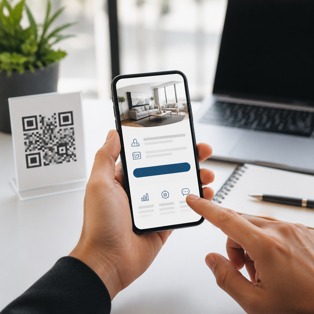
QR code landing pages succeed or fail in seconds because the scan happens in the physical world, yet the conversion happens on a small mobile screen where patience, bandwidth, and attention are limited. A QR code landing page is the destination a user reaches after scanning a printed, packaged, displayed, or embedded code, and conversion means the specific action you want that visitor to complete, such as buying, booking, downloading, subscribing, calling, or redeeming an offer. In practice, optimizing these pages is not just about design polish. It requires mobile UX decisions that reduce friction from the instant the camera opens through the moment the user confirms an action. I have built and audited QR campaigns for retail displays, restaurant menus, product packaging, field events, and direct mail, and the same pattern shows up every time: when the page loads fast, matches scan intent, and asks for only one obvious next step, conversion rates improve. When it feels like a generic webpage squeezed onto a phone, users bounce. This matters because QR traffic is unusually high intent. People scan because they expect immediate value in context, whether that is a coupon at a storefront, warranty details on a box, or event check-in from a poster. If the landing page breaks that expectation with slow load times, cramped forms, unclear messaging, or desktop-first layouts, the campaign wastes paid media, print costs, and foot traffic that may not return.
Best practices for mobile UX begin with understanding the moment of scan. Users are often standing, walking, commuting, shopping, or multitasking. Lighting may be poor, connectivity may be unstable, and one-handed use is common. That environment changes design priorities. The page must answer three questions immediately: what is this, why should I care now, and what do I do next? Strong QR code landing pages make those answers visible above the fold, use concise copy, respect thumb reach, and remove anything that delays the primary conversion. They also preserve campaign continuity by aligning the promise on the QR code, sign, package, or callout with the headline and offer on the page. As the hub for mobile QR code design and UX, this guide covers the full system behind higher conversions: message match, page speed, layout, forms, trust signals, analytics, testing, and accessibility. Treat it as the foundation for every QR campaign that needs measurable results on mobile.
Match scan intent with a single-purpose mobile page
The most important rule is simple: one QR code should lead to one clear intent. If a poster says “Scan for 20% off,” the page should open directly to the discount, not a homepage, product catalog, or app splash screen. Message match reduces cognitive load and reassures users that the scan worked as expected. In my audits, the biggest conversion lifts usually came from replacing general mobile pages with campaign-specific landing pages built around a single CTA. A restaurant table tent should lead straight to the digital menu or order flow. A product label should lead to setup instructions, registration, or replenishment purchase. A conference badge scan should open personalized session details or lead capture confirmation.
This is where context becomes strategy. QR scans from packaging often happen after purchase, so the conversion may be registration, onboarding, accessory upsell, or review generation. Scans from out-of-home ads are more top-of-funnel, so the page may need faster orientation, location context, and lighter commitment. Use dynamic QR codes when possible so the destination can change by campaign, region, store, or time of day without reprinting the code. Platforms such as Bitly, QR Code Generator Pro, Beaconstac, and Uniqode support dynamic routing, analytics, and UTM tagging, which makes campaign-specific optimization practical at scale.
Prioritize mobile speed, stability, and instant clarity
Mobile performance is not a technical side issue; it is conversion design. QR users are often on cellular data, and any delay between scan and visible content feels longer because they initiated the interaction with a physical action. Aim for a Largest Contentful Paint under 2.5 seconds and minimize layout shifts that cause taps to miss. Compress images with WebP or AVIF, defer noncritical scripts, limit third-party tags, and use a content delivery network. On campaign pages, I routinely strip out unnecessary carousels, chat widgets, autoplay video, and bloated tag managers because they rarely help the first conversion and often slow it down.
Clarity must appear before scrolling. The opening screen should contain a short headline, one supporting line, one primary CTA, and if needed one trust cue such as “No app required,” “Takes 30 seconds,” or “Secure checkout.” This formula works because it resolves uncertainty fast. If the QR code promised Wi-Fi access, the button should say “Connect Now.” If the code unlocked assembly instructions, the first visible option should be “Watch the 2-minute setup.” Keep visual hierarchy obvious with large type, ample contrast, and tap targets of at least 44 by 44 CSS pixels, a standard aligned with Apple Human Interface Guidelines and generally supported by accessibility best practice.
Design for thumb-first interaction and frictionless completion
Good mobile UX respects ergonomics. Place the primary CTA within easy thumb reach, usually in the middle to lower portion of the viewport, and repeat it on longer pages with a sticky footer button when appropriate. Avoid tiny text links, dense navigation, and side-by-side buttons that invite accidental taps. QR landing pages perform best when they behave like streamlined task flows rather than full websites. Remove the global navigation if it competes with conversion, reduce choices, and keep copy scannable with short paragraphs and descriptive labels.
Forms deserve special attention because they are where many QR conversions die. Ask only for the fields required to complete the action. Use proper input types such as email, tel, number, and date to trigger the right mobile keyboard. Enable autofill, address lookup, wallet payment options, and one-tap sign-in where relevant. If a long form is unavoidable, break it into steps with visible progress indicators. Error messages should appear inline, explain the problem in plain language, and preserve already entered data. For location-based conversions like store appointments, prefill the nearest location using geolocation only after consent, and always offer manual entry as a fallback.
| Mobile UX element | Best practice | Why it improves conversions |
|---|---|---|
| Headline | Repeat the QR promise in 6 to 12 words | Confirms users landed in the right place immediately |
| Primary CTA | Use one dominant button with action language | Reduces hesitation and decision fatigue |
| Page speed | Load key content in under 2.5 seconds | Prevents abandonment on cellular connections |
| Forms | Limit fields and enable autofill | Shortens time to completion on small screens |
| Trust signals | Show security, privacy, or redemption details | Addresses risk at the moment of action |
| Analytics | Track scans, sessions, CTA clicks, and completions | Reveals where the funnel is leaking |
Build trust with message continuity, accessibility, and transparent value
QR scans can trigger caution because users are jumping from an offline object into a browser without seeing the destination first. Trust cues therefore carry more weight than on many other mobile pages. Brand the page clearly so it matches the packaging, poster, email, or display that contained the code. Use HTTPS, show recognizable payment methods if checkout is involved, and make any privacy implications explicit before asking for data. If the reward is a discount or free resource, state the terms clearly. Hidden conditions, forced account creation, and surprise pop-ups create immediate drop-off.
Accessibility is also a conversion factor, not only a compliance concern. High color contrast, readable font sizes, descriptive button labels, logical heading structure, and screen-reader-friendly forms help all users under real mobile conditions, including glare, motion, and temporary impairment. Captions on video matter because many scans happen in public spaces where sound is off. Avoid using QR pages that rely on pinch-zoom, tiny checkbox targets, or CAPTCHA challenges that are difficult on mobile. If identity verification or anti-fraud is required, choose lower-friction options such as invisible bot protection or email verification after the first action, not before it.
Measure the full QR funnel and test like a performance marketer
Optimization requires better measurement than scan counts alone. A scan is only the top of the funnel. Track unique scans, page sessions, bounce rate, CTA clicks, form starts, form completions, checkout starts, purchases, revenue, and assisted conversions. Use UTM parameters consistently so analytics tools such as Google Analytics 4, Adobe Analytics, or Matomo can separate scans by placement, creative, region, and campaign. If the same creative appears in multiple stores, create distinct URLs or parameters for each location. Otherwise, you will not know whether poor performance came from the page, the offer, or the placement.
Testing should focus on variables with clear behavioral impact: headline specificity, CTA wording, form length, incentive framing, coupon presentation, hero image, and sticky button behavior. On QR campaigns, I have seen meaningful lifts from changes as small as replacing “Submit” with “Get My Coupon,” moving redemption details above the fold, or swapping a generic product shot for a photo showing the exact in-store item next to the code. Also test by context. A QR code on product packaging may convert better with support content first and upsell second, while a retail window code may need store hours, map directions, and a fast claim button before anything else. Heatmaps from Hotjar or Microsoft Clarity can reveal rage taps, dead zones, and scroll abandonment patterns that standard analytics miss.
Make this hub the standard for every QR landing page you launch
Optimizing QR code landing pages for conversions comes down to respecting the mobile moment. People scan with purpose, often in distracting environments and on limited time, so the page has to respond with equal precision. Match the promise of the code, load fast, show one obvious next step, simplify forms, and give users confidence that the action is worth taking. Those are the core best practices for mobile UX, and they apply whether your goal is ecommerce sales, lead generation, event registration, menu ordering, app downloads, or product onboarding.
As the central guide within a mobile QR code design and UX strategy, this article establishes the framework every supporting page should expand on: page speed, layout patterns, form optimization, accessibility, analytics, and testing. Teams that treat QR landing pages as dedicated mobile conversion assets consistently outperform teams that send scan traffic to generic destinations. Review your current QR experiences on an actual phone, in the real locations where people scan, and fix the friction you can feel in under a minute. Then build, measure, and iterate every campaign with the same discipline.
Frequently Asked Questions
What makes a QR code landing page different from a regular landing page?
A QR code landing page is different because the visit begins offline and continues online in a matter of seconds. Someone scans from packaging, signage, direct mail, a menu, a product label, an event display, or a storefront, then lands on a mobile page with very little patience and very high intent. That context changes everything. Unlike a standard landing page that may be reached from search or ads after some browsing, a QR landing page must immediately confirm that the user is in the right place, explain the offer fast, and make the next action effortless on a small screen.
The best-performing QR destinations are built for mobile-first behavior, not desktop assumptions. They load quickly, avoid clutter, use short copy blocks, feature a clear headline, and present a single obvious call to action. They also match the promise made near the code itself. If the printed message says “Get 20% off,” the page should repeat that exact benefit right away. If the QR code is placed on a product package, the landing page should feel like a natural continuation of that product experience rather than a generic homepage. In short, a regular landing page can often educate and persuade over time, but a QR code landing page must validate intent, reduce friction, and convert almost immediately.
How can I optimize a QR code landing page for higher conversions on mobile devices?
Start with speed and clarity. A QR code scan creates a moment of intent, but that moment disappears fast if the page is slow, crowded, or confusing. Compress images, limit scripts, avoid unnecessary pop-ups, and design for fast mobile loading on average cellular connections, not just strong Wi-Fi. The first visible screen should answer three questions instantly: what this is, why it matters, and what to do next. A strong headline, a concise value proposition, and one prominent call-to-action button usually outperform pages that try to offer too many choices.
Next, remove every avoidable step from the conversion path. Keep forms short, use large tap targets, enable autofill where possible, and minimize typing. If the goal is to call, make the number tap-to-call. If the goal is to download, link directly to the relevant app store or file. If the goal is to redeem an offer, display the coupon or redemption action immediately instead of forcing users to hunt for it. Trust signals also matter on mobile. Include recognizable branding, simple benefit-focused copy, customer proof where relevant, and privacy reassurance if personal information is requested.
Finally, align page design with scan context. A person scanning in a store, at a trade show, on a product box, or from a restaurant table has different needs and time constraints. Tailor the message to that moment. Someone standing in an aisle may need a quick product comparison, while someone scanning from direct mail may be more willing to fill out a lead form. Optimization is not just about prettier design; it is about reducing friction between the physical-world prompt and the digital action you want the user to complete.
What should I include above the fold on a QR code landing page?
Above the fold, focus on confirmation, value, and action. The user should instantly recognize that the page is relevant to the QR code they scanned. That means using a headline that matches the callout near the code, such as “Claim Your Free Trial,” “Redeem Your In-Store Offer,” or “Book Your Appointment Today.” Supporting text should be brief and specific, explaining the primary benefit in plain language. This is not the place for a long brand story or multiple competing messages.
You should also include one dominant call to action that stands out visually and is easy to tap. If there are multiple possible actions, prioritize one and keep secondary options subtle. Strong pages often include a supporting visual, product image, or short explainer that reinforces the offer without slowing the page down. If trust is necessary for conversion, add quick credibility cues such as star ratings, secure checkout messaging, limited-time offer details, partner logos, or a concise privacy statement. The goal is to help the visitor feel confident enough to act without making them scroll to understand the page.
In many cases, the best above-the-fold layout is surprisingly simple: a clear headline, a short benefit-driven paragraph, a primary button, and a visual or trust cue. That simplicity works because QR visitors are often task-oriented. They do not want to explore; they want to complete something quickly. If the top of the page feels obvious, relevant, and low-friction, conversion rates usually improve.
How do I match the QR code’s placement and message to the landing page experience?
Message match is one of the most important conversion factors for QR campaigns. The wording, design, and promise surrounding the code should connect directly to the landing page content. If the QR code appears on a poster offering event registration, the landing page should open with event details and a registration button, not a general company page. If it is printed on packaging for setup instructions, users should land on setup help immediately, not a catalog. Every extra moment spent re-orienting the visitor increases abandonment.
Placement context also shapes user intent. A code on retail packaging may attract users who want reviews, how-to guidance, recipes, warranty activation, or product verification. A code in a restaurant may need to open a menu, loyalty sign-up, or reorder flow. A code in out-of-home advertising may need to deliver a fast, bold offer because the user may be standing, walking, or multitasking. By understanding why someone is likely to scan in that exact setting, you can build a page that feels timely and useful rather than generic.
Consistency in visual language helps too. Similar colors, offer language, product naming, and branding create confidence and reduce confusion. You should also avoid forcing all QR traffic to one destination. Dynamic QR codes and segmented campaigns let you send different audiences to more relevant pages based on location, product, promotion, or channel. The closer the landing page matches the scan trigger, the more likely users are to continue toward conversion.
How should I measure and improve the conversion performance of QR code landing pages?
Begin by defining one primary conversion goal for each page. That could be a purchase, booking, download, subscription, call, coupon redemption, or form submission. Once the goal is clear, track the full path from scan to completion. Useful metrics typically include scan volume, landing page visits, bounce rate, load time, click-through rate on the main call to action, form completion rate, and final conversion rate. If possible, also measure segmented performance by QR code location, campaign, device type, time of day, and returning versus new visitors.
To improve performance, look for friction points rather than relying only on total conversions. If scans are high but page visits are low, there may be a technical issue after the scan. If visits are high but clicks are low, the value proposition or message match may be weak. If clicks are high but conversions are low, the form, checkout, or next step may be too demanding for mobile users. Heatmaps, session recordings, and A/B testing can help identify whether people are getting distracted, confused, or blocked before converting.
Continuous testing is what turns a decent QR landing page into a high-converting one. Test headlines, button text, page length, offer framing, form fields, trust elements, and visual hierarchy. You can also test context-specific variations for different placements. In many campaigns, small improvements such as shortening a form, speeding up load time, or moving the call to action higher on the page can produce meaningful gains. The most effective teams treat QR landing pages as living conversion assets that are refined over time using real user behavior, not assumptions.





