QR codes look distorted for several technical reasons, and the fix depends on where the distortion begins: during design, export, printing, display, or scanning. In practical troubleshooting work, I usually see the same patterns repeat. A code may appear stretched, blurry, blocky, low contrast, over-decorated, or physically damaged. Any of those issues can break readability because a QR code is not just a graphic; it is a machine-readable matrix built from modules, quiet zones, finder patterns, timing patterns, alignment patterns, format information, and encoded data. When one part is warped or obscured, scanners lose the reference points they need to decode it correctly.
This matters because distorted QR codes waste paid traffic, break packaging workflows, create support tickets, and damage trust at the point of scan. A restaurant menu, product label, event sign, direct mail piece, or payment placard only works if the code resolves instantly. Even small visual changes can reduce scan success, especially on older phone cameras, glossy surfaces, low-light environments, or long-distance scans. This technical FAQ hub explains why a QR code looks distorted, how to diagnose the exact cause, and which related troubleshooting topics you should review next if the issue involves size, error correction, file format, color, printing, or dynamic links.
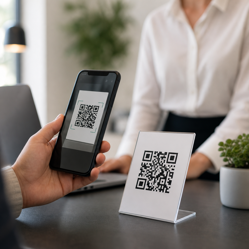
What a distorted QR code actually means
A distorted QR code is any code whose modules no longer preserve the clean square structure required for reliable decoding. Distortion may be geometric, such as stretching a square code into a rectangle; optical, such as blur from low-resolution export; visual, such as insufficient contrast between foreground and background; or physical, such as wrinkling on a curved bottle label. In production environments, I separate distortion into creation errors and environmental errors. Creation errors happen in design software, file export, or branding edits. Environmental errors happen after publication, including poor print quality, reflective lamination, dirty screens, and camera perspective.
The fastest way to identify the problem is to ask three direct questions. First, does the code fail everywhere or only in one context? Second, does the distortion appear in the source file or only after printing or posting online? Third, was the code customized after generation? These questions usually narrow the root cause quickly. If the original PNG or SVG looks perfect but the printed version does not scan, the issue is likely sizing, substrate, ink spread, or finishing. If the source file itself looks uneven, the problem usually started with resizing, raster compression, or an overaggressive logo treatment.
Most common causes of QR code distortion
The most common cause is improper resizing. A QR code should scale proportionally. If someone drags a corner incorrectly in Canva, PowerPoint, Illustrator, Figma, or a CMS image block, the code becomes horizontally or vertically stretched. Scanners expect square modules arranged on a square grid. Once those modules become rectangles, detection rates drop sharply. I also see frequent problems when teams export tiny raster images and then enlarge them later for posters, flyers, or storefront signs. Upscaling a small PNG introduces blur between module edges, which weakens decoding.
Another major cause is missing quiet zone, the blank margin around the QR code. ISO/IEC 18004 defines the technical structure of QR codes, and that margin is not decorative whitespace; it helps scanners isolate the symbol from nearby text, borders, photos, or background patterns. Designers often crop too tightly, place the code inside a badge, or add a stroke around it. The result looks tidy to humans but confusing to cameras. Similarly, heavy customization can distort function. Rounded modules, gradients, embedded logos, drop shadows, and patterned backgrounds are not automatically bad, but each reduces tolerance if pushed too far.
| Distortion type | Typical cause | What it looks like | Best fix |
|---|---|---|---|
| Stretching | Non-proportional resizing | Rectangular code, uneven modules | Restore 1:1 aspect ratio from original file |
| Blurring | Low-resolution PNG enlarged | Soft edges, muddy squares | Use SVG or regenerate at final size |
| Cropping | Quiet zone removed | Code too close to text or border | Add clear margin on all sides |
| Low contrast | Poor color pairing | Stylish but hard to scan | Use dark foreground on light background |
| Print deformation | Ink spread, curved surface | Modules bleed or warp | Increase size, test on final material |
Design and export mistakes that create distortion
Design software can preserve a QR code perfectly or ruin it quietly. Vector formats such as SVG, EPS, and PDF usually retain sharp module edges at any size, which is why I prefer them for professional print production. Raster formats such as PNG can also work well, but only when exported at sufficient resolution for the final use case. A small email-signature QR code may scan fine at 300 pixels square on screen, while a trade-show banner viewed from several feet away needs dramatically more physical size and clean source artwork. JPEG is the worst choice because lossy compression creates artifacts around module edges.
Another hidden mistake is anti-aliasing introduced during export or screenshotting. Teams sometimes generate a QR code correctly, then paste it into slides, screenshot it, crop it, and save it again through multiple apps. Each step can soften edges or alter contrast. Web publishing platforms can also compress uploaded images automatically. If your code looks crisp in the asset folder but fuzzy on the live page, inspect the rendered image dimensions and compression settings. For hub readers troubleshooting file issues, the next related topics to review are QR code image format selection, SVG versus PNG usage, and how compression affects scannability.
Printing, materials, and placement problems
Many distorted QR codes are technically fine on screen but fail after printing. Print introduces variables that digital previews hide. Ink gain can make small modules bleed together on porous paperboard. Gloss coating can create glare under store lighting. Thermal printers can produce jagged edges if darkness or speed settings are off. Curved packaging, fabric, corrugate, and shrink sleeves can bend the symbol enough to interfere with scanner alignment. I have seen shipping labels scan poorly simply because the code crossed a box seam or folded over a rounded edge.
Placement matters as much as print quality. A QR code on a window may distort visually because the substrate is transparent, reflective, or backlit. A code mounted too high forces users to scan at an extreme angle, creating perspective distortion. A code on moving equipment, vehicle decals, or outdoor signage may be affected by dirt, weathering, and fading. For practical troubleshooting, print a control sample on plain matte stock at the recommended final size, then compare scan performance. If the control sample works but the production piece fails, the issue is almost always material, finishing, placement, or environmental lighting rather than the encoded data itself.
Customization, branding, and error correction limits
Branded QR codes can work very well, but customization must respect technical boundaries. Error correction lets a code remain readable when part of the symbol is obscured or damaged. The common levels are L, M, Q, and H, with H providing the most recovery capacity. That does not mean you can remove large areas freely. A centered logo, decorative frame, or rounded module set still changes how scanners interpret the symbol. In audits, I often find codes with a logo that covers too much of the data area, combined with a reduced quiet zone and low contrast. Any one of those changes might be survivable; stacked together, they cause distortion-like scan failure.
Color is another overlooked factor. The safest combination is a dark code on a light, solid background. Inverted schemes, metallic inks, transparent overlays, and gradient fills can all reduce readability. Some phone cameras compensate well; others do not. The practical rule is simple: if a human has to squint to separate foreground from background, a scanner will struggle too. For related hub questions, readers should also check articles on QR code color best practices, logo size limits, error correction choices, and whether stylized codes remain compliant across common scanning apps and native smartphone cameras.
How to diagnose and fix a distorted QR code quickly
Start with the original source asset, not the live placement. Verify that the code is perfectly square, with a full quiet zone on all sides. Test the untouched file on multiple devices: iPhone Camera, Google Lens, and at least one dedicated scanning app. Then test the same code in the exact context where it fails, such as printed packaging, a PDF, a website hero image, or an in-store sign. If failure appears only in context, isolate one variable at a time: size, color, substrate, lighting, curvature, compression, or distance. This method is faster than redesigning blindly.
Next, regenerate the code from the destination URL or payload to rule out corruption. Use a reputable generator that supports vector export, dynamic QR management if needed, and adjustable error correction. If branding is involved, strip the design back to a plain black-on-white version and confirm baseline scannability. Then reintroduce logo, color, and shape changes one by one. In production teams, I document a pass/fail matrix across devices and conditions before approval. The key takeaway is that a distorted-looking QR code is usually fixable once you identify whether the root cause is geometry, resolution, contrast, material, or customization. Review the related technical FAQ articles in this hub, test your assets early, and standardize a proofing checklist before launch.
Frequently Asked Questions
Why does my QR code look stretched or squashed?
A QR code usually looks stretched or squashed when its original square proportions were changed during editing, layout, or resizing. QR codes are built on a precise square grid of modules, which are the small dark and light blocks that carry the encoded data. If the image is pulled wider, made taller, or resized unevenly in a design program, those modules stop being perfectly square. Even if the distortion seems minor to the eye, scanners may have trouble interpreting the pattern correctly because they expect consistent geometry, especially around the finder patterns in the corners and the surrounding quiet zone.
This commonly happens when someone drags only one side of an image box, places the code inside a non-square container, or exports it through software that applies automatic fitting or aspect-ratio changes. The fix is simple but important: always scale a QR code proportionally, lock the aspect ratio, and keep the file in a true square format from creation through final output. If the code has already been distorted, do not try to repair it visually. Go back to the original source file or regenerate the QR code, then resize it correctly. A QR code should never be treated like decorative artwork that can be freely warped to fit a layout.
Why does my QR code look blurry or fuzzy instead of sharp?
Blurriness usually means the QR code was exported or displayed at the wrong resolution, or it was converted in a way that softened the hard edges between modules. QR codes need crisp transitions from dark to light because scanners detect those module boundaries to decode the symbol. When the image is too low-resolution, enlarged too much, compressed heavily, or filtered by design or web software, the edges can become soft, anti-aliased, or slightly smeared. That visual softness may seem harmless on screen, but it can make the code harder to scan, especially from a distance or under poor lighting.
The best prevention is to use a vector format such as SVG, EPS, or PDF whenever possible, especially for print. Vector files preserve the square structure cleanly at any size. If you must use a raster image like PNG, export it at the final display size or larger, with enough pixel density to keep the modules sharp. Avoid JPEG for QR codes because its compression can introduce artifacts around the edges. Also be cautious with screenshotting, copy-pasting between apps, and uploading to platforms that recompress images automatically. If the code looks even slightly soft when zoomed in, regenerate or re-export it before publishing. Sharp edges are not just a visual preference; they are part of what makes the code machine-readable.
Can colors, low contrast, or decorative styling make a QR code look distorted?
Yes, absolutely. A QR code can appear distorted even when its shape has not been physically stretched, because heavy styling changes how scanners perceive the pattern. Low contrast is one of the most common problems. If the dark modules are too light, the background is too busy, or the foreground and background colors are too similar, the code may look visually stylish but functionally compromised. Gradients, shadows, transparency effects, textured backgrounds, and photo overlays can also interfere with the clean separation scanners need between modules and the empty quiet zone around the code.
Over-decoration creates another layer of risk. Rounded modules, custom eyes, logos placed in the center, and artistic effects can work in moderation, but once too many elements are changed, the code stops behaving like a reliable matrix and starts behaving like a damaged graphic. Even with error correction enabled, there is a limit to how much visual modification a QR code can tolerate. The safest approach is to maintain strong dark-on-light contrast, preserve a clear quiet zone, and test the code on multiple phones before using it publicly. If branding is important, keep styling conservative and let readability come first. A QR code is not successful because it looks creative; it is successful because it scans instantly and consistently.
Why does my printed QR code look blocky, broken, or hard to scan?
Print introduces several ways for a QR code to become distorted. A code may look blocky if it was exported at too low a resolution for the print size. It may look broken if ink spread, toner issues, paper texture, or poor press calibration caused small modules to fill in, lighten, or merge together. Very small printed QR codes are another common problem. If the modules become too tiny on the final piece, scanners may struggle to separate one square from the next, especially if the print surface is glossy, curved, or uneven. Physical damage such as folds, scratches, creases, or trimming too close to the edges can also interfere with the finder patterns or the quiet zone.
To fix print-related distortion, start by generating the code at an appropriate size for the viewing distance and use vector artwork whenever possible. Keep the quiet zone intact and avoid placing the code near folds, seams, perforations, or die cuts. Print a test copy at actual size, then scan it with several devices under realistic conditions, not just under perfect office lighting. If the code is going on packaging, labels, posters, or outdoor signage, account for material behavior and environmental wear. What looks acceptable on a monitor may fail once ink, substrate, and handling are involved. In print, readability depends not only on file quality but also on production quality and physical durability.
How can I tell whether the distortion is happening during design, export, display, or scanning?
The fastest way to troubleshoot a distorted QR code is to isolate where the problem begins. Start with the original generated file. If that file looks correct and scans reliably, the issue likely appears later in the workflow. Next, inspect the version used in the design layout. If it looks stretched, clipped, recolored, or filtered there, the distortion was introduced during placement or styling. Then compare the exported version. If the code became blurry, compressed, pixelated, or oddly scaled after export, the output settings are responsible. If the code looks fine in the file but fails only on a website or app, the platform may be resizing it, recompressing it, or displaying it on a low-quality screen. If everything looks correct visually but scans inconsistently, then the problem may be environmental, such as glare, distance, motion, focus, or scanner quality.
In practical troubleshooting, I recommend a simple checklist: verify the code is square, confirm the modules are sharp, maintain strong contrast, preserve the quiet zone, avoid excessive decoration, and test on multiple devices. Also test the code in the exact medium where it will be used: printed on the actual material, displayed on the real screen, or viewed from the intended distance. Many QR code issues repeat because people assume a code is “just an image,” when in reality it is a machine-readable pattern with strict structural requirements. Once you identify the exact stage where the appearance changes, the solution usually becomes straightforward.