QR code scanability is the difference between a code that opens instantly and one that frustrates users, stalls campaigns, and wastes print space. In practical terms, scanability means how reliably a QR code can be detected, decoded, and acted on by a smartphone camera or dedicated scanner across real-world conditions such as glare, distance, motion, low light, poor printing, or damaged surfaces. Because this page sits within a broader FAQs and Troubleshooting Hub, it answers the technical questions that usually surface after teams discover that “it scans on my phone” is not a meaningful quality standard.
I have worked on QR deployments for packaging, retail displays, direct mail, event signage, menus, and equipment labels, and the same pattern repeats: most scan failures come from preventable design and production choices, not from the QR format itself. Improving QR code scanability matters because the code is often the bridge between offline attention and online action. If that bridge fails, conversion drops immediately. A code can be technically valid yet practically unusable, so teams need standards for size, contrast, quiet zone, error correction, placement, and destination behavior.
A QR code is a two-dimensional matrix barcode defined by ISO/IEC 18004. It stores data in modules, the small square cells people commonly call pixels. Scanner software locates three finder patterns, reads alignment information, corrects some damage with Reed-Solomon error correction, and decodes the payload. Scanability improves when the camera can clearly separate dark and light modules, the quiet zone around the symbol is preserved, distortion is limited, and the encoded data is not needlessly dense. The rest of this hub explains the technical FAQs that determine whether a QR code works consistently in the field.
Start with symbol design: size, contrast, and quiet zone
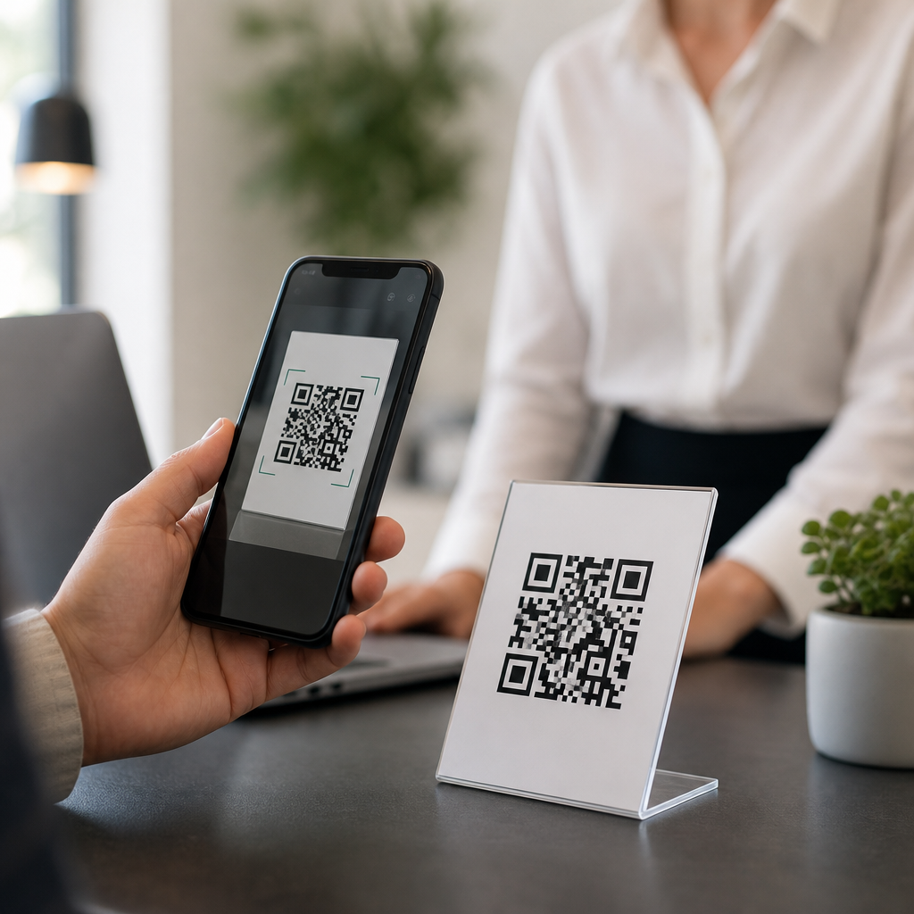
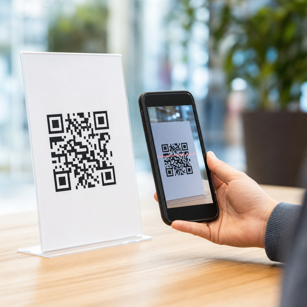
The first technical FAQ is simple: what makes a QR code easy to scan at all? Three fundamentals matter more than any styling trend: adequate physical size, strong contrast, and an intact quiet zone. The quiet zone is the empty margin around the code, and the standard recommendation is four modules on all sides. If logos, borders, text, or background graphics invade that space, detection reliability drops sharply because scanners struggle to isolate the symbol from surrounding visual noise.
Size should be matched to scanning distance. A dependable field rule is that the minimum code size should be roughly one-tenth of the intended scan distance. A code expected to be scanned from 50 centimeters should therefore be about 5 centimeters wide. For packaging handled at arm’s length, 2 to 3 centimeters can work; for posters viewed from several feet away, larger is safer. I usually reject miniature codes unless there is controlled scanning with excellent print quality, because small modules collapse first when ink spread, blur, or low-resolution printing enters the process.
Contrast means dark modules on a light background, ideally black on white or a similarly high-luminance difference. Reversed codes, metallic inks, translucent substrates, and busy photographic backgrounds routinely cause failures, especially on older phones or under dim lighting. The practical test is not whether a design mockup looks attractive on a monitor but whether multiple devices can decode it instantly from common angles. If a code requires users to hunt for focus, adjust distance, or increase brightness, scanability is already compromised.
Manage data density and error correction wisely
Another frequent question is whether adding more information makes a code harder to scan. The answer is yes. The more characters you encode, the more modules the symbol needs, which creates a denser pattern that becomes less forgiving when printed small or viewed at a distance. A short URL scans better than a long raw link with tracking parameters. That is why dynamic QR codes are usually preferable for campaigns: they encode a short redirect URL while letting you change destinations and analytics later without reprinting the symbol.
Error correction is useful but often misunderstood. QR codes support four levels: L, M, Q, and H, allowing approximately 7%, 15%, 25%, and 30% error recovery respectively. Higher error correction helps when a code may be scratched, curved, or partly obscured, but it also increases symbol density. In practice, M is a strong default for most print uses. I reserve Q or H for cases with embedded logos, rough environments, or likely damage. Using H by default on a tiny label is a mistake, because the denser code can become less scannable than a simpler symbol with M.
Character set also matters. Numeric data is most efficient, then alphanumeric, while full byte mode consumes more capacity. That efficiency difference affects final symbol complexity. If your workflow generates QR codes automatically, standardize short URLs, remove unnecessary parameters, and avoid embedding entire vCards or long text blocks unless offline storage is truly required. When teams ask how to improve QR code scanability without changing the artwork much, reducing payload length is one of the fastest technical wins.
Print production and materials often determine real-world performance
Many scan problems are introduced after design approval during printing, finishing, or installation. Dot gain on absorbent paper can thicken dark modules and close narrow white spaces. Low-resolution output can create ragged edges that hurt decoding. Gloss lamination and shrink-wrap can add glare or curvature. On corrugated packaging, the board texture may break clean module boundaries. That is why production proofs should be scanned under realistic conditions rather than approved visually. A code that passes on a laser print can fail on the final substrate.
Placement is equally important. Avoid folds, seams, bottle necks, corners, rivets, and highly curved surfaces. Keep codes away from perforations, tear areas, and variable data zones that may drift in registration. For outdoor signage, consider reflections from glass, acrylic, or polished metal at different sun angles. For industrial labels, account for abrasion, oil, condensation, and cleaning chemicals. In warehouses and manufacturing sites, I have seen codes fail because thermal transfer ribbons produced weak blacks on synthetic labels; switching ribbon grade solved the issue without redesigning the symbol.
| Factor | Recommended baseline | Common failure | Practical fix |
|---|---|---|---|
| Quiet zone | 4 modules minimum | Text or graphics too close | Add clear margin on all sides |
| Contrast | Dark on light | Low-contrast brand colors | Use near-black on white background |
| Size | 1:10 size-to-distance rule | Code too small for placement | Increase symbol width or reduce distance |
| Payload | Short dynamic URL | Long dense encoded data | Shorten destination and remove extras |
| Surface | Flat, matte area | Glare, curvature, texture | Reposition or change material finish |
Device behavior, testing methods, and troubleshooting workflow
Teams also ask why one phone scans instantly while another struggles. Camera quality, autofocus speed, image processing, and scanner software all vary. Newer devices usually tolerate more blur and lower contrast, while older budget phones expose weaknesses quickly. Native camera apps may behave differently from retail or industrial scanning apps. For that reason, testing should cover both iPhone and Android devices across at least a few generations, with bright and dim lighting, portrait and landscape orientation, and realistic user movement.
A reliable troubleshooting workflow starts by isolating variables. First, test the destination URL independently to confirm it loads quickly and resolves over HTTPS without redirects that trigger delays or warnings. Second, inspect the symbol itself: verify quiet zone, size, contrast, and payload length. Third, review production factors such as resolution, substrate, lamination, and placement. Fourth, compare the failing code against a control code generated from the same destination with default settings in a trusted tool such as QRCode Monkey, Bitly, Adobe Express, or enterprise platforms like QR TIGER and Scanova.
Use objective tools where possible. Print at final size, then test scan success rate, time to first decode, and reading distance. If your team handles high volumes, establish pass/fail criteria, such as instant decoding within two seconds on five common devices. For websites linked from QR codes, monitor landing-page speed in PageSpeed Insights or Lighthouse, because users often blame the code when the real issue is a slow page. A technically scannable code still underperforms if the post-scan experience is sluggish, mismatched, or blocked by intrusive interstitials.
Design customization, accessibility, and hub-level next steps
Branded QR codes can work well, but customization must never outrank function. Rounded modules, center logos, gradients, and colored eyes are acceptable only if testing confirms reliable decoding at final size and on final materials. Keep finder patterns distinct, preserve the quiet zone, and avoid gradients that reduce edge definition. Accessibility also matters: place the code where users can approach it safely, add a short call to action describing the benefit of scanning, and consider including a short fallback URL for people whose devices or conditions prevent easy scanning.
As the technical hub for FAQs and troubleshooting, this page should connect readers to deeper articles on print sizing, dynamic versus static QR codes, logo safety, packaging materials, destination URL best practices, and scan analytics. The central lesson is consistent across all of them: improve QR code scanability by simplifying the symbol, protecting contrast and quiet zone, matching size to distance, choosing realistic error correction, and validating the final printed piece on multiple devices. Audit your current codes against these standards, then test them where customers actually scan.
Frequently Asked Questions
What are the most effective ways to improve QR code scanability?
The biggest improvements usually come from getting the fundamentals right: size, contrast, quiet zone, data density, and print quality. A QR code should be large enough for the expected scanning distance, with a practical rule of thumb being about 1 inch of code size for every 10 inches of scanning distance. If users will scan from a poster, sign, or storefront window, the code needs to be much larger than one printed on packaging or a business card.
High contrast is equally important. Dark modules on a light background perform best because cameras detect edge differences more reliably when there is strong visual separation. Black on white remains the safest choice, while low-contrast combinations such as gray on black, pastel on white, or metallic inks can reduce detection speed and increase failed scans. The quiet zone, which is the blank margin around the code, also matters more than many people realize. Without adequate empty space surrounding the symbol, scanners may struggle to isolate the code from nearby text, borders, images, or patterns.
Another major factor is how much data the code holds. The more characters, tracking parameters, or embedded information you add, the denser the pattern becomes. Dense codes create smaller modules, and smaller modules are harder to scan under glare, motion, low light, or poor focus. Using a short URL instead of a long destination often improves reliability immediately. Finally, print and surface quality affect real-world performance. Blurry edges, ink spread, glossy reflections, curved surfaces, and material damage all reduce readability. In most troubleshooting scenarios, improving scanability means simplifying the code, increasing its size, preserving clear margins, and testing it under the actual conditions where people will use it.
How does QR code size affect scanning performance?
Size directly affects how easily a camera can detect and decode the code, especially when the user is not standing still or is scanning from a distance. A small code may still be technically valid, but if the individual modules are too tiny for the camera sensor to resolve cleanly, scan performance drops fast. This is why a code that works perfectly on a computer screen can fail when printed too small on labels, menus, flyers, or product packaging.
What matters is not just the overall dimensions of the QR code, but the size of each module inside it. If the code contains a lot of data, the module count increases, which means each square becomes smaller unless the total printed size also increases. That is why a highly dense QR code often needs more physical space than a simple one. For close-range applications such as business cards or tabletop signage, a smaller code may be acceptable, but for storefronts, trade show displays, outdoor posters, or vehicle graphics, a much larger format is essential.
A good planning approach is to match the code size to the intended scan distance and environment. If people will scan while walking, from behind glass, or in a crowded space, go larger than the minimum. If the code will appear in low light, on moving objects, or on textured materials, extra size gives users more margin for success. In practice, making a QR code slightly larger is one of the simplest and most dependable ways to improve scanability, because it helps offset many other real-world obstacles at the same time.
Why do contrast and color choices matter so much for QR code scanability?
Scanners do not interpret QR codes the way people see design elements. They rely on strong contrast and clear boundaries between dark and light areas in order to identify the finder patterns, alignment features, and individual modules. When contrast is weak, smartphone cameras may have trouble distinguishing the code from the background, particularly in dim lighting, bright sunlight, or when the camera is slightly out of focus. That leads to slow scans, inconsistent results, or complete failure.
The safest design is a dark foreground on a light background. Black on white is the industry standard because it creates maximum separation and remains dependable across most devices and lighting conditions. Inverted styles, such as white modules on a dark background, can sometimes work but are less universally reliable. Decorative color choices also introduce risk. Bright yellow, pale pink, silver, reflective foil, transparent overlays, and gradients may look attractive, but they can interfere with edge detection and reduce scanner confidence. Even if a code scans well in ideal office lighting, it may fail outdoors, under retail spotlights, or on glossy packaging.
Brand customization is possible, but it should never compromise readability. If you want a stylized QR code, maintain strong luminance contrast rather than focusing only on color difference. For example, dark navy on white is generally safer than medium gray on light blue. Avoid busy backgrounds, patterned fills, and visual effects that blur module boundaries. The more critical the use case, such as payments, ticketing, or campaign attribution, the more conservative your contrast choices should be. In troubleshooting terms, if a QR code is scanning inconsistently, revisiting the color and contrast combination is one of the first and most important checks.
What is a quiet zone, and how can a missing quiet zone cause scanning problems?
The quiet zone is the empty margin around the QR code that separates it from surrounding design elements. It may seem like wasted space, but it is a core part of reliable scanning. Scanners use that blank area to determine where the code begins and ends. If text, borders, icons, background textures, or other graphics sit too close to the symbol, the scanner may have trouble isolating the code correctly, even when the data itself is perfectly valid.
A missing or reduced quiet zone is one of the most common causes of scan failure in otherwise well-designed materials. This often happens when a QR code is squeezed into a layout, framed with a decorative border, placed on a patterned image, or surrounded by call-to-action text too tightly. The result is that the scanner may interpret nearby elements as part of the code or fail to lock onto the edges at all. This issue becomes even more pronounced in low light, at sharp angles, or when the user is scanning quickly without carefully centering the camera.
To improve scanability, preserve a generous blank margin on all four sides of the code. The quiet zone should remain clear of design clutter, shadows, crop marks, and fold lines. If the code is printed on packaging, make sure seams, curves, and edges do not intrude into that space. If it appears on digital screens, avoid placing interface buttons or animated elements too close. In many troubleshooting cases, restoring proper quiet zone spacing solves scan problems without requiring any change to the encoded destination at all.
How should you test a QR code to make sure it scans reliably in real-world conditions?
Effective testing goes beyond checking whether the code works once on your own phone. A QR code should be tested across different devices, camera qualities, operating systems, screen brightness levels, and scanning apps, because real users will not all interact with it the same way. A code that scans instantly on a modern flagship smartphone may struggle on an older device with a weaker camera or slower autofocus. If the QR code supports an important customer action, broad compatibility testing is essential.
Just as important is environmental testing. Scan the code in the actual context where it will appear: indoors, outdoors, in low light, under glare, from expected distances, at slight angles, while moving, and on the final printed material or installed surface. If it will be laminated, mounted behind glass, wrapped around a curved container, or exposed to weather, test those exact conditions. Surface reflections, wrinkles, smudges, and print distortion frequently cause problems that are invisible in a flat digital proof.
You should also test user flow after the scan. Fast detection means little if the destination page loads slowly, breaks on mobile, or presents an overly long URL redirect chain. Confirm that the code opens the correct destination immediately and that the landing experience is optimized for phones. In a troubleshooting workflow, the best practice is to test early, test on production-ready assets, and test conservatively. If a code only works under perfect conditions, it is not truly scanable enough for public use. The goal is not just technical validity, but dependable performance in the messy, imperfect situations where people actually scan.