QR codes should link to the single destination that best matches the user’s immediate intent, device context, and stage in the customer journey. That sounds simple, but in practice it is where many business and marketing campaigns fail. I have audited restaurant menus, trade show booths, direct mail, packaging, invoices, and storefront signs, and the same mistake appears repeatedly: the code sends people to a generic homepage instead of the exact action they expected. A QR code is a bridge between a physical touchpoint and a digital outcome. If that bridge adds friction, scans do not become revenue, leads, bookings, or support resolutions.
For businesses, the question “What should a QR code link to?” matters because QR codes are now mainstream customer behavior, not a novelty. Smartphone cameras natively scan them, consumers recognize them instantly, and marketers can track outcomes with precision when the destination is chosen correctly. In plain terms, the right link creates momentum. The wrong link wastes attention that is often expensive to earn, especially on printed materials, event sponsorships, product packaging, and point-of-sale displays. This hub article explains the best destination types, how to choose among them, what to avoid, and how to structure QR code campaigns so they support both marketing and troubleshooting needs across a business.
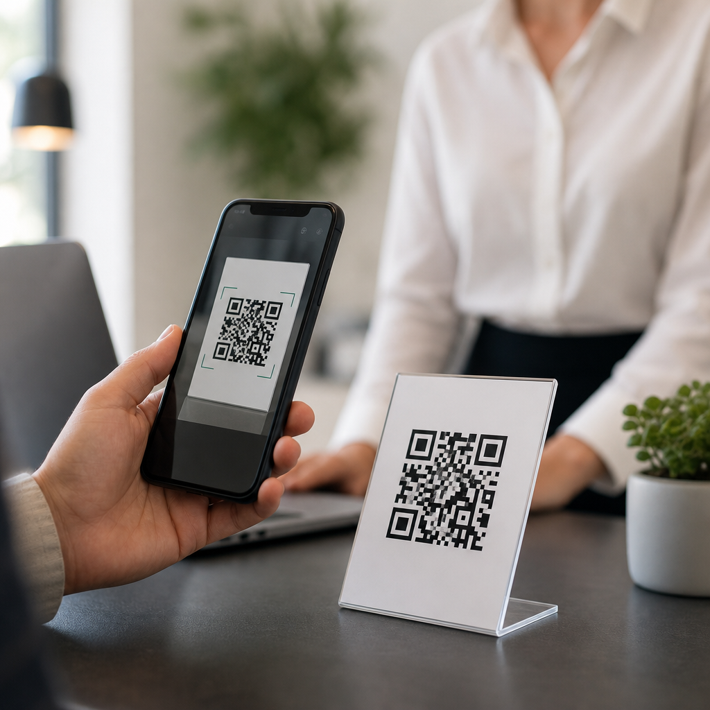
A useful definition helps. A static QR code contains a fixed destination that cannot be changed after printing. A dynamic QR code points to a short redirect URL that can be updated later, allowing edits, scan analytics, A/B testing, and campaign segmentation. In most business use cases, dynamic codes are the safer choice because printed assets often outlive offers, landing pages, and tracking parameters. The destination itself can be a landing page, menu, payment screen, app store listing, contact card, review form, support article, Wi-Fi access page, video, PDF, or map listing. The correct answer depends on what the person scanning needs next, not on what the business wants to promote broadly.
Match the link to the user’s next action
The best QR code destination answers one question immediately: what is the scanner trying to do right now? If someone scans a code on product packaging, they may want setup instructions, ingredients, authenticity verification, warranty registration, or reorder options. If they scan a code on a table tent in a restaurant, they expect a menu, ordering flow, or loyalty signup, not a company history page. If they scan a code on a direct mail postcard, they should land on the exact offer shown in print, with the same headline, same discount, and a mobile-friendly conversion path.
When I build QR campaigns, I map destinations to intent categories: buy, book, learn, verify, contact, review, pay, or troubleshoot. This keeps the decision practical. A real estate sign rider should link to the specific property page with photos, floor plan, price, and tour booking. A code on a conference booth should link to a lead capture page with one focused asset such as a case study or demo request, not a crowded navigation experience. A code on an invoice should link to payment options or billing support. A code on an employee poster might link to safety procedures or an HR form. The destination should remove one step, not add three.
Best QR code destinations for common business and marketing goals
Most successful business QR code campaigns fall into a small set of proven destination types. For lead generation, use a dedicated landing page with a tight headline, one form, social proof, and clear privacy language. For retail and ecommerce, use a product detail page or a curated collection page that mirrors the physical context. For restaurants, use a mobile menu with structured sections, allergen details, and ordering links. For local businesses, a location page with map directions, hours, click-to-call buttons, and booking options consistently outperforms a homepage because it solves the local intent directly.
For customer retention and support, link QR codes to help centers, setup guides, video walkthroughs, returns portals, and account management pages. For post-purchase journeys, packaging QR codes work especially well for onboarding and repeat purchase. I have seen consumer goods brands increase repeat orders by linking packaging inserts to refill subscriptions rather than generic promotional pages. For reputation management, a QR code can link to a review request landing page that lets users choose Google, Yelp, TripAdvisor, or a first-party feedback form. For events, use session schedules, speaker bios, downloadable slides, or networking signup pages. In every case, the destination should be mobile first, fast loading, and stripped of unnecessary navigation.
| Business scenario | Best QR code destination | Why it works |
|---|---|---|
| Restaurant table | Mobile menu or order page | Matches immediate dining intent and reduces wait time |
| Product packaging | Setup guide, warranty, or reorder page | Supports use after purchase and lowers support tickets |
| Direct mail offer | Campaign-specific landing page | Keeps message continuity and improves conversion rate |
| Trade show booth | Demo booking or lead capture page | Turns booth traffic into attributable pipeline |
| Storefront window | Hours, directions, call, and booking page | Helps after-hours visitors take the next step |
| Invoice or bill insert | Payment portal or billing support page | Reduces friction for collections and service issues |
What a QR code should not link to
A QR code should not link to anything that creates friction, confusion, or trust concerns. The most common weak destination is the homepage because it forces users to search again after already taking action by scanning. Another poor choice is a desktop-only page with tiny buttons, long load times, or intrusive pop-ups. PDF files are also frequently mishandled. A QR code can link to a PDF when a printable manual or form is necessary, but for menus, brochures, or onboarding content, a responsive web page is usually better because it loads faster, tracks behavior more cleanly, and adapts to screens.
Avoid linking directly to content behind a login unless the audience already expects authentication, such as employees using an internal operations code. Avoid destination URLs that look suspicious, use random strings, or trigger browser warnings. Branded domains and secure HTTPS links improve confidence. Also avoid linking to pages with multiple competing calls to action. If the sign says “Scan to book a demo,” the page should center on demo booking. Do not send users to an app download page unless the app is essential for the task and there is a fallback web experience. Requiring an app for a simple information request is one of the fastest ways to kill scan completion.
How to choose the right destination strategically
Choosing the right QR code link is easier when you evaluate five factors: context, intent, friction, measurability, and longevity. Context means where the code appears and how much time the user has. A code on transit advertising needs a fast, simple destination because the user may be moving. Intent is the specific task the user expects to complete. Friction covers page speed, form length, tap targets, and whether the scanner must pinch, zoom, or hunt. Measurability means using tagged URLs, dynamic redirects, and analytics tools such as Google Analytics 4, Adobe Analytics, HubSpot, or Bitly to attribute scans and conversions. Longevity asks whether the printed asset will remain in circulation long enough that the destination may need to change later.
In practical terms, I recommend dynamic QR codes for most marketing uses, plus campaign naming conventions that identify source, placement, audience, and date. For example, a postcard campaign might route through a dynamic link labeled spring-mailer-dallas-offer-a. That naming discipline matters when businesses run dozens of codes across packaging, displays, and local promotions. Use UTM parameters where appropriate, but keep the visible redirect branded and clean. Finally, test on both iPhone and Android, on strong and weak connections, and in bright and dim lighting. The destination decision is not complete until the real scan experience works under ordinary conditions.
Hub priorities: business and marketing FAQ use cases
As a hub for business and marketing FAQs, this topic connects to the most common QR code decisions organizations face. Small businesses often ask whether a QR code should link to Google reviews, a booking page, or a digital business card. The answer depends on the touchpoint. At checkout, a review request is reasonable because the customer has completed the service. On a flyer, booking is usually stronger because it drives measurable demand. B2B marketers ask whether booth signage should link to a brochure or a meeting scheduler. In most cases, a short qualification page that offers both a primary scheduler and a secondary downloadable asset captures more value than a static PDF alone.
Other frequent questions include whether one QR code can serve multiple purposes, whether printed codes expire, and whether QR codes help offline attribution. A single code can serve multiple purposes only if the landing page presents a clear hierarchy and the physical context supports that choice. Printed static codes do not expire unless the destination changes or breaks; dynamic codes remain usable as long as the redirect service stays active. For offline attribution, QR codes are one of the cleanest tools available because each placement can use a unique dynamic link. Businesses should create supporting articles for reviews, payments, menus, event marketing, product packaging, real estate, nonprofits, and support documentation so readers can go deeper by scenario.
The clearest answer to “What should a QR code link to?” is this: link it to the exact mobile-friendly action the user expects at that moment. For business and marketing teams, that usually means a dedicated landing page, product page, menu, booking flow, payment portal, review request, support article, or map-based location page. Dynamic QR codes are usually the best operational choice because they allow editing, tracking, and testing after print. Branded, secure, fast-loading destinations build trust and improve completion rates. Generic homepages, awkward PDFs, app-only dead ends, and cluttered navigation reduce performance.
When businesses treat QR codes as part of the full customer journey rather than as isolated graphics, results improve quickly. Match the destination to intent, minimize friction, measure every scan, and plan for long-term flexibility. That approach turns a QR code from a novelty into a reliable conversion and support channel across marketing, sales, operations, and customer service. If you are building or fixing a campaign, start by auditing every live code in your business and asking one simple question: does this link help the scanner do the next obvious thing? If not, update the destination first.
Frequently Asked Questions
What should a QR code link to instead of a generic homepage?
A QR code should link to the single most relevant destination for the person scanning it at that exact moment. In most cases, that is not your homepage. A homepage forces the user to figure out where to go next, which adds friction and often causes them to leave. The better approach is to send them directly to the action they already expect to take. If the code is on a restaurant table, it should open the menu. If it is on product packaging, it should open setup instructions, registration, or reorder options. If it is on a trade show sign, it should open a landing page tailored to that event with a clear form, offer, or demo request. If it appears on an invoice, it should take the customer straight to payment or account support.
The strongest QR code destinations are intent-matched, mobile-friendly, and immediately useful. When someone scans a code, they are usually trying to accomplish one thing quickly. Your link should remove decision-making, not introduce it. That means using a dedicated landing page, a specific product page, a downloadable file, a booking page, a contact card, a review page, or another destination that aligns exactly with the context of the scan. The more precise the match between the code’s placement and the landing experience, the higher the likelihood of conversion, engagement, and user satisfaction.
How do I decide the best QR code destination for a specific campaign or location?
The best way to choose a QR code destination is to start with user intent, not internal business preferences. Ask a simple question: what is the scanner most likely trying to do here? The answer will usually be obvious when you look at the environment. On packaging, the user may want instructions, warranty registration, ingredients, authenticity verification, or reorder information. On a poster, they may want event details or tickets. On direct mail, they may want to claim an offer or learn more about a specific service mentioned in the piece. On a storefront, they may want store hours, directions, booking, or a current promotion. The code should connect directly to that goal.
It also helps to consider device context and customer journey stage. QR scans happen on mobile devices, often while people are standing, walking, waiting, shopping, or multitasking. That means the destination must load quickly, display well on a phone, and present a clear next step without clutter. A person at the awareness stage may respond best to a short, compelling landing page with key benefits and one call to action. A person closer to purchase may need a product detail page, a payment link, or a scheduling form. By aligning the link with immediate intent, mobile conditions, and funnel stage, you create a smoother experience that feels natural instead of confusing.
Why do so many QR code campaigns fail when they link to the homepage?
They fail because a homepage is rarely designed for the specific moment that prompted the scan. A homepage serves many audiences at once, which makes it broad by design. A QR code scan, however, is a highly specific action. The user scanned because something in the physical world created a particular expectation. When they land on a generic homepage, they have to search, navigate, and interpret what to do next. That mismatch creates friction at exactly the point where convenience should be highest. Even interested users may abandon the process simply because the path is unclear or takes too long.
There is also a trust and continuity issue. The scan creates an implicit promise: “Scan this to do or learn this specific thing.” If the destination does not fulfill that promise immediately, the experience feels broken. That is especially damaging in places like menus, signs, mailers, booths, and packaging, where the physical context clearly suggests a next step. Sending users to a homepage often reflects an organizational mindset focused on general traffic rather than task completion. Strong QR strategy focuses on relevance, not volume. A lower-traffic destination that perfectly matches intent will usually outperform a broad homepage because it shortens the path from scan to action.
What makes a good QR code landing page for mobile users?
A good QR code landing page is fast, focused, and built for immediate action on a smartphone. It should load quickly on mobile data, use readable text, avoid unnecessary pop-ups, and make the primary call to action obvious without excessive scrolling. The page should reflect the context that led to the scan so users instantly know they are in the right place. Strong examples include a menu page with categories and prices, a product support page with setup steps and video tutorials, an appointment page with time slots, or a promotional landing page with one clear offer and a simple form.
Clarity matters more than creativity here. Every extra option competes with the user’s original purpose. Keep navigation minimal when possible, use concise headlines, and place the most important action near the top. If forms are required, ask only for essential information. If the page supports a purchase, booking, download, or payment, reduce the number of steps as much as possible. It is also smart to include tracking, so you can measure scans, conversions, and drop-off points by placement or campaign. The best QR landing pages do not try to be everything; they are purpose-built to help a mobile user complete one relevant task easily and confidently.
Should one QR code ever link to multiple destinations?
In general, a QR code should feel like it has one job. That does not always mean the underlying system cannot adapt, but the user experience should still lead to the most relevant next step. In some situations, smart routing makes sense. For example, a dynamic QR code might detect device type, language, location, or campaign source and send users to a version of the page that best fits their context. A packaging QR code could route customers to localized support content. An app-focused code could send iPhone users to the App Store and Android users to Google Play. These are good uses of flexibility because they still support a single user intent.
What usually does not work is making one code serve multiple unrelated purposes, such as trying to combine shopping, customer service, social media, company information, and newsletter signup in the same scan experience. That forces users to choose from too many paths and weakens the purpose of the code. If you truly have different goals in the same physical space, it is often better to use separate QR codes with clear labels so each one maps to a distinct action. The rule of thumb is simple: one code, one expected outcome. Even when the backend adapts dynamically, the scanner should feel like the destination was designed specifically for what they wanted to do.