Testing QR code size and placement strategies is one of the fastest ways to improve scan rates, reduce wasted print space, and turn static materials into measurable response channels. In practice, most QR code failures are not caused by the code itself but by poor decisions about dimensions, contrast, viewing distance, location, and surrounding design. A/B testing QR codes means comparing controlled variations, such as a larger code on the front of a mailer versus a smaller code near the offer details, to see which version produces more scans, conversions, or qualified leads. This matters because QR codes now appear across packaging, direct mail, retail signage, menus, event assets, and out-of-home advertising, where every centimeter competes with branding and compliance copy. I have run these tests across flyers, product labels, countertop displays, and transit posters, and the pattern is consistent: when teams test size and placement deliberately, performance usually improves without changing the offer. A strong testing program helps marketers answer practical questions quickly. How large should the code be for a store shelf? Should it sit above the fold on a brochure? Does adding a directional cue increase engagement? This hub article explains the principles, methods, metrics, and common mistakes behind effective A/B testing QR codes.
What to test first when optimizing QR code size and placement
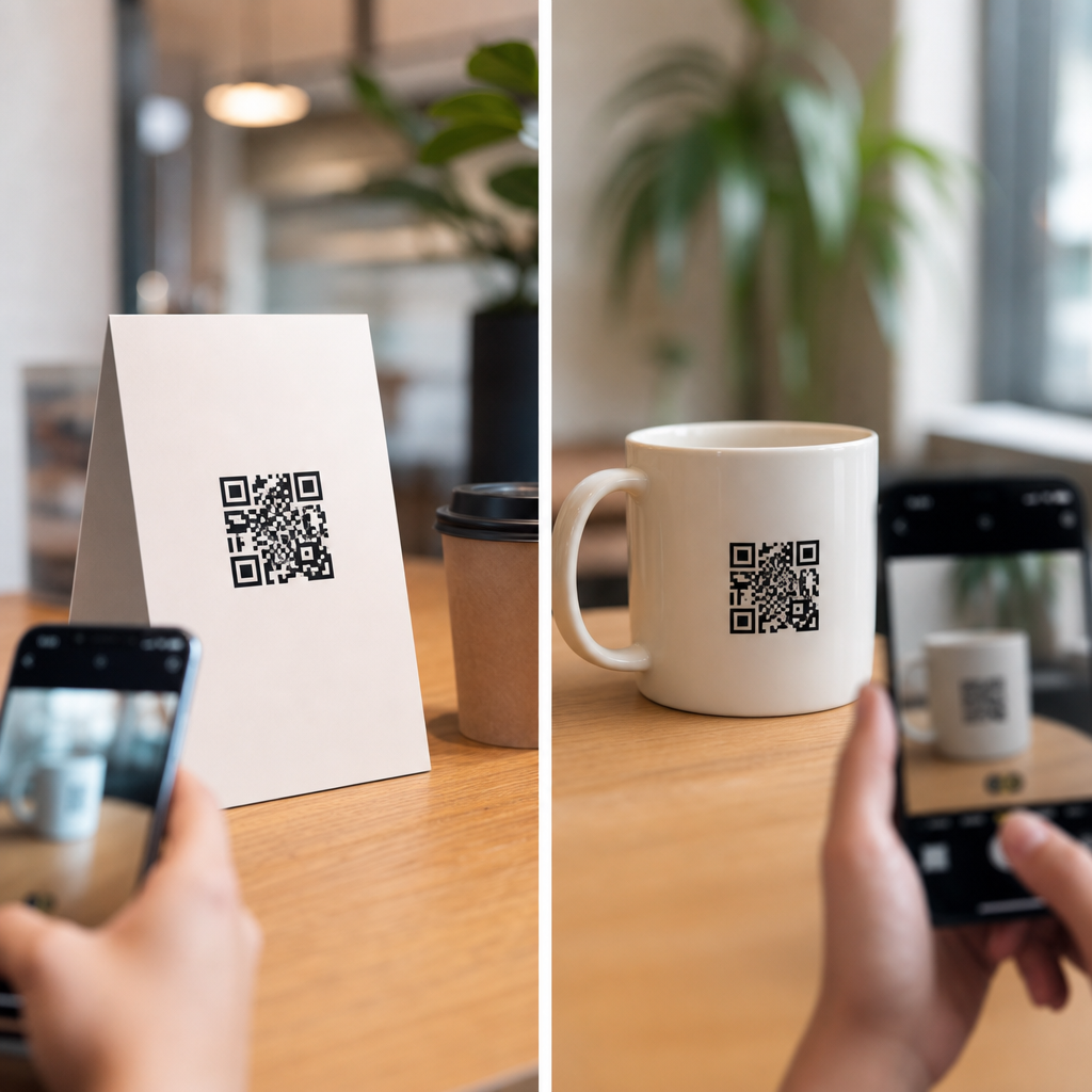
The first priority is scanability, because a visually elegant code that fails under real conditions has zero value. Start with minimum physical size, contrast, quiet zone, and destination behavior. A widely used field guideline is the 10-to-1 distance rule: for every 10 units of viewing distance, use at least 1 unit of code size. A code intended to be scanned from 20 inches away should be about 2 inches wide, while a poster viewed from 10 feet away needs a much larger mark. In packaging and print, I treat that rule as a baseline, then verify with device testing across older Android phones and current iPhones. Placement comes next. Codes positioned near the primary message or call to action usually outperform codes buried in footer areas, near folds, or beside cluttered legal text. On shelf talkers, eye-level placement tends to beat lower-corner placement because shoppers notice it sooner. On direct mail, placing the code near the headline and benefit statement often lifts scans because the user understands the reason to scan before encountering the code.
Marketers should also test context cues. A QR code with no instruction often underperforms one paired with concise language such as “Scan for demo,” “See menu,” or “Claim 15% off.” The code does not communicate value by itself; the surrounding copy does. Another high-impact variable is whether the landing page matches the physical context. A restaurant table tent should open to a mobile menu immediately, not a desktop homepage. A product package should deep-link to setup instructions, warranty registration, or product verification. When these basics are wrong, size and placement tests become noisy because the true bottleneck is post-scan friction. That is why I separate scan-rate tests from conversion-rate tests and document every variable before launch.
How to structure A/B testing QR codes so results are reliable
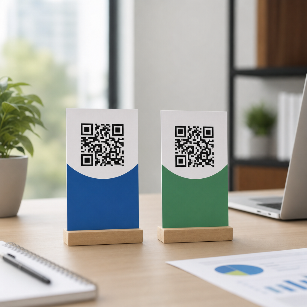
Reliable A/B testing QR codes depends on controlling one variable at a time whenever possible. If version A uses a 1-inch code in the bottom right and version B uses a 1.5-inch code near the headline, the result blends two factors and makes interpretation harder. In clean tests, change size only, then placement only, then support elements such as CTA copy, arrows, color treatment, or surrounding white space. Use dynamic QR codes so each variation resolves through a unique tracked URL. That allows precise measurement in analytics tools, campaign dashboards, and CRM systems without changing the visible destination. I typically map each asset version to UTM-tagged links in Google Analytics 4, then reconcile scans with downstream events such as form completions, purchases, or booked appointments.
Sampling matters. A poster in one store and a poster in another are not equivalent if traffic patterns differ. For in-store testing, rotate versions across matched locations or alternate weekly placements to reduce location bias. For direct mail, randomize recipients across segments with similar demographics and geography. For event materials, split inventory evenly across entrances or days. Statistical confidence should guide decisions, but do not stop at a raw scan delta. A larger code may produce more scans simply because it is easier to notice, while a strategically placed code near product specs may produce fewer scans but more qualified conversions. The right winner depends on the campaign goal. Awareness campaigns can optimize for scan rate, while lead generation should prioritize completed actions per impression. Document hypotheses before the test starts. For example: “Moving the code from the bottom panel to the benefit section will increase scans by reducing search effort.” Good hypotheses force discipline and speed up learning across future campaigns.
Best-performing size and placement scenarios across common formats
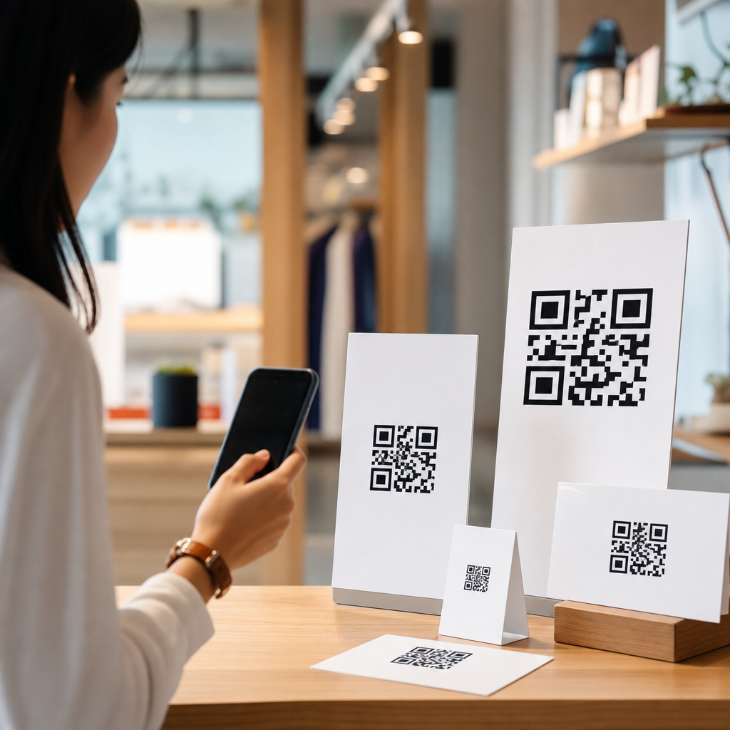
Performance varies by medium, but some patterns repeat often enough to treat them as starting assumptions. On product packaging, side-panel QR codes work when the user is already holding the item and seeking instructions, ingredients, authenticity details, or loyalty rewards. Front-panel codes can work for premium products, but only when they do not conflict with mandatory labeling or visual hierarchy. On brochures and postcards, placing the code above the fold or adjacent to the offer block usually beats backside-only placement. On restaurant menus, a medium-size code in the upper third with a clear task cue performs better than a tiny footer code because guests scan quickly and under social distraction. For trade show signage, distance changes everything: attendees often need to scan while walking, so the code must be physically larger, placed at natural stopping points, and paired with a short benefit-driven prompt.
Out-of-home campaigns require the strictest realism. A QR code on a transit shelter may look large on a designer’s monitor but fail once glare, weather, and motion enter the picture. In those cases, test not only size and placement but also angle, lighting, and whether the code appears on a cluttered creative. I have seen a modest increase in white space outperform a bigger code because separation improved recognition. Retail window signage also benefits from testing time-of-day conditions; reflective surfaces can lower scanability even with adequate dimensions. The table below summarizes strong baseline ranges that teams can test before refining for their audience.
| Format | Starting Size Range | Best Initial Placement Test | Main Risk |
|---|---|---|---|
| Product packaging | 0.8 to 1.25 inches | Front panel vs side panel near instructions | Competing label elements |
| Direct mail postcard | 1.0 to 1.5 inches | Offer block vs lower corner | Fold and visual clutter |
| Table tent or menu | 1.25 to 1.75 inches | Upper third vs footer | Low attention span |
| Retail poster | 2 to 4 inches | Eye level vs bottom panel | Viewing distance variation |
| Transit or outdoor sign | 4 inches and up | Center-right action zone vs corner | Motion, glare, limited dwell time |
Metrics, tools, and diagnostics that reveal why one version wins
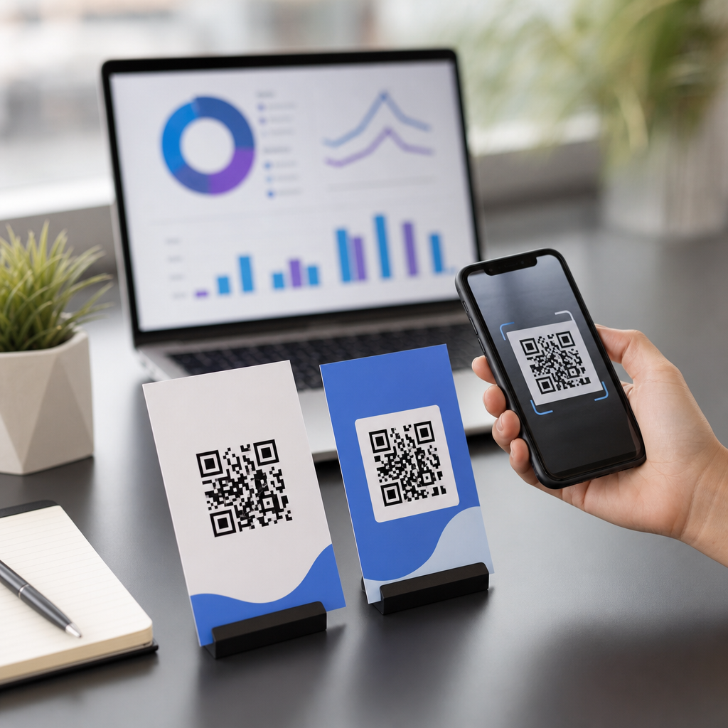
The core metrics for A/B testing QR codes are impressions, scans, unique scanners, scan-through rate, landing page engagement, and completed conversions. If the campaign supports commerce, add revenue per scan and conversion value by version. Dynamic QR platforms such as Bitly, QR Code Generator PRO, Uniqode, and Flowcode can report scans by time, device, and geography, while Google Analytics 4 or Adobe Analytics can measure post-scan behavior. For lead flows, connect campaigns to HubSpot, Salesforce, or another CRM so you can see whether one placement attracts better opportunities rather than more low-intent visitors. When a test underperforms, inspect failure points in sequence: was the code seen, scanned, loaded, and acted on? Each stage can break for a different reason.
Diagnostic testing should include multiple phones, camera apps, and network conditions. A code that scans instantly in a design review room may lag in a concrete venue with weak mobile service. Print production checks are equally important. Dot gain, lamination, low contrast inks, and trimming errors can shrink the quiet zone and reduce readability. I always run preflight checks using printed proofs rather than PDFs alone, because production variance changes outcomes. Heat mapping and observational studies add useful context in retail and events. If people glance at the code but do not scan, the issue may be unclear value. If they attempt to scan and fail, size or contrast is likely at fault. If they scan but bounce, the landing page is the culprit. These distinctions prevent teams from drawing the wrong lesson from a test.
Common mistakes, edge cases, and how this hub connects your testing program
The most common mistake is treating QR testing as a design tweak instead of a full funnel experiment. Teams often debate whether the code should be larger without asking whether the destination, incentive, and environment support scanning at all. Another error is over-customizing the code with logos, brand colors, or stylized shapes that reduce error tolerance. Branded codes can work, but they should be validated against ISO/IEC 18004 principles and tested on real devices before scale. A third mistake is ignoring accessibility and usability. Low-vision users need strong contrast and uncluttered layouts, while multilingual audiences benefit from clear labels that explain what happens after the scan. Privacy expectations also matter. If the code opens an app, requests location, or pushes users into a long form, drop-off will rise unless the value exchange is obvious.
As a hub page under advanced QR code strategies, this article should anchor related work on QR code CTA copy, dynamic versus static QR codes, packaging QR compliance, landing page optimization, offline attribution, and QR analytics implementation. The practical advantage of a hub is consistency: every downstream article can inherit the same testing framework, naming conventions, success metrics, and production checklist. The key takeaway is simple. Test size and placement with discipline, isolate variables, measure beyond scans, and validate in the real environment where people actually use their phones. When you do that, QR codes stop being decorative boxes and become dependable conversion points. Review your current assets, identify one high-traffic touchpoint, and launch a controlled QR code test this week.
Frequently Asked Questions
What is the best QR code size to test first on printed marketing materials?
A strong starting point is to test a QR code that is large enough to be scanned quickly at the expected viewing distance without overpowering the layout. In many print applications, a practical baseline is around 1 x 1 inch for close-range materials such as product inserts, brochures, business cards, and direct mail pieces that are handled in the hand. For larger formats like posters, signage, window displays, or packaging viewed from farther away, the code usually needs to scale up significantly. The goal is not simply to make the code bigger, but to match its dimensions to the context in which people will encounter it.
One of the most useful rules in testing is to connect size to scanning distance. If a user is standing several feet away, a small code may technically work under ideal conditions, but real-world conditions are rarely ideal. Lighting varies, hands shake, camera focus changes, and users are often in motion or distracted. That is why testing should begin with a conservative size that prioritizes fast recognition by a mobile camera. If scan speed is slow or inconsistent, increasing size is often the simplest and highest-impact adjustment.
It is also important to account for the code’s data density. A QR code that contains a short URL is often easier to scan at smaller sizes than one packed with more complex encoded data. In most campaigns, using a short dynamic URL creates more flexibility because it allows the code to remain cleaner while still enabling tracking and destination updates. When testing size, keep the encoded content consistent so the comparison isolates the effect of dimensions rather than changes in code complexity.
For A/B testing, compare at least two clear size variations in otherwise identical layouts. For example, test a smaller code against a moderately larger one while keeping placement, contrast, call to action, and offer the same. Measure not just total scans, but scan rate relative to impressions or distribution volume. That gives a more accurate view of whether increased size improves performance enough to justify the additional print space it requires.
Where should a QR code be placed for the highest scan rate?
The best placement is usually wherever the code is easiest to notice, interpret, and scan without friction. In practical terms, that often means placing it in a visually prominent area near the main offer, headline, or call to action rather than burying it in a corner or at the very bottom of the layout. People need a clear reason to scan, so the QR code should feel connected to the benefit being promoted. If users have to search for the code or guess what happens after scanning, scan rates tend to drop.
Placement should also reflect the natural reading and viewing path of the piece. On a mailer, for example, a code near the primary message on the front may outperform one on the back because it is seen earlier and demands less effort to find. On packaging, a code placed on a flat, unobstructed panel often works better than one wrapped around a curved edge or positioned near seams, folds, or reflective surfaces. On posters and signs, eye-level placement generally performs better than locations that require users to crouch, stretch, or stand at awkward angles.
Another major factor is physical scanability. A QR code can be visually noticeable but still perform poorly if it is too close to edges, creases, glossy highlights, product contours, or other design elements that interfere with camera recognition. Give the code sufficient quiet space around it and avoid placing it where shadows, glare, or handling damage are likely. A code near a fold line on a brochure, for instance, may degrade much more in use than it appears in a flat digital proof.
The most reliable way to determine placement is to test specific positions under realistic conditions. Compare front versus back, upper versus lower section, near-offer versus near-contact-info, or central placement versus margin placement. Then evaluate scans by version, audience segment, and distribution channel. Often, the highest-performing position is the one that combines visibility, relevance, and physical ease of scanning rather than the one that simply draws the most visual attention.
Why do QR codes fail to scan even when the design looks correct?
Most scanning failures come from execution details that seem minor during design but create major problems in the real world. Size is one of the biggest issues. A code may appear crisp on screen or in a proof, yet become difficult to scan once printed, trimmed, folded, or viewed from a distance. Contrast is another common problem. QR codes work best when there is strong contrast between the dark modules and the light background. Reversed, low-contrast, patterned, or heavily stylized designs often reduce recognition, especially in inconsistent lighting.
Placement can also create failure points. Codes positioned too close to other graphic elements, text blocks, borders, or edges may lose the quiet zone needed for reliable scanning. Likewise, if a code is printed on reflective materials, textured packaging, curved surfaces, or areas prone to wrinkles, glare and distortion can interfere with mobile camera detection. Even when the QR code file itself is valid, the printed environment around it can make it functionally unusable.
Another issue is user context. People may be trying to scan while walking, standing outdoors, holding a bag, or using an older phone camera. A code that scans eventually in a controlled office setting may still underperform in a live campaign because it requires too much precision or patience. That is why testing should include different devices, distances, lighting conditions, and user scenarios. A fast scan in ideal conditions is not enough; what matters is consistent scanability under normal behavior.
Destination experience matters too. Sometimes what appears to be a scanning problem is actually a post-scan problem. If the code opens a slow page, a poor mobile landing experience, or a destination that does not clearly match the printed message, users may abandon before the action is counted as meaningful engagement. Effective testing therefore looks at the full chain: successful scan, page load speed, message match, and conversion behavior. A QR code is only successful when the user can scan it easily and then complete the intended next step.
How should you A/B test QR code size and placement without confusing the results?
The key to a useful A/B test is controlling variables so you can confidently attribute performance differences to size or placement rather than unrelated changes. Start by selecting one variable to test at a time whenever possible. If you want to test size, keep placement, call to action, surrounding design, offer, destination, and audience consistent. If you want to test placement, keep the QR code size and all other creative elements the same. The more factors that change at once, the less reliable the insight becomes.
Use separate tracking for each variation so scans can be measured accurately. Dynamic QR codes are especially helpful because they allow each version to point to a trackable URL while preserving flexibility if the landing page needs to be updated later. In addition to raw scan counts, review scan rate, conversion rate, and any downstream actions such as purchases, sign-ups, bookings, or coupon redemptions. A version that generates more scans but weaker conversions may not actually be the better performer.
Sample quality matters as much as sample size. Make sure each variation is distributed in a comparable environment. For example, if one mailer version goes to a warmer audience segment or one poster placement appears in a busier retail location, the test may reflect audience differences rather than creative differences. Whenever possible, randomize distribution or rotate versions evenly across locations, lists, or time periods. This helps isolate the true effect of size or placement.
It is also smart to define success criteria before the test starts. Decide whether the main objective is scan volume, scan rate, cost efficiency, lead quality, or final conversion. That prevents teams from chasing whichever metric looks best after the fact. Once the test ends, apply the winning insights systematically. If a larger code on the front of a mailer outperforms a smaller one near the offer details, use that learning as a baseline and continue refining from there. Strong QR optimization is usually iterative, with each test reducing uncertainty and improving future creative decisions.
What design best practices help QR codes scan better while still fitting the overall layout?
The most effective QR code designs balance function and aesthetics, with scan reliability always taking priority. Start with high contrast, ideally a dark code on a light, solid background. Avoid busy textures, gradients, low-contrast color combinations, or decorative effects that make the module pattern harder for cameras to interpret. Even if a stylized code looks more brand-friendly in concept, it should only be used after real-world scan testing confirms that performance remains strong across devices and lighting conditions.
Preserving the quiet zone around the code is essential. This empty margin helps scanners distinguish the QR code from surrounding content. Designers often weaken performance by placing text, icons, borders, or visual flourishes too close to the code. The QR code should have enough breathing room to stand apart from other elements, especially in dense layouts. This does not mean it has to look isolated or awkward, but it does need clear separation to function reliably.
A clear call to action also improves results. Many QR codes underperform not because users miss them, but because they do not understand why they should scan. Simple adjacent copy such as “Scan to view the offer,” “Scan for pricing,” or “Scan to book now