Testing QR code design variations is the fastest way to improve scan rate, landing-page visits, and campaign return without guessing what visual style people will actually use. In practice, “A/B testing QR codes” means showing two or more versions of a code that lead to the same destination, then measuring which version produces better behavior under comparable conditions. Design variation includes color, contrast, frame, call-to-action text, logo placement, size, quiet zone, surrounding copy, and the physical context where the code appears. I have run these tests across packaging, retail signage, direct mail, event badges, and restaurant tables, and the same lesson repeats: minor visual changes can produce meaningful performance differences when the code remains technically scannable. This matters because QR campaigns fail for two main reasons: people do not notice the code, or their camera cannot decode it quickly. A disciplined test isolates those two variables, protects readability, and ties results to measurable business outcomes such as scans, unique users, assisted conversions, or first-party data capture.
What A/B Testing QR Codes Actually Measures
A/B testing QR codes measures how a design change influences user action while holding the offer, destination, and audience as constant as possible. The primary metric is usually scan-through rate: the percentage of exposures that become successful scans. Secondary metrics often include unique scans, repeat scans, landing-page bounce rate, conversion rate, time to first interaction, and completion of a downstream action such as coupon redemption or form submission. In print environments, exposure is estimated from circulation, foot traffic, or placement counts. In digital out-of-home or in-store screens, exposure can be approximated through impression data and audience measurement systems.
The most important distinction is between technical success and marketing success. A highly stylized code may still decode in ideal light with a modern smartphone, yet underperform in a grocery aisle, on a moving bus shelter ad, or on glossy packaging where glare reduces contrast. Conversely, a plain black-and-white code may decode perfectly but attract fewer scans because it blends into the layout and lacks a reason to act. Good testing therefore evaluates both readability and motivation. You are not just asking, “Can this be scanned?” You are asking, “Will someone notice it, trust it, and complete the action quickly enough for this context?”
Build a Test Plan Before You Change the Design
The most reliable QR code tests start with a written hypothesis, a single primary metric, and a shortlist of variables. A useful hypothesis sounds like this: “Adding a branded frame and explicit call to action will increase scan-through rate on shelf wobblers by at least 15% because shoppers understand the benefit before opening their camera.” That statement identifies the audience, placement, design change, expected effect, and reason. It also prevents the common mistake of changing five things at once and learning nothing.
Keep the destination page, tracking parameters, offer, and placement timing stable. If you test a red code with a discount message against a blue code with a recipe message, the result tells you nothing cleanly about design. I usually separate tests into three layers. First, scanability variables: size, error correction level, contrast ratio, quiet zone, data density, and logo intrusion. Second, attention variables: surrounding whitespace, frame shape, icon treatment, and headline. Third, persuasion variables: incentive copy, trust cues, and what happens immediately after the scan. Dynamic QR platforms such as Bitly, QR Code Generator PRO, Scanova, Beaconstac, and Flowcode make this easier because each variant can point to the same canonical URL while preserving variant-level analytics.
Which Design Variables Matter Most
Not every visual tweak deserves a test. Start with variables most likely to influence either decoding speed or user confidence. Size is foundational. For print, a common rule is a minimum of about 2 x 2 centimeters for short-distance scanning, but practical minimums rise quickly as viewing distance increases. On posters and windows, I prefer testing larger sizes first because distance, reflections, and camera shake create friction. Quiet zone also matters. ISO/IEC 18004 defines the blank margin around the symbol, and violating it remains one of the most frequent causes of field failures I see during audits.
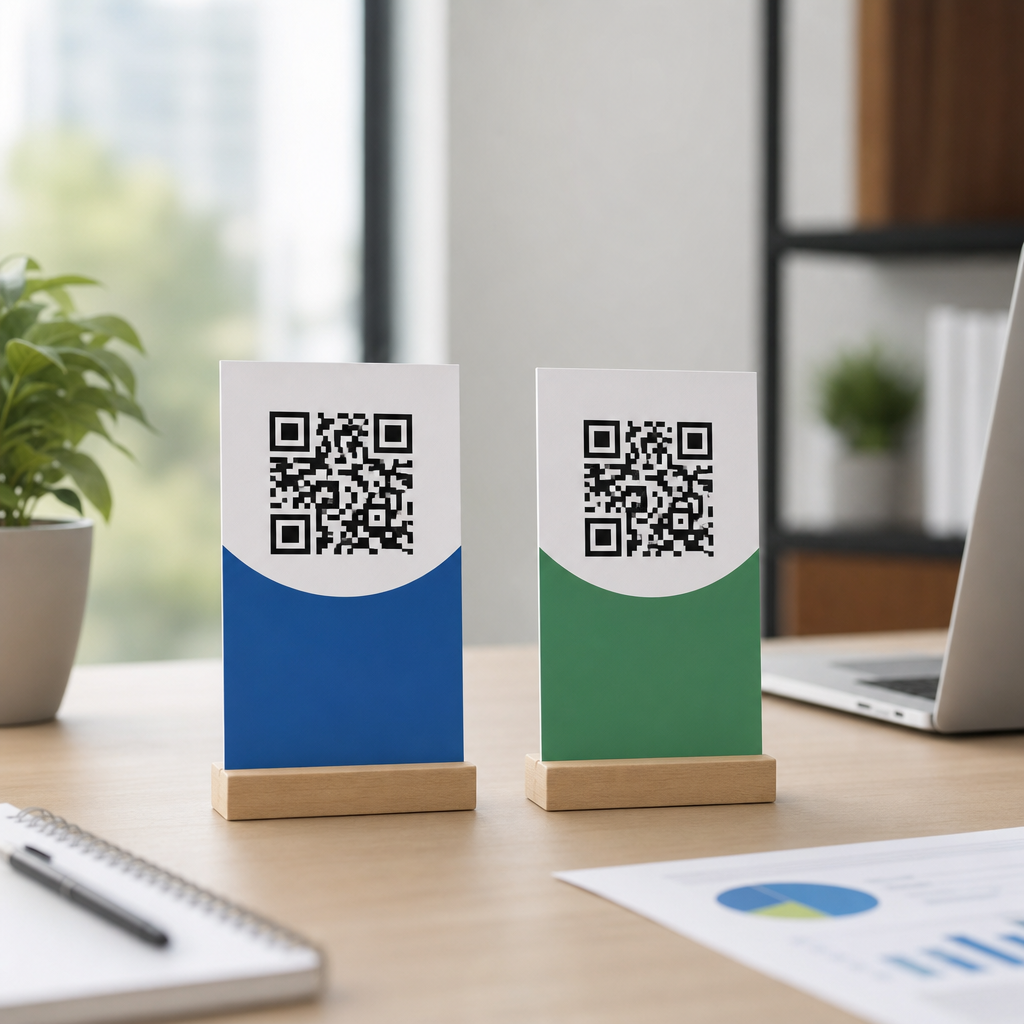
Contrast is the next major driver. Dark modules on a light background remain the safest option. Reversed codes, metallic inks, gradients, and low-contrast brand colors often look sophisticated in mockups and fail in stores. Logos can help attention and trust, but only if they do not cover too much of the symbol. Error correction allows some damage or obstruction, yet higher correction also increases module density, which can make a code harder to scan when printed small. Frames and calls to action, such as “Scan for setup guide” or “Scan to see ingredients,” regularly lift performance because they remove ambiguity. People scan more when the value is obvious.
How to Set Up a Fair QR Code Experiment
A fair experiment controls the environment as tightly as the channel allows. In direct mail, split the mailing list randomly so each household receives one variant only. In retail, rotate variants across comparable stores or shelves, then reverse placements midway to reduce location bias. At events, alternate badge or signage versions by registration cohort. On packaging, use matched production runs rather than introducing one design during a promotion week and another after demand has changed. Randomization matters because shopper mix, time of day, weather, and staff behavior can skew results more than design alone.
Use unique dynamic URLs or campaign identifiers for every variant. Append consistent UTM parameters so analytics tools can attribute sessions and conversions accurately. Pair QR platform data with web analytics in GA4, Adobe Analytics, or Matomo, and define what counts as success before launch. If your goal is qualified leads, scans alone are not enough. I have seen a design win on scan rate and lose on completed forms because the audience it attracted was merely curious. The best version is the one that improves the business metric you care about, not just the top-of-funnel number.
| Variable | Why Test It | Common Risk | Best Use Case |
|---|---|---|---|
| Size | Changes scan distance and speed | Too small for real-world viewing | Posters, packaging, menus |
| Color contrast | Affects camera decoding reliability | Brand colors reduce readability | Retail signage, direct mail |
| CTA frame | Explains value before scan | Overcrowds surrounding design | In-store displays, ads |
| Logo placement | Improves brand recognition | Covers critical modules | Packaging, event materials |
| Landing-page match | Protects post-scan conversion | Message mismatch raises bounce | All campaigns |
How to Validate Scanability Before Launch
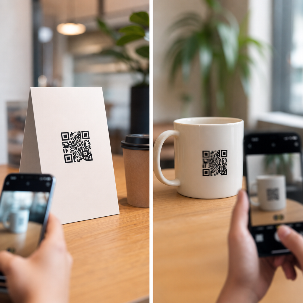
Every variant should pass a preflight process before it reaches a live audience. Start with technical validation across iPhone and Android devices, using both native camera apps and at least one third-party scanner. Test in bright light, low light, glare, and at realistic angles. Print prototypes at production size on the actual substrate whenever possible. A code that scans on matte office paper may fail on curved plastic, foil pouches, laminated menus, or textured corrugate. If the code will live outdoors, test after exposure to water, abrasion, and sun. If it will appear on screens, test at different brightness levels and refresh environments.
I also recommend measuring time to successful scan. If one version scans in half a second and another takes three seconds with the same phone, users will feel the difference even when both are technically valid. Keep encoded data short by using dynamic redirects instead of long static URLs. Generate assets at sufficient resolution for print, ideally vector formats such as SVG, EPS, or PDF. Finally, verify destination security. Users are more willing to scan when the landing page loads quickly over HTTPS, matches the promise near the code, and does not trigger interstitial clutter.
How to Read Results and Avoid False Winners
Interpret QR test results with statistical discipline and situational judgment. A result is meaningful only if the sample size is large enough and the traffic quality is comparable between variants. For low-volume placements, run tests longer rather than declaring a winner after a handful of scans. Watch for novelty effects too. A highly unusual design can spike early curiosity and then normalize as repeat viewers stop noticing it. Segment results by location, device type, time period, and conversion outcome. If a variant wins only on the newest phones, it may be risky for a broad audience.
Also separate causation from correlation. A higher scan rate might be caused by better placement, friendlier staff prompts, or a stronger headline near the code rather than the symbol itself. When results are close, favor the design with the wider operating margin: stronger contrast, more forgiving quiet zone, and cleaner production tolerances. Field reliability beats fragile creativity. After the first winner is identified, continue iterating. Strong QR programs rarely improve through one dramatic redesign; they improve through a sequence of controlled tests that compound gains over time across noticeability, scanability, and conversion.
Common QR Testing Mistakes and the Best Next Step
The most common mistake in A/B testing QR codes is treating the symbol as decoration instead of a functional interface. Teams approve a visually clever code, skip real-device testing, and then wonder why scans lag. Other frequent errors include changing the offer between variants, ignoring quiet zone requirements, printing below safe size, using static codes that cannot be updated, and measuring scans without measuring what happens after the scan. Another avoidable problem is failing to account for context. A code that works on a product insert may fail on a storefront window because the distance, reflections, and user intent are completely different.
The best next step is simple: choose one high-impact placement, define one business metric, and test one meaningful design change against a stable control. Start with the variables most likely to move results—size, contrast, frame, and call-to-action clarity—then validate every version in real conditions before launch. Document what you learn so future campaigns inherit proven design rules instead of repeating guesswork. As the hub for Advanced QR Code Strategies on this subtopic, this guide should anchor deeper work on packaging tests, retail signage, analytics setup, and post-scan optimization. Run a disciplined QR design experiment this month, and turn scan performance into a repeatable advantage.
Frequently Asked Questions
What does it actually mean to test QR code design variations?
Testing QR code design variations means comparing two or more versions of a QR code to see which one produces better real-world results under similar conditions. In most cases, the destination stays the same, but the visual presentation changes. That could include color, contrast, size, logo placement, frame shape, call-to-action text, quiet zone spacing, or the copy and design elements around the code. The goal is not to guess which version looks best to a marketing team, but to measure which version gets scanned more often and leads to stronger post-scan behavior such as landing-page visits, form submissions, purchases, or app downloads.
In practice, this is often called A/B testing when you compare two versions, or multivariate testing when several design elements are tested at once. For example, one version might use a black-and-white code with a simple “Scan Me” label, while another uses brand colors, a logo in the center, and a more action-oriented prompt like “Scan for 20% Off.” If both are shown to similar audiences in similar environments, performance differences can usually be attributed to the design choices rather than random chance.
The reason this matters is simple: QR code performance depends on both scannability and motivation. A design can be technically readable but visually unconvincing, or visually attractive but harder for phone cameras to detect. Testing helps you find the balance between brand alignment and reliable scanning. Instead of relying on opinions about what should work, you gather evidence about what people actually scan and what they do after scanning it.
Which QR code design elements should I test first for the biggest impact?
The best starting point is to test the elements most likely to affect scan rate and readability before moving into finer visual refinements. In most campaigns, the biggest-impact variables are contrast, size, call-to-action text, and the amount of clear space around the code. A QR code needs to be easy for a camera to detect quickly, so strong contrast between dark and light areas is critical. If you experiment with brand colors, make sure the code still maintains enough tonal difference from the background. A stylish design that blends into a package, poster, or sign often underperforms a simpler version with cleaner contrast.
Size is another foundational variable. If the code is too small relative to viewing distance, scans will drop even if the design is otherwise excellent. Testing a larger version against a smaller one can reveal whether visibility is limiting performance. Quiet zone, which is the blank margin around the QR code, also deserves careful attention. Removing or shrinking it to fit more tightly into a design layout can hurt recognition, especially in cluttered environments.
After those fundamentals, test persuasive elements that influence willingness to scan. A frame around the code, a short explanation of the benefit, and direct call-to-action text can significantly improve response. Compare generic prompts such as “Scan Here” with specific benefit-driven copy like “Scan to View the Menu,” “Scan for Pricing,” or “Scan to Claim Your Offer.” You can also test logo placement and branded styling, but do that carefully. Logos can increase trust and brand recognition, yet they may reduce scannability if they cover too much of the code or interfere with its structure.
As a general rule, start with one major variable at a time. If you change color, size, frame, and surrounding copy all at once, you may discover which version won, but not why it won. Isolating variables makes the results easier to interpret and more useful for future campaigns.
How do I run a fair A/B test for QR codes without skewing the results?
A fair QR code A/B test requires comparable conditions. The most important principle is to keep everything except the design variation as consistent as possible. Both versions should point to the same destination or equivalent landing experience, appear in similar placements, be shown to similar audiences, and run during the same time period whenever possible. If one code appears on premium packaging in a retail checkout area and the other appears on a flyer that people rarely notice, the test result will reflect placement differences more than design performance.
One strong method is to create separate trackable QR codes that each redirect to the same final URL. That lets you measure scans independently while holding the destination constant. You can then place each version in matched environments, such as alternating them evenly across direct mail pieces, store displays, event signage, product labels, or digital ads. If the test involves physical materials, random distribution is important. For example, if version A goes only to one geographic region and version B goes only to another, differences in audience behavior may distort the outcome.
You should also define success metrics before launching the test. Scan rate is usually the first metric, but it should not be the only one. A version that gets more scans but attracts low-intent traffic may be less valuable than one that produces fewer scans but more conversions. Depending on your campaign goal, you may want to track landing-page visits, time on page, form completions, purchases, coupon redemptions, or app installs.
Finally, collect enough data before drawing conclusions. Small sample sizes can make random fluctuations look meaningful. If possible, run the test until each version receives a sufficient number of impressions and scans to support a confident decision. In short, a clean QR code test is part design experiment and part measurement discipline. The more controlled the setup, the more trustworthy the insight.
How can I tell whether a QR code design is improving scan rate or hurting usability?
The clearest way to judge a design is to look at both scanning behavior and downstream engagement. Start with raw scan volume, but place it in context by comparing it with impressions or exposure. If one version was seen by more people, it may naturally produce more scans even if it is less effective. Scan rate, or scans relative to views, gives a better picture of whether the design itself is encouraging action. If you can estimate or measure how many people encountered each code, you will have a much stronger basis for comparison.
Usability issues often appear when a design looks appealing but performs poorly in practical conditions. Warning signs include a lower scan rate, repeated scan attempts, high abandonment before page load, or reduced performance in low light, at distance, or on curved surfaces such as bottles and packaging. A code may work perfectly in a design mockup yet struggle in the field if the contrast is weak, the logo is too large, the quiet zone is too small, or the background is visually busy. Real-world testing is essential because phone cameras, screen glare, printing quality, and user patience all affect outcomes.
It is also useful to test across multiple devices and environments before full rollout. Check scanning on both iPhone and Android devices, in bright and dim lighting, and from realistic viewing distances. If the code appears on printed materials, verify that ink, texture, finish, and placement do not reduce readability. If it appears digitally, make sure the code remains clear at different screen sizes and resolutions.
Ultimately, a winning design should do two things at once: scan easily and motivate action. A highly usable QR code is not just technically readable; it is also obvious, trustworthy, and relevant enough that people want to use it. That is why the best evaluation combines technical scan success with business metrics tied to campaign performance.
What are the most common mistakes to avoid when testing QR code design variations?
One of the biggest mistakes is changing too many variables at the same time. If one QR code version uses a different color, different size, different call-to-action, different placement, and different surrounding copy, it becomes very difficult to identify which factor drove the result. Another common mistake is focusing only on aesthetics. A beautifully branded code may satisfy visual guidelines but underperform if contrast is too low, the background is distracting, or the logo interferes with scan detection.
Poor test control is another major issue. If the versions are shown to different audiences, in different environments, or during different campaign periods, the comparison may not be fair. Seasonality, audience intent, and placement quality can all influence results. Marketers also sometimes forget to use separate tracking links or redirect structures for each QR code variation, which makes performance attribution incomplete or impossible.
A related mistake is using scan count as the only success metric. Scans matter, but they are just the top of the funnel. If version A wins on scans but version B generates more qualified traffic, better conversion rates, or stronger return on ad spend, the real winner may be different from what the scan numbers suggest. Testing should connect the QR code to the broader campaign objective.
Finally, many teams stop testing after one result and assume they have found a universal best design. In reality, QR code performance is context-dependent. What works on outdoor signage may not work on product packaging. What performs well in a retail aisle may not win in a restaurant, event booth, or direct mail format. The best approach is ongoing optimization: test a meaningful variable, learn from the result, apply that insight to the next version, and keep refining. That process is how QR code design moves from guesswork to dependable performance improvement.