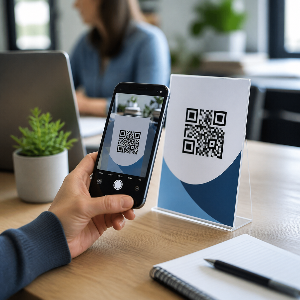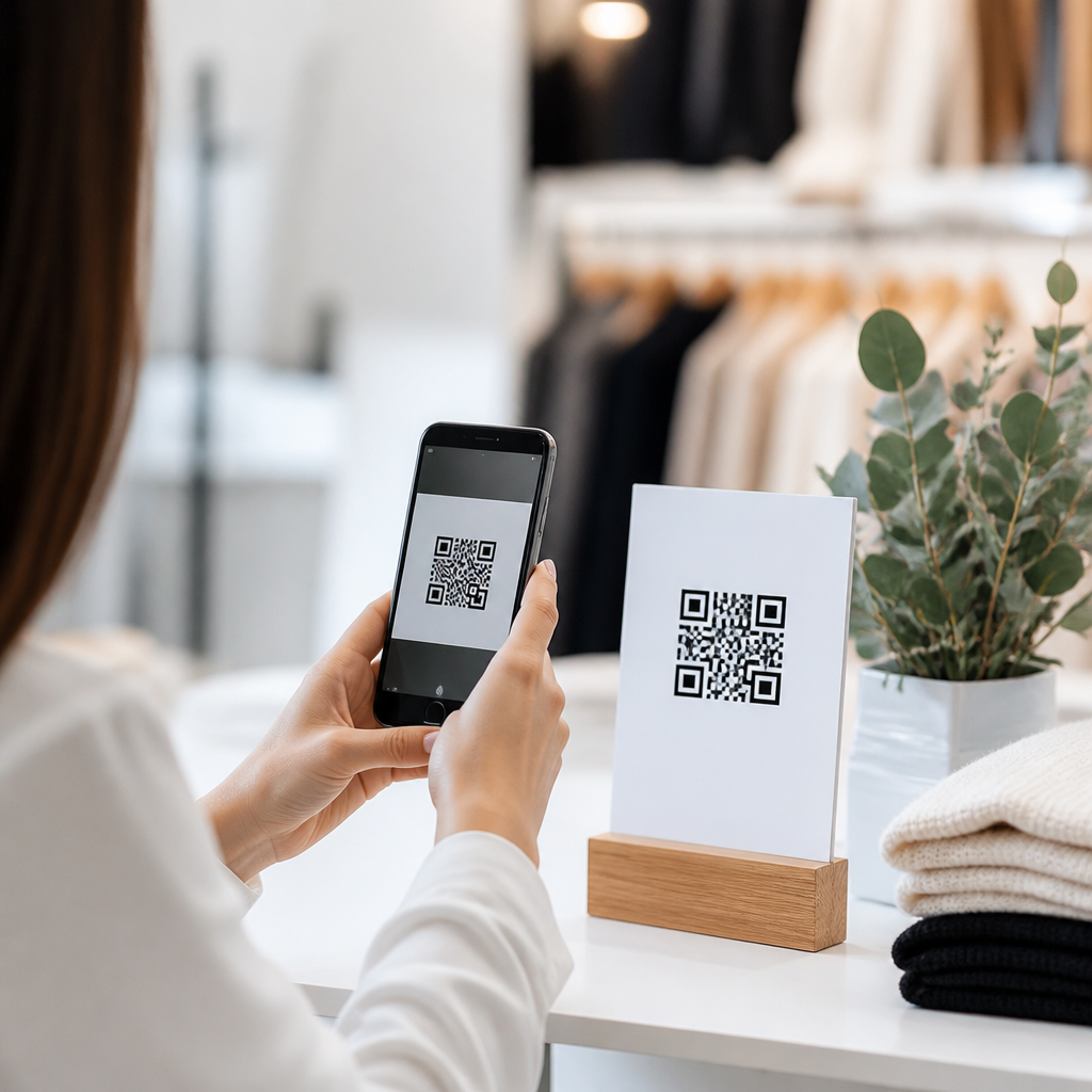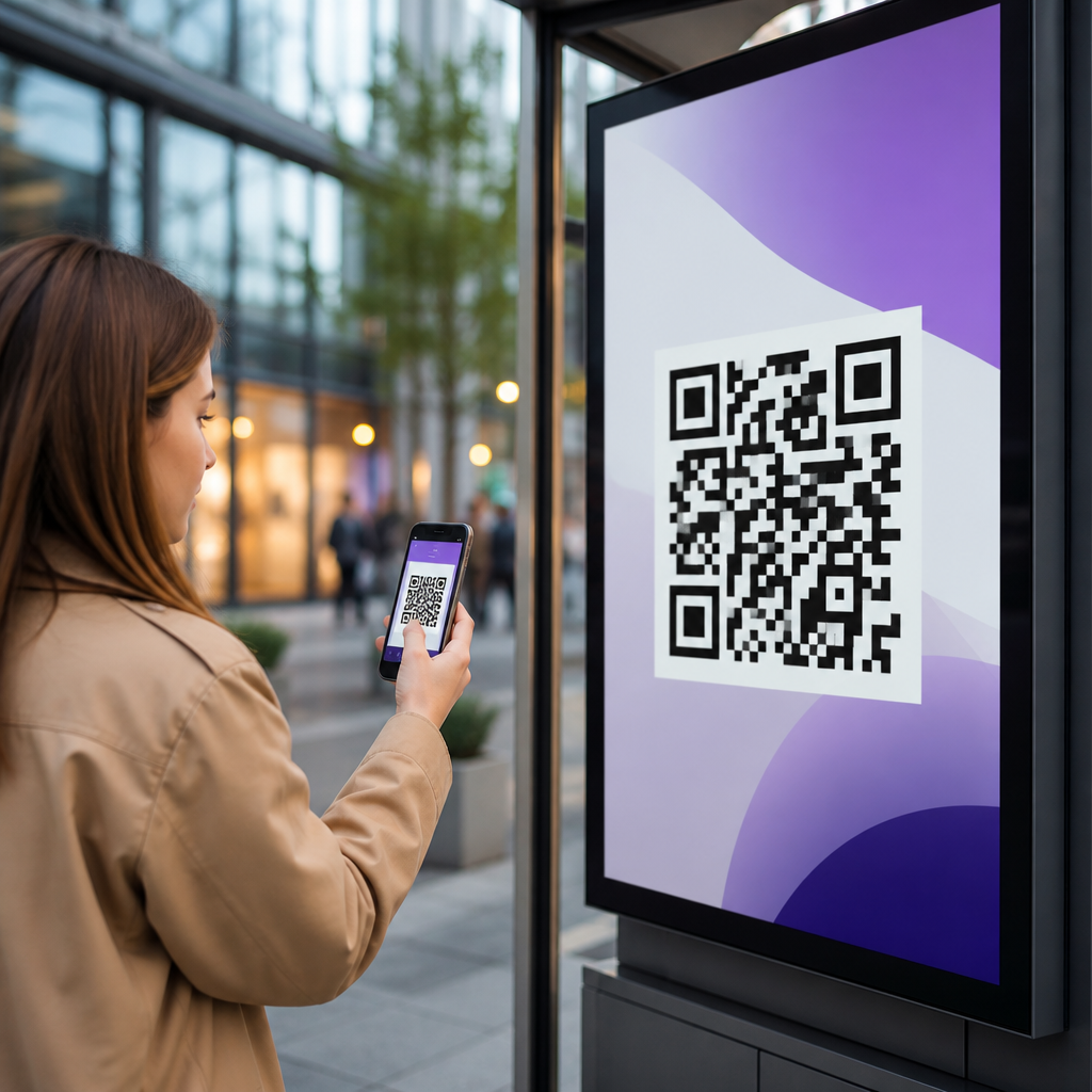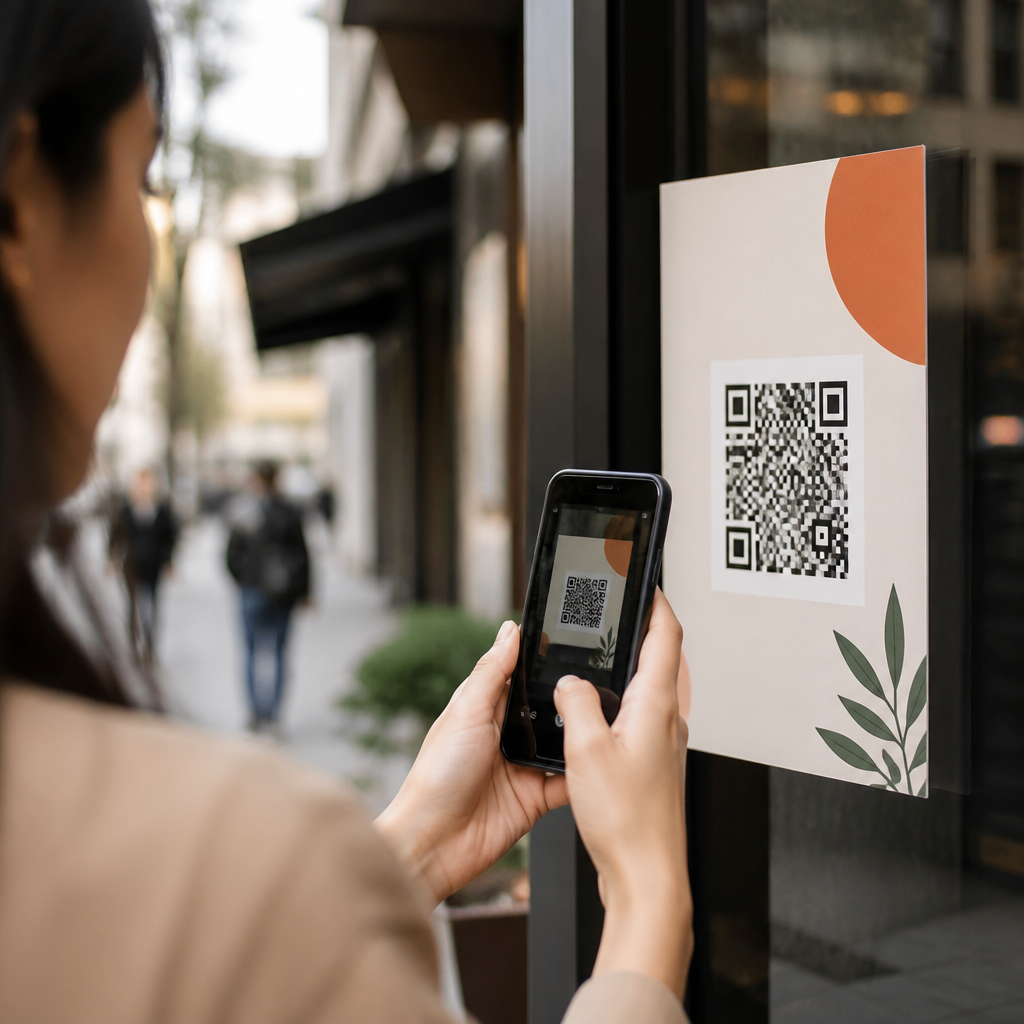
Email QR codes can lift response rates, bridge inbox and mobile behavior, and make email marketing measurably easier to act on, but only when they are implemented correctly. In practice, an email QR code is simply a scannable image placed inside an email that sends a subscriber to a landing page, app store listing, RSVP form, coupon, video, or contact card. I have used them in product launches, field-event campaigns, retail promotions, and post-purchase nurture flows, and the same pattern appears every time: teams focus on generating the code, then overlook the user experience around the scan. That is where performance is won or lost.
This matters because email is still one of the highest-return owned channels, while mobile is where most recipients now read and act. Many brands see more than half of opens on phones, yet they ask users to tap tiny links, copy promo codes, or remember details for later. A well-placed QR code reduces friction by moving a reader from email to an intended mobile action in seconds. A badly executed one creates confusion, tracking gaps, inaccessible creative, and broken journeys that waste attention. Avoiding common email QR code mistakes is therefore not a design detail; it is a conversion discipline.
For marketers building a broader mobile QR strategy, this topic sits at the center of several connected practices: mobile landing page optimization, campaign tagging, dynamic QR code management, subscriber segmentation, promotional compliance, and scan analytics. This hub page covers the essentials of QR codes in email marketing and highlights the errors that most often suppress results. If you are planning newsletter promotions, event invitations, loyalty campaigns, in-store to inbox journeys, or lifecycle automation, the principles here will help you choose the right destination, format the code properly, measure scans accurately, and create an experience that works across Apple Mail, Gmail, Outlook, and common privacy-constrained environments.
Sending Scanners to the Wrong Destination
The most common mistake is linking the QR code to a destination that does not match the email’s promise. If the subject line offers a discount, the scan should land on a page where the discount is immediately visible and redeemable. If the email promotes event check-in, the code should open the ticket, calendar add, or registration wallet pass, not the website home page. I have audited campaigns where the QR code opened a generic category page because the marketer reused an old URL. Scans looked healthy, but revenue was weak because visitors had to navigate again.
The best destination is usually a mobile-first landing page with one primary action. Dynamic QR codes are especially useful here because they let you change the URL after send without changing the image in the email. That matters when inventory changes, event details shift, or a temporary page expires. Use campaign parameters consistently, but remember that the destination itself must be fast, relevant, and readable on small screens. A scan is a high-intent action; sending that intent into a cluttered page is one of the most expensive mistakes in QR codes in email marketing.
Ignoring How People Actually Scan in an Email Environment
Many teams forget a practical reality: scanning a QR code from an email on a phone is awkward unless the user is viewing the email on another device or saves and opens the image elsewhere. That does not mean QR codes do not belong in email. It means context determines whether they help. In B2B newsletters read on desktops, conference emails opened on laptops, or household retail promotions checked on tablets, scans are natural. In mobile-dominant lists, a QR code often works best as a secondary path alongside a standard button.
Answer the user’s likely question directly: when should an email include a QR code? Include one when the audience may be reading on a second screen, when the scan unlocks an offline action such as store redemption, or when the code will be reused beyond the inbox through forwarding, screenshots, or printouts. I typically pair the code with a text link and a CTA button so no subscriber is blocked. This redundancy improves accessibility and gives recipients options. It also protects performance when image loading is disabled or email clients alter layout.
Using Poor QR Code Design, Size, and Contrast
Another frequent error is treating the QR code as decorative artwork. A functioning code needs a sufficient quiet zone, high contrast, and enough pixel density to survive image compression. Dark code on a light background remains the safest choice. Tiny codes tucked into a footer often fail because email templates compress images or recipients view them on high-density mobile screens. As a rule, keep the code visually prominent, avoid busy backgrounds, and test with multiple camera apps and native scanners before deployment.
Customization requires restraint. Adding brand colors, center logos, or stylized modules can work if error correction and contrast remain strong, but over-designed codes are a common source of scan failure. I have seen marketers invert colors, place a code over a lifestyle image, or crop the margin to save space. Those changes looked polished in review and underperformed in the wild. If branding competes with readability, readability wins. A QR code is not a banner; it is a utility element, and utility must come first.
Failing to Track Scans, Sessions, and Conversions Properly
Measurement problems are everywhere in email QR campaigns. Teams often count clicks in the ESP and assume they understand performance, yet a QR scan is not the same as an email click. The clean approach is to use a dynamic QR platform or redirect layer that records scans, then pass visitors into analytics with consistent UTM parameters. In Google Analytics 4, evaluate sessions, engaged sessions, key events, and revenue by campaign. In the ESP, compare open rate, click-through rate, click-to-open rate, and downstream conversion to understand whether the QR code supplements or cannibalizes other actions.
| Mistake | What Happens | Best Fix |
|---|---|---|
| No unique tracking URL | Scans blend with other traffic sources | Use dedicated UTMs for each email, segment, and placement |
| Static code to a final page | No scan logging or destination flexibility | Use a dynamic code with redirect analytics |
| Only measuring scans | High scan counts but unclear business value | Track sessions, form fills, purchases, and assisted conversions |
| Ignoring device context | Misreading low scan rate as low interest | Compare scans against desktop opens and total conversions |
Privacy controls add nuance. Apple Mail Privacy Protection can inflate opens, and some corporate environments route traffic through filters or security scanners. That is why I never evaluate email QR codes on scans alone. Tie them to outcomes. If the QR code leads to app download, monitor store visits and installs where possible. If it drives store traffic, use redeemable offers or location-specific landing pages. Good attribution in QR codes in email marketing is not perfect, but it should be deliberate, consistent, and tied to a clear conversion event.
Overlooking Accessibility, Deliverability, and Email Client Behavior
A QR code inside an email is still an image, and images come with constraints. Some clients block images by default, some dark mode settings alter surrounding contrast, and some screen readers need clear descriptive alt text to communicate purpose. Use alt text that explains the action, such as “Scan to claim your 15 percent discount,” not “QR code.” Also include visible supporting copy and a plain-text fallback link nearby. That protects usability for assistive technology users and for anyone whose client does not render the image as intended.
Deliverability and file handling matter too. Very large image files slow loading, while all-image emails can trigger poor engagement and spam concerns. Keep the code optimized, hosted reliably, and integrated into a balanced email structure with live text. Test in Litmus or Email on Acid across Gmail, Outlook, Apple Mail, and major mobile clients. Watch for image scaling, cropping, and dark mode interactions. A code that scans perfectly in the design tool can fail after send because the receiving client changed dimensions or sharpened the image poorly.
Forgetting Consent, Security, and Brand Trust
Recipients are rightly cautious about scanning unknown codes. If the email does not clearly explain where the code goes and why it is safe, response falls. State the benefit in plain language and keep the visible destination aligned with the brand. HTTPS is mandatory. Avoid URL shorteners that obscure trust unless the redirect domain is branded and recognizable. In regulated industries, make sure the destination page includes any required disclosures and that subscriber consent covers the type of follow-up experience being offered.
Security also applies operationally. QR code generators vary widely in quality, permanence, and data practices. Use reputable platforms that support domain control, scan analytics, password protection where appropriate, and exportable records. Document who owns the codes, which campaigns use them, and when they expire. I have seen teams lose visibility because a freelancer created codes in a free tool tied to a personal account. The email kept circulating, but nobody could update the destination. Treat QR assets as part of campaign infrastructure, not throwaway creative.
Missing the Strategic Role of QR Codes in Email Marketing
The strongest programs do not add QR codes randomly; they assign them a clear job within the customer journey. In welcome emails, a QR code can drive app installs or save a loyalty pass. In event campaigns, it can handle registration, agenda access, or venue navigation. In post-purchase flows, it can link to setup guides, warranty registration, or review prompts. In retail promotions, it can bridge inbox to store with cashier-readable offers. Each use case should answer one question: what mobile action becomes easier when a subscriber scans instead of taps?
As the hub for this subtopic, this page points to the core disciplines every supporting article should deepen: choosing static versus dynamic codes, designing mobile landing pages, adding UTMs, testing email client rendering, writing scan-oriented CTAs, and measuring true conversion impact. The key takeaway is simple. Common email QR code mistakes to avoid include weak destinations, poor context, unreadable design, incomplete tracking, inaccessible execution, and low-trust presentation. Fix those issues and QR codes become a practical conversion tool inside email marketing, not a gimmick. Audit your next campaign against these standards, test before send, and give subscribers the fastest path from interest to action.
Frequently Asked Questions
What is the most common mistake marketers make with email QR codes?
The most common mistake is treating the QR code as the campaign instead of as a shortcut within the campaign. A QR code is only useful when it helps the subscriber take a next step faster and with less friction. If the code appears in the email without a clear reason to scan, without supporting copy, or without a strong post-scan destination, response rates usually suffer. In other words, the problem is rarely the technology itself. It is usually the lack of strategy around why the code is there and what happens after the scan.
A good email QR code should connect directly to a specific action, such as claiming a coupon, registering for an event, watching a product demo, downloading an app, saving contact information, or opening a mobile-friendly landing page. When that intent is vague, subscribers may ignore the code entirely. This is especially true because many people now read email on their phones, and a QR code inside a mobile inbox can create a usability issue if the reader would need a second device to scan it. That means the code must be used selectively and purposefully, not automatically added to every campaign.
The practical fix is to define the job of the QR code before design begins. Ask what unique convenience the scan provides that a regular button or link does not. Then support it with nearby text that explains the benefit, the destination, and the action. For example, “Scan to RSVP in under 30 seconds” is much stronger than placing an unexplained code under a hero image. When the purpose is explicit and the destination is relevant, the QR code becomes a conversion aid instead of visual clutter.
Why do some email QR codes get low scan rates even when the offer is strong?
Low scan rates often come down to poor context, poor placement, or poor user experience rather than a weak offer. Even an excellent incentive can underperform if the recipient does not immediately understand why scanning is worthwhile. In email, attention is limited and behavior is fast. If the QR code is small, buried below the fold, visually disconnected from the call to action, or introduced with generic wording, many readers will simply move on. The offer may be good, but the path to act on it feels unclear or unnecessary.
Another major issue is audience-device mismatch. If most of your subscribers open on mobile, asking them to scan a QR code displayed on the same device can create a dead end unless they have another screen available. In that case, a standard tappable CTA button should usually carry the primary action, while the QR code can serve desktop readers or cross-channel use cases such as saving the offer for in-store redemption. This is one of the biggest practical mistakes in email QR code implementation: forgetting that inbox behavior is not the same as poster, packaging, or point-of-sale behavior.
To improve scan rates, make the value proposition explicit and reduce uncertainty. Use a concise headline, a one-line explanation of what happens after the scan, and a visible fallback link or button. Place the QR code near the relevant CTA, not as an isolated design element. Also test where your audience actually opens email and review click-to-open, device distribution, and post-scan engagement data. When the QR code is aligned with how subscribers consume the message, scan rates tend to increase naturally.
How can design and formatting mistakes make an email QR code unusable?
Design errors are a frequent reason QR codes fail, even when the campaign idea is sound. The biggest issues include making the code too small, reducing contrast, placing it on a busy background, adding too much branding to the center, or exporting it at low resolution. A QR code has to be easy for a camera to detect and decode quickly. If the image is compressed too heavily by the email platform, blurred by scaling, or surrounded by distracting visual elements, scanning becomes frustrating. Most users will not try more than once or twice.
Spacing matters as much as the code itself. QR codes need a clear quiet zone, meaning blank space around the edges so scanning apps can identify the boundaries. Marketers sometimes squeeze the code into a crowded module, place text too close to it, or overlay it on patterns and gradients that interfere with recognition. Another mistake is using colors that look on-brand but do not provide enough contrast for reliable scanning. Dark code on a light background is still the safest standard in most campaigns.
The best approach is to prioritize function over decoration. Use a high-resolution image, preserve the code’s proportions, leave generous padding around it, and test it in actual inbox environments before sending. Scan it from different phones, under normal lighting, and at common screen sizes. If you include a logo in the center, keep it small enough that it does not affect readability. Strong visual design should support scannability, not compete with it. A QR code that fits the brand but fails to scan is not a branding win; it is a conversion leak.
What landing page mistakes hurt performance after someone scans an email QR code?
One of the most damaging mistakes happens after the scan: sending people to a weak destination. The QR code may work perfectly, but if it leads to a generic homepage, a slow page, a desktop-oriented form, or an offer that does not match the email message, conversions drop sharply. The post-scan experience should feel like a seamless continuation of the promise made in the email. When there is a disconnect, users lose trust and momentum.
Mobile optimization is especially important because most QR code scans happen on smartphones. If the landing page loads slowly, asks for too much information, uses tiny form fields, or requires excessive scrolling, many users will abandon it. This is particularly costly in campaigns tied to urgent actions like event RSVPs, coupons, app installs, or limited-time promotions. The easier the landing page is to complete with one hand and minimal typing, the better it tends to perform.
You should also make the destination measurable and specific. Use campaign-tagged URLs, dedicated landing pages, and a single clear conversion goal. If the scan is intended to drive a coupon redemption, do not send users to a broad category page and hope they find it. If it is meant to support a post-purchase nurture sequence, take them directly to setup instructions, a how-to video, or product registration. The strongest email QR code campaigns remove ambiguity at every step. The subscriber should know exactly what they are getting before the scan and immediately receive that value after it.
How should marketers test and track email QR codes to avoid costly mistakes?
Testing and tracking should be built into the campaign from the start, not added after launch. A common mistake is sending an email with a QR code and only measuring overall clicks or broad campaign results. That makes it difficult to understand whether the code itself contributed meaningful engagement, whether subscribers preferred standard links, or whether a problem occurred in scanning, page load, or conversion. Without clean tracking, optimization becomes guesswork.
Start by using a unique destination URL for the QR code, ideally with campaign parameters that separate scans from regular email clicks. This helps you compare performance by device, audience segment, placement, and offer type. You can then answer important questions such as whether desktop readers scan more often than mobile readers, whether event invitations outperform retail offers, or whether the QR code works better near the top of the email versus near the closing CTA. Those insights are what turn QR codes from a novelty into a repeatable channel tactic.
Testing should cover both technical and strategic variables. Technically, scan the code using multiple devices, email clients, and screen brightness conditions. Strategically, test CTA wording, landing page alignment, code placement, and whether the QR code should be primary or secondary to a standard button. It is also smart to monitor downstream metrics, including bounce rate, form completion rate, coupon redemption, app install rate, or revenue per recipient, depending on the campaign goal. The right question is not just “Did people scan?” but “Did the scan produce the intended business outcome?” Marketers who test and track at that level avoid the most expensive mistake of all: repeating an attractive tactic that does not actually perform.