
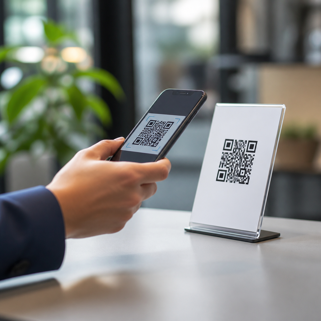
Choosing the best words to use in QR code CTAs can dramatically increase scan rates, because the prompt beside the code often matters as much as the design of the code itself. In this context, CTA means call to action: the short phrase that tells people what they will get, why they should care, and what to do next. I have tested QR code signage in retail stores, trade show booths, restaurant tables, packaging, direct mail, and event check-in flows, and one pattern is consistent: vague language suppresses scans, while specific benefit-led wording lifts response. CTA optimization for QR codes is the practice of matching those words to user intent, placement, and context. It matters because a QR code is not self-explanatory. People need a reason to interrupt what they are doing, open their camera, and trust the destination. The right words reduce friction, clarify value, and improve measurable outcomes such as scans, landing-page visits, coupon redemptions, registrations, and app downloads.
What makes a QR code CTA effective
The best QR code CTA words are clear, concrete, and outcome-focused. Effective phrases answer three questions immediately: what happens after the scan, what benefit the user receives, and how much effort is required. “Scan to view menu” outperforms “Scan here” because it removes ambiguity. “Get 10% off today” outperforms “Learn more” when the real goal is coupon redemption. Strong QR code CTA copy also aligns with user context. On product packaging, people often want setup help, warranty details, or refill options. At a conference booth, they want pricing, specs, a demo, or a giveaway entry. On a poster in transit, they need very low-friction value because attention is limited. In practice, the highest-performing CTA structure is usually verb plus benefit plus immediacy, such as “Scan for instant quote” or “Scan to book today.” This framing works because it combines action, reward, and timing in a phrase short enough to read at a glance.
Best words to use in QR code CTAs by intent
Different user intents require different language. If the goal is information, use words such as “view,” “see,” “explore,” “compare,” or “learn,” but pair them with the exact asset: “Scan to compare plans” is stronger than “Scan to learn more.” If the goal is savings, use direct value words such as “save,” “claim,” “unlock,” “redeem,” and “get,” as in “Scan to claim your free sample.” For transactions, the highest-clarity verbs are “buy,” “order,” “book,” “reserve,” “register,” and “pay.” For support experiences, “activate,” “set up,” “track,” “check,” and “report” are effective because they mirror the task users already expect. For engagement, words like “vote,” “enter,” “watch,” “join,” and “subscribe” perform well when the outcome is immediate and obvious. Across campaigns, I have found that the strongest CTA words are not necessarily the most creative ones. They are the ones that match the user’s intent with precision. Novel copy may win attention, but familiar task words usually win scans because they reduce mental load.
Proven CTA formulas and examples for common placements
Placement changes what people are willing to do. In restaurants, practical CTAs outperform promotional ones. “Scan to view menu,” “Scan to pay table-side,” and “Scan for allergen info” work because they solve a present need. In retail aisles, shoppers respond to decision-support language: “Scan for reviews,” “Scan to compare sizes,” or “Scan for how-to video.” On packaging, support and loyalty are common winners, including “Scan to register warranty,” “Scan for setup guide,” and “Scan to reorder.” At events, speed matters most: “Scan to check in,” “Scan to get slides,” “Scan to book a demo,” or “Scan to enter giveaway.” For direct mail, urgency and specificity matter more than cleverness: “Scan to see your rate,” “Scan for your personalized offer,” or “Scan to book before Friday.” The formula is simple. Match the CTA to the exact task, keep the verb strong, and state the payoff in plain language. When teams skip that discipline, they default to “Scan me” or “Learn more,” which are usually weaker because they ask for action before they explain value.
CTA word choices that build trust and reduce friction
People hesitate to scan QR codes when they are unsure where the code leads, whether the page is mobile-friendly, or whether they will be asked for too much information. The best words for QR code CTAs reduce that uncertainty. Use trust-building language that previews the destination or process: “Scan to view secure menu,” “Scan for official registration,” or “Scan to track your order.” When privacy matters, say so explicitly: “No app needed,” “Takes 30 seconds,” or “Opens in browser.” In healthcare, finance, and education, I have seen compliance-conscious teams increase scan confidence by pairing the CTA with a brand URL, a recognizable logo, and a precise outcome statement. For example, “Scan to access your patient forms” is better than “Scan now,” especially when it appears alongside the clinic name. Friction-reducing words also help set effort expectations. “Quick,” “instant,” “today,” and “in one minute” can lift response when they are true. The rule is straightforward: reassure users about destination, time, and ease without making promises the landing page cannot fulfill.
High-performing CTA examples by goal
Use this table as a practical starting point for CTA optimization for QR codes. The strongest option depends on context, but these examples consistently map words to user goals and expected outcomes.
| Goal | Weak CTA | Better CTA | Why it works |
|---|---|---|---|
| Menu access | Scan here | Scan to view menu | States the exact result immediately |
| Coupon redemption | Learn more | Scan to get 15% off | Leads with specific value |
| Lead capture | Find out more | Scan to book a demo | Uses a clear next step tied to sales intent |
| Product education | More info | Scan to watch setup video | Names the format and purpose |
| Event engagement | Join us | Scan to enter giveaway | Creates immediate incentive |
| Support | Help | Scan to track your order | Matches a concrete customer task |
How to test and improve QR code CTA performance
CTA optimization for QR codes should be measured, not guessed. Start with one primary conversion goal per code: scan-to-menu, scan-to-form, scan-to-coupon, scan-to-demo, or scan-to-payment. Then test one wording variable at a time. Good A/B tests compare changes like “Scan to save 10%” versus “Scan to claim 10% off,” or “Scan for pricing” versus “Scan to see pricing.” Keep the QR code size, placement, color contrast, and landing page constant so the copy is the main variable. Track scans, unique visitors, bounce rate, completion rate, and assisted conversions in analytics platforms such as GA4, Adobe Analytics, or a QR management tool like Bitly, QR Code Generator PRO, or Beaconstac. In field testing, I also review environmental factors: viewing distance, lighting, dwell time, and whether the CTA is readable from the approach path rather than only up close. Use statistically meaningful sample sizes where possible, but even directional tests across stores, mail drops, or event days can reveal language patterns. The biggest gains usually come from specificity, not persuasion tricks.
Common QR code CTA mistakes to avoid
The most common mistake is using generic text that does not explain the benefit. “Scan me,” “Click here,” and “Learn more” waste valuable space because they force users to infer the destination. Another mistake is misalignment between CTA and landing page. If the sign says “Scan to get pricing” and the page asks for a long form before showing prices, trust drops and abandonment rises. Overpromising is equally damaging. Words like “instant,” “free,” or “exclusive” should only appear when they are accurate and obvious after the scan. Teams also overlook readability. A great CTA can still fail if it is printed too small, buried in visual clutter, or positioned below the code where the eye never lands first. Accessibility matters too. Use strong contrast, plain language, and enough surrounding context that all users understand the action. Finally, do not treat every placement the same. The best words to use in QR code CTAs at a bus shelter are different from the best words on product packaging or a tabletop tent because attention, motivation, and available time are fundamentally different.
The best words to use in QR code CTAs are the ones that make the next step obvious, valuable, and low risk. Strong CTA optimization for QR codes starts with user intent, then translates that intent into precise verbs and concrete benefits: view the menu, get the discount, book the demo, watch the setup video, track the order. When the wording matches the situation, scan rates improve because people understand exactly what they gain. The most reliable formula is simple: action verb, specific outcome, and honest expectation of effort or timing. Avoid generic prompts, preview the destination when trust matters, and test copy against real conversion goals instead of relying on preference. If you manage mobile QR code design and UX, treat CTA copy as a performance lever, not a last-minute label. Review every live code, rewrite vague prompts, and measure the difference. Small wording changes often produce the fastest gains in QR engagement, and they compound across packaging, signage, mail, events, and in-store experiences.
Frequently Asked Questions
What are the best words to use in a QR code CTA to increase scan rates?
The best words are usually the ones that make the benefit immediately clear and reduce hesitation. In practice, high-performing QR code CTAs tend to be specific, action-oriented, and reward-focused. Words like “scan,” “get,” “save,” “claim,” “see,” “unlock,” “view,” “order,” and “enter” often outperform vague phrases because they tell people exactly what will happen next. For example, “Scan to view the menu” is stronger than just “Scan me,” and “Scan to get 15% off” is more compelling than “Learn more.” The reason is simple: people decide in a split second whether a QR code is worth the effort, so the CTA has to answer three questions fast: what should I do, what do I get, and why should I care?
The strongest CTA wording also matches user intent in the moment. On product packaging, “Scan for setup instructions” or “Scan to reorder” can perform extremely well because they are useful and timely. In a retail store, “Scan to check sizes” or “Scan to get today’s offer” tends to work better than generic brand language. At a trade show booth, “Scan to book a demo” or “Scan to get the spec sheet” usually beats “Discover more.” The best words are not universally flashy; they are context-aware. If the audience wants speed, use words that promise convenience. If the audience wants value, use words that signal savings or exclusivity. If the audience wants information, use words that promise clarity. Effective QR code CTA copy succeeds because it removes uncertainty and makes the next step feel obviously worthwhile.
Why do vague QR code CTAs like “Scan me” or “Learn more” usually underperform?
Vague CTA language underperforms because it places too much mental work on the user. A person looking at a QR code is making a micro-decision: is this worth my time, is it safe, and what exactly will happen if I scan it? Phrases like “Scan me” or “Learn more” do not answer those questions well. They may be short, but they are not persuasive. “Scan me” describes the action without the payoff, while “Learn more” hints at information but gives no clue about what kind of information, how useful it is, or why it matters right now. When a CTA lacks specificity, people often ignore it because there is no clear incentive to act.
Specificity improves performance because it reduces friction and builds trust. Compare “Learn more” with “Scan to compare models,” “Scan to see ingredients,” or “Scan to reserve your seat.” Each of those examples creates a clear expectation. People are much more likely to scan when they know exactly what they will receive. This is especially important in physical environments like restaurant tables, product packaging, direct mail, and event signage, where attention is limited and distractions are high. A vague CTA asks users to take a risk on an unknown outcome. A specific CTA gives them a concrete reason to engage. In most real-world QR code campaigns, clarity consistently beats cleverness.
How should QR code CTA wording change based on where the code appears?
QR code CTA wording should always reflect the user’s immediate environment, intent, and urgency. The same phrase will not perform equally well on a restaurant table, a retail shelf tag, a conference banner, and a mailer. In a restaurant, the most effective wording often emphasizes speed and usefulness, such as “Scan to view the menu,” “Scan to pay,” or “Scan to order dessert.” On packaging, practical CTAs usually work best, including “Scan for directions,” “Scan to register your product,” or “Scan for recipes.” In a trade show setting, stronger CTA language often highlights access and follow-up value, such as “Scan to get the case study,” “Scan to book a demo,” or “Scan to enter the giveaway.”
The core principle is that the CTA should mirror what the user is already trying to do in that moment. In retail, shoppers want help making a decision, so use phrases like “Scan to see reviews,” “Scan to check colors,” or “Scan for today’s price.” In direct mail, recipients need a compelling reason to move from offline to online, so benefit-driven copy like “Scan to claim your offer” or “Scan to see your custom quote” is often effective. At events, where people are moving quickly, urgency and simplicity matter, so CTAs such as “Scan to check in,” “Scan for the schedule,” or “Scan to download the guide” tend to convert well. Good QR code CTA wording is not just about strong verbs; it is about matching the words to the user’s context so the scan feels like the next obvious step.
What makes a QR code CTA feel more trustworthy and safe to scan?
Trust is a major factor in QR code performance because users are often cautious about scanning unknown links. The CTA can help reduce that hesitation by being transparent, specific, and professional. One of the easiest ways to make a QR code feel safer is to explain exactly what the user will get: “Scan to view the warranty,” “Scan to verify authenticity,” or “Scan to download the event agenda.” This kind of wording signals legitimacy because it sounds purposeful rather than mysterious. Trust also increases when the QR code appears alongside recognizable branding, clean design, and supporting context, but the words themselves still do a lot of the work.
Avoid language that feels gimmicky, manipulative, or unclear. Overhyped wording can make users skeptical, especially if the QR code appears in public spaces. Instead of promising something dramatic without detail, state the value plainly. “Scan to get 10% off today” is more believable than “Unbelievable surprise inside.” It also helps to set expectations about the destination: “Scan to view the PDF,” “Scan to open our menu,” or “Scan to join the waitlist.” These phrases make the experience feel controlled and predictable. In many cases, adding a short supporting line beneath the CTA can further improve confidence, such as “No app required” or “Takes 10 seconds.” The more clearly the CTA communicates the outcome, the more likely people are to trust the scan and follow through.
How can I test and improve QR code CTA wording over time?
The best way to improve QR code CTA wording is to treat it like any other conversion element and test it systematically. Start by changing one variable at a time so you can identify what actually affects scan behavior. For example, compare a generic CTA like “Learn more” against a specific benefit-focused version like “Scan to get your coupon.” Then test action verbs against outcome-based phrasing, such as “Scan to order” versus “Scan to skip the line.” You can also test urgency, including phrases like “today,” “now,” or “before it’s gone,” when they fit the offer honestly. Track scan rate, downstream conversion rate, and completion quality, not just raw scans. A CTA that gets slightly fewer scans but generates far more purchases or signups may be the better performer.
It is also important to test CTA wording in the real environment where people see the code. What works on a mockup may not work on a shelf, a table tent, or a poster across a busy aisle. Distance, lighting, placement, and surrounding distractions all influence how quickly the CTA must communicate value. Keep your tests practical by comparing short phrases that fit naturally in the design. Good examples include testing “Scan to save 15%” against “Scan for today’s discount,” or “Scan to view menu” against “Scan to order now.” Over time, look for patterns by channel and audience. You will often find that convenience-driven language wins in fast-paced settings, while value-driven or information-driven language wins when users are in research mode. The highest-performing QR code CTAs are rarely accidents; they are the result of repeated testing, clear messaging, and close attention to what motivates people in each context.





