
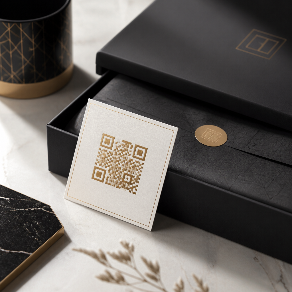
Premium brands cannot treat QR codes as generic black-and-white utilities, because every customer-facing detail influences perceived value. In luxury retail, hospitality, beauty, automotive, and high-end consumer goods, a QR code is not just a scannable square. It is a branded interaction point that must balance aesthetics, usability, trust, and measurable performance. When I have worked on premium packaging and in-store journeys, the strongest results came from treating the code as part of the brand system rather than an afterthought added at production.
Designing QR codes for premium brands starts with understanding two essentials: what a QR code is, and what makes a brand feel premium. A QR code is a two-dimensional matrix barcode that stores data, usually a URL, and can be scanned by smartphone cameras. Premium branding, by contrast, signals quality through consistency, restraint, materials, spacing, typography, color discipline, and frictionless customer experience. The challenge is obvious: QR codes are technical by nature, but luxury branding depends on emotional cues. The best executions reconcile both without compromising scan reliability.
This matters because QR codes now sit across high-value moments in the customer journey: product authentication, concierge booking, aftercare instructions, digital lookbooks, loyalty enrollment, event access, and personalized storytelling. A poorly designed code can erode trust instantly, especially when attached to expensive goods. A well-designed one can extend brand equity into mobile, deepen engagement, and create trackable first-party data. For a sub-pillar on branding with QR codes, the goal is comprehensive guidance: when to use them, how to style them, what mistakes weaken premium perception, and how to connect design choices to measurable commercial outcomes.
Define the job of the QR code before styling it
The first rule is strategic: decide exactly what the QR code must do before making it look beautiful. Premium brands often overload one code with too many expectations. In practice, the highest-performing codes usually serve one primary action. On fragrance packaging, that may be authenticity verification. In a five-star hotel suite, it may open a multilingual guest services menu. On a watch hangtag, it may launch care guidance and warranty registration. Each use case affects placement, size, call-to-action language, and destination design.
I recommend writing a one-sentence job statement for every branded QR code. Example: “This code helps boutique shoppers book a private styling appointment in under thirty seconds.” That clarity immediately improves creative decisions. A booking code should feel discreet, elegant, and invitation-led. An anti-counterfeit code should feel secure, official, and easy to trust. A post-purchase onboarding code should emphasize convenience and brand care. Without this foundation, teams drift toward surface decoration and miss the customer intent that actually determines adoption.
Destination quality is equally important. A premium QR code that opens an unstyled mobile web page, a slow PDF, or a generic marketplace listing damages the experience. The scan target should mirror the brand environment through mobile-first layout, strong visual hierarchy, fast loading, and domain consistency. If the packaging is exquisite but the landing page looks templated, customers notice. Premium brands should use custom domains, secure HTTPS links, concise URLs behind dynamic codes, and analytics platforms that track scans by location, product line, campaign, or channel.
Build the QR code inside the brand system, not beside it
Premium QR code design works when the code inherits recognizable brand assets without becoming harder to scan. The practical design levers are color, quiet zone, shape treatment, logo integration, surrounding typography, and material finish. Start with the existing brand guidelines. If the brand uses a warm ivory, deep forest, brushed gold, or muted charcoal palette, those tones can often replace standard black and white, provided contrast remains strong. Dark foreground on a light background is still the safest option for consistent smartphone scanning.
Logo placement is common, but it must respect error correction limits. Most premium designs use higher error correction, often level H, to allow a central logo mark while preserving scan integrity. That does not mean every logo belongs in the middle. Some marks are too detailed or too large. In those cases, branding the frame around the code or pairing it with a monogram nearby is safer. Adobe Illustrator, Figma plugins, QR Code Generator Pro, and Beaconstac all support controlled customization, but outputs should always be device-tested before production approval.
Shape customization deserves restraint. Rounded modules, softened corners, and bespoke finder patterns can make a code feel more aligned with luxury packaging, but excessive experimentation creates recognition problems in low light or at oblique angles. Premium branding is usually about disciplined reduction, not visual novelty. I have seen the best results when teams limit themselves to one or two custom traits, such as a signature color and refined frame, while preserving the code’s fundamental geometry. That approach communicates design intent without sacrificing function.
Use placement, materials, and context to create premium perception
Where a QR code appears often matters as much as how it looks. On-pack, it should never feel like a compliance label that landed accidentally in a corner. On a rigid box, for example, the code can sit under the lid with a discreet invitation to “Discover the craftsmanship” rather than compete with the primary front-of-pack design. In a boutique, a tabletop code can be etched into acrylic or printed on textured stock that matches the environment. In hospitality, bedside or minibar codes should feel integrated into the room language, not taped on as a convenience fix.
Material execution affects perceived value directly. Foil stamping, embossing, debossing, varnish, and metallic inks can elevate print design, but they also introduce scan risk. Reflective gold foil may look luxurious under display lighting yet fail under smartphone cameras. Matte finishes usually scan more reliably than glossy ones. If using dark substrates, print vendors should verify contrast with physical proofs, not only digital mocks. Premium brands should budget for prototype rounds because camera behavior changes across iPhone, Samsung Galaxy, and lower-end Android devices.
Contextual language around the code also shapes customer response. Generic labels such as “Scan me” undersell the interaction. Better calls to action explain value in brand-appropriate language: “View the atelier story,” “Activate your private fitting,” “Verify authenticity,” or “Access cellar notes.” The principle is simple: tell customers exactly what they will receive. In premium environments, clarity feels more luxurious than gimmickry because it respects the customer’s time and removes uncertainty.
Protect usability with technical standards and testing
A premium QR code still fails if it does not scan instantly. Technical discipline is what separates attractive concepts from dependable brand assets. Minimum printed size depends on scan distance, but for packaging viewed at arm’s length, many teams use at least 20 x 20 mm as a baseline, then test upward. The quiet zone should generally be four modules wide around the code. Contrast should remain high, and inverted light-on-dark treatments should be tested carefully because they are less universally reliable than dark-on-light formats.
Dynamic QR codes are usually the right choice for premium brands because they allow destination updates without reprinting physical materials. That matters for seasonal campaigns, product recall messaging, multilingual routing, regional compliance, and long-lifecycle products such as luggage or jewelry. Dynamic codes also support analytics, A/B testing, and retargeting integrations. Static codes still have a role for permanent utilities, but they are less flexible and provide limited measurement.
| Design factor | Premium best practice | Common risk |
|---|---|---|
| Color | Brand-aligned dark foreground on light background | Low contrast reduces scan speed |
| Logo | Small centered mark with high error correction | Oversized logo breaks readability |
| Material | Matte print with physical proof testing | Gloss or foil causes camera glare |
| Placement | Integrated into packaging or environment with a clear CTA | Hidden or awkward placement lowers adoption |
| Destination | Mobile-first branded landing page on custom domain | Slow, generic, or off-brand page harms trust |
Testing should include different devices, lighting conditions, angles, and network speeds. I typically test in bright retail lighting, natural daylight, dim restaurant conditions, and while the code is curved around cylindrical packaging. Teams should also test after production finishes are applied, because a code that works in artwork review can fail on the final substrate. The standard for premium is simple: the first scan should work quickly, without repositioning or retries.
Connect branded QR codes to customer journey and measurement
Branding with QR codes is most valuable when it supports a larger customer journey. A single product may use one code for authentication, another for aftercare, and another for loyalty, but each should connect to a defined journey map and CRM logic. For example, a premium skincare brand might place a verification code on the carton, then route authenticated owners to personalized routines, replenishment reminders, and consultation booking. A luxury automaker might use in-showroom codes to compare trims, then continue the relationship through test-drive scheduling and owner onboarding.
This is why QR code governance matters. Teams should define naming conventions, ownership, expiration policies, and reporting cadences. UTM parameters, consent-compliant analytics, and dashboard segmentation make QR programs measurable instead of anecdotal. Useful metrics include scan-through rate by placement, authenticated product registrations, appointment bookings, average session duration, and downstream conversion. The commercial benefit is not the scan itself; it is what the scan reveals about intent and what the brand does next with that insight.
As the hub page for branding with QR codes, the central lesson is that premium execution depends on alignment. Strategy, visual identity, technical reliability, materials, copy, and mobile destination must reinforce one another. When they do, QR codes stop feeling like utilitarian add-ons and become credible brand touchpoints. Audit your current codes, test them in real conditions, and redesign the weakest links first. Premium brands earn trust through details, and QR code design is one detail customers now notice immediately.
Frequently Asked Questions
Why do premium brands need a different approach to QR code design?
Premium brands operate in a space where presentation is inseparable from value, so a QR code cannot be treated as a generic functional add-on. In luxury environments, customers notice materials, spacing, typography, finishing, color consistency, and the overall coherence of the brand experience. A standard black-and-white QR code may be technically usable, but if it looks visually disconnected from elegant packaging, refined retail displays, or carefully curated hospitality touchpoints, it can reduce the sense of exclusivity the brand has worked to build. The code should feel intentional, not improvised.
A different approach is necessary because a premium QR code serves two roles at once. First, it must perform as a reliable scannable tool that works quickly across devices and lighting conditions. Second, it must function as a branded interaction point that extends the identity of the business into the digital moment. For a luxury beauty label, that might mean a code integrated into minimalist secondary packaging with subtle contrast and a refined call to action. For an automotive or high-end consumer goods brand, it may connect the physical product to concierge support, authentication, owner education, or exclusive digital content. In every case, the QR code should feel like part of a designed journey rather than a utility pasted onto the surface at the last minute.
When premium brands treat QR codes strategically, they also gain stronger trust and better performance data. Customers are more likely to scan a code that appears credible, polished, and clearly connected to the brand. A well-designed implementation can also support campaign measurement, personalization, post-purchase engagement, and retail or packaging optimization. The key principle is simple: in premium markets, even functional elements influence perceived quality, so the QR code should be designed with the same discipline applied to packaging, signage, digital experiences, and brand storytelling.
How can a QR code look luxurious without hurting scannability?
The best premium QR code designs start with a non-negotiable rule: aesthetics should enhance the experience, not compromise usability. A QR code can absolutely look sophisticated, but only if core technical requirements remain intact. That means maintaining enough contrast between the code and the background, preserving the quiet zone around the code, avoiding visual clutter near the edges, and testing the final design across multiple phones, camera qualities, screen brightness levels, and real-world lighting conditions. Luxury does not mean overdesigned. In many cases, restraint produces the most premium result.
There are several effective ways to elevate appearance while preserving functionality. Brands can use a refined color palette instead of pure black and white, as long as the code remains clearly distinguishable from the background. Deep charcoal, metallic-inspired tones rendered in print-safe contrast, or dark brand colors on soft neutral packaging can work beautifully. Rounded modules, subtle logo integration, and custom frame treatments may also support brand expression, but they should be implemented carefully so they do not interfere with the code structure. Embossing, foil, varnish, and textured substrates can create a premium feel as well, though these finishes must be tested thoroughly because glare, reflection, or insufficient tonal contrast can reduce scan reliability.
Equally important is the context around the QR code. A luxury code often looks more premium because of what surrounds it: elegant spacing, thoughtful placement, a strong headline or invitation, and a landing page that matches the same level of quality. A beautiful code that sends users to a poorly designed mobile page breaks the experience instantly. In practice, the most successful premium executions balance visual refinement with disciplined production standards. If a design choice makes the code harder to scan, it is not a luxury detail; it is a usability flaw. Premium design is about seamless execution, not decorative complexity.
Where should premium brands place QR codes on packaging, in-store displays, or customer touchpoints?
Placement should always follow the customer journey. A QR code should appear where it feels natural, useful, and contextually justified, rather than where there was simply empty space in the layout. On premium packaging, that often means placing the code on a secondary panel, interior flap, insert card, or other area that preserves the hero branding while still making the code easy to find when the customer is ready to engage. For luxury products, this can be especially effective because it allows the brand to maintain a clean front-of-pack aesthetic while making the digital interaction feel more intentional and exclusive.
In-store and hospitality environments, placement should align with the moment of highest relevance. A code near a product display can unlock craftsmanship details, provenance, styling ideas, or availability information. In a premium hotel or spa setting, it might support menu browsing, private booking access, or tailored guest services. In automotive showrooms, it can extend the experience with model specifications, immersive demos, or owner-program enrollment. The guiding question is not merely “Where will people see it?” but “Where will scanning feel valuable and frictionless?” Height, lighting, distance, surface finish, and expected dwell time all matter. If customers must awkwardly bend down, deal with glare, or guess what the code offers, performance will suffer regardless of how elegant the design looks.
Premium brands should also think beyond visibility and consider discretion. Not every QR code needs to be prominent. In some categories, especially luxury fashion, beauty, spirits, jewelry, or high-end gifting, subtle placement can reinforce exclusivity. A code hidden inside packaging or revealed after purchase can feel more curated than one prominently printed on the front. That said, subtle should never mean confusing. The brand should provide just enough guidance through microcopy, iconography, or presentation to make the purpose of the scan obvious. Great placement respects both the visual hierarchy of the brand and the practical behavior of the customer.
What should a premium brand link a QR code to?
A premium QR code should lead to an experience that feels worthy of the brand. Too often, companies invest in packaging or physical presentation but send users to a generic homepage, a non-mobile-friendly product page, or a destination that offers no meaningful value. That undermines trust and makes the scan feel transactional rather than curated. For premium brands, the destination should be specific, relevant to the moment, and designed to continue the same level of polish customers just encountered in the physical world.
The most effective destinations depend on the use case. On packaging, a QR code may link to product authentication, care instructions, sourcing transparency, craftsmanship stories, refill programs, membership enrollment, or personalized aftercare content. In luxury beauty, it could open tutorials, ingredient narratives, or consultation booking. In hospitality, it might connect guests to concierge services, room enhancements, exclusive experiences, or private event access. In high-end automotive or consumer goods, the code may support onboarding, warranty registration, owner manuals, premium support, or bespoke configuration tools. The best links do not just provide information; they deepen the relationship and reinforce the brand promise.
Just as important, the landing experience should be fast, mobile-optimized, and visually aligned with the rest of the brand ecosystem. If the QR code is elegant but the destination is slow, cluttered, or off-brand, the interaction loses credibility immediately. Brands should also consider measurable goals when choosing destinations. A QR code can support analytics, A/B testing, regional customization, language personalization, and campaign attribution. In other words, the destination should satisfy both brand and business objectives: it should feel exclusive to the customer while generating actionable performance insight for the team behind the experience.
How can premium brands measure QR code performance without making the experience feel overly commercial?
Measurement is essential, but in premium environments it should operate quietly in the background. Customers should experience the interaction as smooth, useful, and brand-enhancing, not as a transparent data collection exercise. The most effective approach is to use dynamic QR codes, campaign-specific URLs, and analytics platforms that track scans, location patterns, device types, time-of-day trends, and conversion behavior without adding unnecessary friction. This allows brands to learn what is working while preserving the polished feel of the customer journey.
Premium brands should define success metrics based on the purpose of the interaction rather than using scan volume alone. If a QR code appears on luxury packaging, relevant measures may include authentication completions, content engagement time, loyalty sign-ups, reorder behavior, or post-purchase service usage. In retail or hospitality settings, brands may look at appointment bookings, product page visits, menu interactions, private event RSVPs, or assisted conversion rates tied to in-store placements. This more nuanced view helps teams understand not just whether people scanned, but whether the scan contributed to a meaningful business outcome and a stronger brand relationship.
It is also wise to test creative and contextual variables with discipline. Premium brands can compare different call-to-action language, placement locations, materials, sizes, landing page formats, or audience-specific destinations. However, optimization should never come at the expense of elegance. The goal is not to turn the experience into aggressive performance marketing, but to refine it so that it feels more seamless, relevant, and rewarding. When measurement is handled intelligently, premium QR codes become far more than decorative tech features. They become measurable, high-performing brand touchpoints that connect physical design with digital engagement in a way that supports both prestige and growth.





