
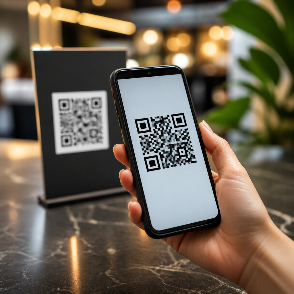
Urgency is the difference between a QR code that gets noticed and a QR code that gets scanned. In mobile-first campaigns, a call to action does more than label the code; it tells people why they should act now, what they will get, and how little effort the next step requires. When marketers talk about QR code CTA optimization, they mean refining the words, design, timing, placement, and landing-page promise surrounding a code so scanning feels immediate, worthwhile, and frictionless. I have tested QR code calls to action on packaging, retail signage, direct mail, event badges, and restaurant tables, and the same pattern repeats: generic prompts like “Scan me” underperform specific, time-bound prompts such as “Scan for today’s 15% lunch offer.” The reason is simple. People are evaluating your QR code in seconds, often while standing, walking, or waiting. If the benefit is vague, they move on.
Creating urgency with QR code CTAs matters because QR interactions live at the intersection of attention, context, and intent. A shopper in an aisle, a conference attendee between sessions, or a diner deciding on dessert all have limited bandwidth. Strong urgency reduces hesitation by answering three questions immediately: Why scan, why now, and what happens next? Done well, urgency increases scan-through rate, improves landing-page conversion, and helps qualify intent because people who scan understand the value proposition before they open their camera. Done poorly, urgency feels manipulative, confuses the offer, or creates disappointment if the destination page does not match the promise. The goal is not fake scarcity. It is clear motivation supported by honest copy, relevant timing, and a destination that delivers exactly what the CTA advertises.
For a hub page on CTA optimization for QR codes, the core principle is this: urgency works when it is specific, credible, and visually impossible to miss. Specific means naming the reward or outcome. Credible means using real constraints like limited dates, inventory, access windows, or event timing. Visible means treating the CTA, code, and surrounding design as one conversion unit rather than separate elements. Every decision, from verb choice to QR quiet zone to mobile page speed, influences whether urgency translates into action.
What urgency means in QR code CTA design
Urgency in QR code design is the deliberate use of immediate value and real deadlines to increase the probability of a scan. It can be time-based, such as “Ends tonight at 9 PM,” quantity-based, such as “First 100 scans get a sample,” or context-based, such as “Scan during the keynote for slides and bonus templates.” In practice, context-based urgency often performs best because it matches the moment the user is already in. At a trade show I worked on, “Scan to learn more” lagged far behind “Scan before 2 PM to book a live product demo” because attendees understood both the reward and the time limit.
The psychology behind this is well established. Loss aversion, reduced decision friction, and perceived exclusivity all raise response rates when used honestly. However, mobile UX determines whether psychological intent becomes measurable behavior. If a CTA promises speed but the landing page loads slowly, urgency collapses. If a poster uses tiny text beneath the code, urgency is invisible. If the offer is urgent but the code is placed where users cannot comfortably stop and scan, execution fails. Effective QR urgency therefore combines copywriting with physical environment planning and destination-page readiness.
Build urgency with the right CTA formula
The most reliable QR CTA structure is verb plus benefit plus urgency plus reassurance. In plain terms: tell people what to do, what they get, why now, and what to expect. For example, “Scan to claim your free sizing guide before checkout closes at midnight” works because it names the action, reward, deadline, and likely next step. Compare that with “Scan here,” which provides no incentive, no timeline, and no reason to interrupt what the user is doing.
Word choice matters. Strong verbs include claim, unlock, reserve, compare, save, book, and get. Benefit terms should be concrete: discount, menu, ticket upgrade, installation guide, warranty registration, loyalty points, waitlist access, or appointment slot. Urgency phrases should be measurable rather than theatrical: today only, this week, before launch, while seats remain, during the event, or by Friday. Reassurance can be subtle but powerful: no app needed, takes 10 seconds, instant download, mobile checkout, or free to join. These phrases lower perceived effort, which is often the hidden blocker behind a skipped scan.
| Weak CTA | Stronger urgent CTA | Why it works |
|---|---|---|
| Scan me | Scan to save 20% before Friday | Specific value and clear deadline |
| Learn more | Scan for today’s menu and limited specials | Matches immediate dining context |
| Visit our site | Scan to book your demo during the expo | Tied to event timing and action |
| Get details | Scan to unlock setup instructions in 30 seconds | Promises speed and practical benefit |
Match urgency to the real-world scanning context
A QR code CTA succeeds when it reflects the user’s physical situation. On product packaging, urgency should often support buying confidence or post-purchase action: “Scan before first use for setup help and warranty activation.” On in-store signs, use price or inventory relevance: “Scan now to compare colors in stock.” On event materials, make timing explicit: “Scan before the session ends for speaker slides.” On restaurant tables, immediate gratification wins: “Scan now for happy hour pricing until 6 PM.” These are not copy variations for style alone; they align the CTA with what users are trying to accomplish in that moment.
Placement changes urgency perception. A code near the entrance of a store can invite planning behavior, while a code beside a shelf edge label can trigger decision behavior. In direct mail, the envelope teaser and the insert CTA should echo the same deadline so the urgency feels continuous. For outdoor placements, assume limited dwell time and greater glare, so the CTA must be shorter, bolder, and high contrast. I have seen excellent offers fail simply because the code sat too low on a poster or too far from the headline, forcing users to search for the reason to scan. When attention is scarce, distance between message and code is conversion friction.
Use visual hierarchy to make the CTA impossible to miss
In QR code design, urgency must be visible before it is readable. The CTA should be the dominant text element closest to the code, with supporting details secondary. Size, contrast, whitespace, and alignment matter more than decorative styling. The code needs a proper quiet zone, but the CTA also needs breathing room so the eye can connect the instruction with the action object. A common mistake is placing a stylized QR code in the center of a layout while burying the offer in small body copy. Users notice the code but never understand the benefit.
Use a clear headline above or beside the QR code, not below several lines of explanation. If there is a deadline, isolate it visually: “Ends Sunday” or “Today only” in a badge or subhead. Brand colors are fine, but contrast ratios must stay strong enough for quick readability and reliable scanning. If you invert colors or use custom code styling, test with iPhone and Android native cameras, not just a generator preview. CTA optimization is inseparable from scannability. The best urgent copy in the world cannot rescue a code that fails under retail lighting, glossy print, or low-resolution export.
Support urgency with a landing page that fulfills the promise
The destination page is where urgency becomes revenue or evaporates. If the QR CTA promises a limited offer, the landing page must repeat that offer immediately above the fold, preserve the same wording, and make the next action obvious. Do not send urgent scans to a generic homepage. Deep link users to a campaign-specific mobile page with compressed images, minimal navigation, and a visible completion path. On Shopify, Klaviyo landing pages, or custom mobile pages, I look first at Largest Contentful Paint, form length, and message match. If the user scanned for a discount, the discount code should be visible without scrolling.
Timers can work, but only when tied to genuine campaign logic. Reserve countdowns for fixed promotions, event windows, or booking deadlines. False countdowns damage trust quickly. Better proof of urgency often comes from operational facts: “Pickup slots filling for tonight,” “Registration closes at 5 PM,” or “Samples available while supplies last.” Add mobile-friendly reassurance near the conversion point, such as accepted payment methods, privacy language, or “takes less than a minute.” Urgency increases attention, but trust closes the conversion.
Measure CTA performance and refine it continuously
QR code CTA optimization should be managed like any conversion program: test, measure, and iterate. Static scan count is not enough. Track scans by location, creative version, device category, time of day, and downstream outcome. Dynamic QR platforms such as Bitly, QR Code Generator PRO, Beaconstac, or Flowcode make this easier by letting teams update destinations and compare campaign variants without reprinting the code. Pair scan analytics with GA4 events so you can see not only which CTA drove scans, but which one led to purchases, signups, or completed forms.
In testing, change one major variable at a time. Start with CTA copy, then offer framing, then placement, then visual emphasis. For example, compare “Scan to save 10% today” versus “Scan to unlock today’s member price.” The second may outperform if exclusivity matters more than discount depth. Also test whether adding “No app needed” increases response in older audiences or lower-tech environments. Document results by context, because a winning retail CTA may fail in hospitality or B2B events. The hub mindset is important here: every subtopic in mobile QR code design, from contrast and placement to landing-page UX and analytics, feeds better CTA performance.
Creating urgency with QR code CTAs is not about pressuring people; it is about removing ambiguity at the exact moment interest appears. The highest-performing QR campaigns make one promise, explain why it matters now, and deliver a fast mobile experience that keeps that promise. If you remember only three rules, make them these: be specific about the benefit, be honest about the deadline, and be obsessive about the scan-to-page experience. Those three choices consistently lift response rates more than clever wording alone.
As a hub for CTA optimization for QR codes, this topic connects copywriting, visual hierarchy, placement strategy, mobile landing pages, and measurement. Strong urgency works when all five align. A shelf talker with a sharp CTA but a weak landing page will leak conversions. A fast landing page with a vague “Scan me” prompt will never reach its potential. Treat the QR code and its CTA as one conversion system, and optimize every touchpoint around the user’s real context.
If you are improving mobile QR code design and UX, start by auditing your current CTAs in the field. Replace generic prompts with specific, time-bound offers, test them in their actual environment, and measure what happens after the scan. That is the fastest route to QR codes that do not just get seen, but get acted on.
Frequently Asked Questions
1. Why is urgency so important in QR code CTAs?
Urgency is what turns a passive glance into immediate action. A QR code by itself is just a visual tool, but a strong CTA gives people a reason to scan now instead of later. In most real-world environments, whether on packaging, posters, mailers, retail displays, or event signage, attention is limited and distractions are everywhere. If the message around the QR code does not communicate a timely benefit, people often assume they can come back to it later, which usually means they never do. Urgency helps eliminate hesitation by making the value of scanning feel current, relevant, and time-sensitive.
Effective urgency works because it answers three questions instantly: why should I care, why should I do this now, and what happens next? When your CTA clearly promises something useful such as a limited-time discount, early access, bonus content, or a fast solution, the scan feels more worthwhile. Just as important, urgency reduces decision friction. Instead of leaving users to interpret the purpose of the code, the CTA frames the next step as easy and beneficial. In mobile-first campaigns especially, urgency is not about pressure for its own sake. It is about clarity, momentum, and making the path from attention to action feel obvious and immediate.
2. What words and phrases create urgency in a QR code call to action without sounding pushy?
The best urgency language is specific, benefit-focused, and believable. Rather than using vague commands like “Scan me” or “Learn more,” stronger CTAs tell users what they gain and why the timing matters. Phrases such as “Scan for today’s offer,” “Unlock your bonus now,” “Claim your seat before registration closes,” “Get instant access,” or “Limited spots available” are more effective because they connect the scan to a real outcome. These phrases create momentum while still sounding helpful and relevant instead of aggressive.
To avoid sounding pushy, tie urgency to a legitimate reason. Time-based language works well when it reflects a genuine deadline, such as “Ends tonight” or “Available this week only.” Quantity-based urgency can also be effective when it is truthful, for example “First 100 redemptions” or “Only a few spots left.” Action language should feel easy and low-risk, so words like “unlock,” “claim,” “get,” “see,” and “access” often perform better than generic instructions. It also helps to reduce perceived effort by pairing urgency with simplicity, such as “Scan now to get your coupon in seconds.” This combination tells people not only that they should act now, but that doing so will be quick and worthwhile.
3. How can design and placement make a QR code CTA feel more immediate?
Design and placement have a major influence on whether urgency is noticed at all. Even strong copy can underperform if the CTA is visually weak, buried in clutter, or placed too far from the moment of decision. To create immediacy, the QR code and its CTA should stand out clearly from surrounding content. High contrast, readable type, directional cues, and a clear visual hierarchy help users recognize the code as an actionable element rather than a decorative one. The CTA text should be close to the code, large enough to read at a glance, and visually tied to the promised benefit.
Placement matters just as much as wording. Put QR codes where user intent is naturally highest, such as near checkout areas, product comparisons, event entry points, menus, packaging panels, or promotional displays. The more closely the code appears to the moment someone is considering a decision, the more effective urgency becomes. For example, a “Scan now for 15% off today’s purchase” CTA is much more compelling near the point of sale than at the bottom of a general awareness poster. Adding visual reinforcement like countdown language, limited-time labels, or supporting microcopy such as “Takes 10 seconds” can further reduce hesitation. The goal is to make the code impossible to misunderstand: users should instantly see what it is, why it matters now, and how easy the next step will be.
4. What should the landing page deliver after someone scans an urgent QR code CTA?
The landing page must immediately fulfill the promise made by the CTA. If the QR code says “Scan for today’s exclusive offer,” users should land on that exact offer without having to search, scroll endlessly, or navigate through unrelated content. This is critical for maintaining trust. Urgency creates expectation, and if the post-scan experience feels slow, confusing, or mismatched, conversion rates drop quickly. The transition from scan to landing page should feel seamless, direct, and intentionally designed around one clear action.
A high-performing landing page for an urgency-based QR campaign usually has a strong headline that mirrors the CTA, a clear explanation of the benefit, minimal distractions, and a simple next step such as redeeming an offer, signing up, downloading, or purchasing. Mobile optimization is essential because most QR scans happen on smartphones. That means fast load speed, thumb-friendly buttons, concise copy, and no unnecessary form fields. If urgency is part of the message, reinforce it on the page with elements like an expiration date, availability notice, event countdown, or a clear reminder of what the user gains by acting now. Most importantly, do not overcomplicate the experience. The post-scan journey should feel faster and easier than any alternative, which is exactly what makes the QR code CTA effective in the first place.
5. How can marketers test and improve QR code CTA urgency over time?
Improving urgency is an ongoing optimization process, not a one-time copy decision. Marketers should test how wording, visuals, placement, timing, and offer structure affect scan rates and conversions. Start by measuring the full funnel: views or impressions where possible, scan rate, landing-page engagement, and final conversion. A QR code that gets many scans but few completions may have a strong CTA but a weak landing-page experience. A code with low scans may point to poor visibility, weak urgency language, or an unclear value proposition. Looking at both scan behavior and post-scan performance gives a more accurate picture of what needs improvement.
A practical way to optimize is through controlled A/B testing. Compare one urgent CTA against another, such as “Scan to save 10%” versus “Scan today to unlock 10% off.” Test deadline framing against instant-benefit framing, or compare different placements in the customer journey. You can also experiment with design variables like button-style frames, color contrast, supporting text, and nearby trust cues. Seasonal timing, audience type, and campaign context matter too, so what works in a retail environment may not work in B2B events or direct mail. The most effective marketers refine urgency based on real behavior, not assumptions. Over time, these small adjustments can significantly improve scan intent, reduce friction, and increase the overall performance of QR code CTAs.





