
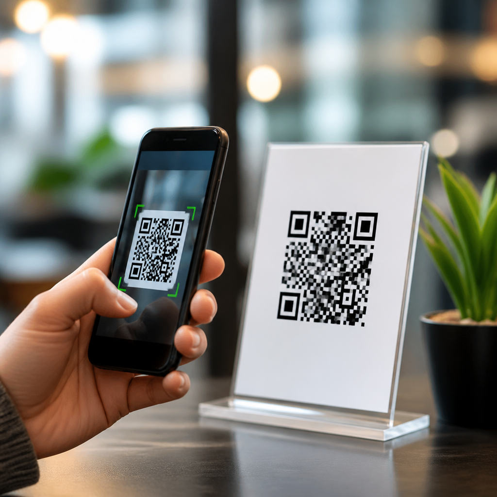
QR codes fail more often because of weak calls to action than poor scanning technology. In mobile QR code design and UX, a call to action, or CTA, is the short prompt that tells someone why to scan, what they will get, and what will happen next. CTA optimization for QR codes means improving that prompt across copy, design, placement, context, and landing page continuity so more people notice the code, trust it, and complete the scan. This matters because scan intent is fragile. In campaigns I have audited for retail displays, event signage, packaging, and restaurant ordering, the same code can perform very differently depending on whether it says “Scan here” or “Scan to get today’s 20% offer.” Better CTAs increase scan-through rate, reduce hesitation, and improve downstream conversion because they set a clear expectation before the camera opens. For brands building a mobile-first customer journey, QR CTA strategy is not decoration; it is a measurable lever that affects acquisition cost, attribution quality, and user satisfaction.
What makes a QR code CTA effective
An effective QR code CTA answers three questions immediately: why should I scan, what do I receive, and how fast is the payoff. Generic language such as “Scan me” underperforms because it explains the action but not the benefit. Benefit-led language performs better because people decide in seconds whether a scan is worth the interruption. Strong examples include “Scan to view the menu,” “Scan for setup instructions,” “Scan to claim your warranty,” and “Scan to unlock member pricing.” Each phrase ties the scan to a concrete outcome. Specificity also builds trust. If the destination is a video, say that. If the scan opens a payment page, say that. Ambiguity creates friction because users increasingly evaluate QR codes through a security lens.
Design supports the CTA, but copy carries the core load. In practice, the best-performing prompts are short, verb-led, and visually paired with the code rather than separated by other elements. A useful structure is action plus benefit plus reassurance: “Scan to book in 30 seconds,” “Scan to compare colors,” or “Scan to download the guide, no app needed.” The reassurance clause works well when people may expect a login, app install, or long form. In field testing, adding “no app required” has lifted scans on print pieces because it removes a common objection before it appears.
Match the CTA to user intent and context
The right QR CTA depends on where the code appears and what the user is trying to accomplish at that moment. On packaging, intent is often informational or post-purchase, so CTAs like “Scan for assembly steps” or “Scan to register your product” fit naturally. In a storefront window, intent may be transactional after hours, making “Scan to shop this display” more effective. At events, attendees need speed and orientation, so “Scan for today’s schedule” or “Scan to save this contact” usually outperforms broad promotional language.
Context also changes the amount of detail a CTA needs. A commuter seeing a transit ad for three seconds requires a concise value proposition. A customer seated at a restaurant table can process more information, including a secondary line such as “Scan to view allergens and pay at the table.” When teams reuse one generic CTA across every touchpoint, scan rates typically flatten because the message ignores situational intent. Segmenting CTAs by environment is one of the fastest gains available in QR marketing. It aligns the prompt with motivation, and motivation determines action.
CTA copy patterns that consistently lift scans
Several copy patterns produce reliable gains when used thoughtfully. The first is utility-driven language, which promises immediate help: “Scan for directions,” “Scan to troubleshoot,” or “Scan for care instructions.” The second is incentive-led language, such as “Scan for 10% off today” or “Scan to enter this month’s giveaway.” Incentives work, but only when the reward is credible and relevant to the audience. A small discount on luxury goods can underperform a stronger experiential promise like “Scan to see this watch on wrist.” The third is exclusivity: “Scan for members-only pricing” or “Scan to access the full case study.” This pattern works best when the audience already values the brand or content.
Urgency can help, but it must be real. “Scan before midnight for free shipping” is stronger than empty pressure like “Act now.” Clarity about next steps matters just as much. If scanning launches WhatsApp, maps, Apple Wallet, or a browser form, mention it. I have seen support labels improve simply by changing “Scan for help” to “Scan to chat with support.” The second version reduces uncertainty and raises confidence that the action will resolve the problem.
Use design, hierarchy, and placement to support the CTA
Even the best copy fails if people do not see it or cannot pair it with the code. The CTA should sit directly above or beside the QR code, with strong visual contrast and enough white space for quick recognition. Typography matters more than many teams assume. A bold headline-sized CTA outperforms tiny helper text because users decide whether to scan before they inspect the code itself. Color can reinforce hierarchy, but contrast is the nonnegotiable requirement. Follow accessibility guidance consistent with WCAG contrast principles so the message remains legible in varied lighting.
Placement should reflect physical behavior. On packaging, avoid folds, curves, and glare-prone finishes. On posters, place the code where a person can scan without stepping into traffic or blocking a queue. On table tents, angle the design toward seated eye lines. The CTA should also acknowledge scanning distance. A billboard needs a different interaction than a countertop sign, and many billboard QR failures come from impossible scan range rather than low interest. When distance is long, use fewer words, larger modules, and a CTA that states a quick reward.
Test CTA variants with measurable hypotheses
QR CTA optimization is not guesswork; it is structured testing. Start with a hypothesis tied to one user objection or motivation. For example, if users hesitate because they do not know the reward, test “Scan here” against “Scan for today’s menu and prices.” If they fear complexity, test “Scan to book” against “Scan to book in under 1 minute.” Keep the code itself stable when possible so you isolate CTA impact. Use dynamic QR platforms and analytics tools such as Bitly, Beaconstac, QR Code Generator PRO, or Flowcode to track scans by asset, location, and time.
| Test focus | CTA A | CTA B | What to measure |
|---|---|---|---|
| Benefit clarity | Scan here | Scan to get the price list | Scan-through rate |
| Friction reduction | Scan to register | Scan to register, no app required | Scans and completion rate |
| Urgency | Scan for free shipping | Scan today for free shipping | Scans by daypart |
| Destination transparency | Scan for support | Scan to chat with support | Scans and assisted resolution |
Look beyond raw scans. A CTA that boosts scans but lowers completion may be overpromising or attracting low-intent traffic. The best metric stack includes scan rate, landing page engagement, conversion rate, and assisted revenue or support outcomes. In mature programs, teams also review repeat scans, unique users, and device mix to understand whether the CTA resonates differently across contexts.
Create message continuity after the scan
A QR CTA sets a promise, and the landing experience must fulfill it immediately. If the code says “Scan to view the menu,” the first screen should be the menu, not a homepage. If it says “Scan to claim your coupon,” the coupon should appear without hunting through navigation. Message continuity is one of the most overlooked drivers of scan success because users judge the scan retroactively. A bad post-scan experience teaches them not to trust future codes from the same brand.
Continuity also affects attribution and experimentation. When each CTA maps to a dedicated mobile landing page, performance analysis becomes clearer. You can see whether “Scan to compare plans” produces more qualified visits than “Scan for pricing,” and you can refine both the prompt and the destination. Keep the landing page mobile-optimized, fast, and focused. Google’s mobile usability expectations still apply, and Core Web Vitals influence whether a user stays long enough to convert.
Common QR CTA mistakes and how to fix them
The most common mistake is using a command without a benefit. Replace “Scan me” with a specific outcome. The second is hiding the CTA in small type or placing it too far from the code. Keep the message visually connected. The third is asking for too much commitment too early, such as “Scan to create an account,” when “Scan to explore features” would invite more initial interest. Another frequent error is ignoring trust signals. For high-stakes actions like payments or account access, include brand identity, HTTPS destinations, and destination transparency so users feel safe scanning.
Teams also underestimate operational issues. A strong CTA cannot save a code printed too small, placed in dim light, or linked to a slow page. Nor can it overcome a mismatch between audience and offer. If scans are low, review the full chain: visibility, scanability, message clarity, destination relevance, and analytics accuracy. The fix is usually not one dramatic redesign. It is disciplined refinement across copy, placement, and mobile experience.
Increasing QR code scan rates with better CTAs comes down to clarity, relevance, and follow-through. The strongest CTAs tell users exactly why to scan, match the moment and environment, reduce perceived friction, and deliver a landing experience that fulfills the promise immediately. Generic prompts waste attention, while specific benefit-led language turns passive exposure into measurable action. For any brand working on mobile QR code design and UX, CTA optimization for QR codes should be treated as an ongoing conversion practice, not a one-time wording task. Audit every code, rewrite weak prompts, test one variable at a time, and connect each CTA to a purpose-built mobile destination. When the value is obvious before the scan and consistent after it, scan rates rise, trust improves, and the entire QR journey performs better. Start with your top five QR placements this week and replace every vague CTA with one clear benefit-driven promise today.
Frequently Asked Questions
Why do calls to action matter so much for QR code scan rates?
Calls to action matter because most people do not scan a QR code just because it is there. They scan when they understand the value, trust the outcome, and feel confident about what will happen next. In practice, weak scan performance is often less about the code itself and more about unclear messaging around it. A QR code without a strong CTA asks the user to do mental work: Why should I scan this? Is it worth my time? Will it open something useful, safe, or annoying? A good CTA removes that friction immediately.
In mobile QR code design and UX, the CTA is the bridge between attention and action. It gives a clear reason to engage, such as getting a discount, viewing a menu, watching a demo, claiming a ticket, or accessing setup instructions. It also reduces uncertainty by explaining the next step, such as “Scan to compare plans” or “Scan to see today’s specials.” That level of clarity is critical because scan intent is fragile. Even a moment of confusion can cause someone to move on.
Strong CTAs also improve trust. When users know what they will receive and where the scan will lead, they are more willing to use their phone. This is especially important in public spaces, print materials, packaging, retail displays, and events, where people make split-second decisions. A well-written CTA gives the QR code a purpose, creates relevance in context, and turns passive visibility into measurable action.
What makes a high-performing QR code CTA effective?
An effective QR code CTA usually does three things at once: it tells people why to scan, what benefit they will get, and what will happen after the scan. The best CTAs are short, specific, and useful. Instead of generic language like “Scan me” or “Learn more,” strong CTAs lead with value. Examples include “Scan to get 15% off,” “Scan to watch the 2-minute demo,” “Scan to reorder in seconds,” or “Scan to see the full property tour.” These versions answer the user’s first question immediately: What is in it for me?
Specificity is a major performance factor. Vague prompts create hesitation, while concrete outcomes increase confidence. If the destination is a video, say that. If the scan opens a menu, booking page, coupon, product guide, or event check-in flow, make that explicit. Time-based or convenience-driven language can also help when it is genuine, such as “Scan to book in under a minute” or “Scan to skip the line.” The goal is not hype. The goal is reducing ambiguity and increasing perceived value.
Design also affects CTA performance. The prompt should be visually tied to the QR code, easy to read from the expected viewing distance, and noticeable without overpowering the rest of the layout. Good contrast, clean spacing, and clear hierarchy matter. Supporting microcopy can strengthen the CTA further, especially when trust is a concern. For example, a line such as “Opens our official site” or “No app required” can remove common objections and improve scan confidence.
Most importantly, the CTA must match the user’s situation. A product package, storefront sign, direct mail piece, restaurant table tent, and conference badge all create different expectations. A high-performing CTA reflects that context and offers a next step that feels natural in that moment.
How can I improve QR code CTAs without redesigning an entire campaign?
You can often improve scan rates with relatively small changes. The fastest win is to rewrite the CTA so it focuses on a clear benefit rather than the act of scanning itself. “Scan for details” is weaker than “Scan to compare sizes,” “Scan to activate your warranty,” or “Scan to claim your free sample.” This shift matters because people care about the outcome, not the mechanism.
Placement is another practical lever. If the QR code is easy to miss, even a strong CTA will underperform. Move the code and CTA closer to the main decision point, where the user naturally pauses. On packaging, that may be near usage instructions or promotional callouts. In retail, it may be beside pricing, product comparisons, or shelf-level decision points. On posters or flyers, place the CTA and code where they can be scanned comfortably, not too low, too high, or too far from the supporting message.
You can also improve performance by adding one line of supporting context. A simple sentence like “Opens a quick setup guide” or “See customer reviews before you buy” makes the interaction feel more predictable and useful. If appropriate, mention friction reducers such as “No login required,” “Instant download,” or “Mobile-friendly checkout.” These details reassure users who may otherwise hesitate.
Finally, check the landing page continuity. If the CTA promises one thing but the destination delivers something broader, slower, or less relevant, scan rates and completion rates will suffer. The first screen after the scan should confirm the promise immediately. If your CTA says “Scan to get 10% off,” the landing page should show that offer right away. If it says “Scan to watch the demo,” the video should be instantly visible. Better alignment between prompt and destination can raise performance even without major creative changes.
Where should QR code CTAs be placed for the best results?
The best placement is wherever the user can notice the code, understand the benefit, and scan comfortably in the same moment. That means placement is not only about visibility. It is about timing, context, and physical usability. A QR code CTA tends to perform best when it appears at the point of interest or decision: next to a product someone is considering, on a package they are holding, at a checkout counter, on a display where they are already comparing options, or in a printed piece where they have enough time to act.
The CTA should usually sit immediately above or beside the QR code so the connection is obvious. If the prompt is separated from the code, users may miss the message or not realize what the scan is for. Size, spacing, and viewing distance matter too. A code on a billboard, window, or trade show graphic needs stronger readability and a simpler CTA because users may be further away or moving. A code on a brochure or label can support slightly more detail because the person is closer and more engaged.
Environmental context also shapes performance. In a fast-moving setting, your CTA should emphasize speed and clarity. In a more considered setting, it can highlight information depth or utility. For example, “Scan to order ahead” works well in a busy café, while “Scan to view ingredients and nutrition” may work better on food packaging. In-store, “Scan to compare models” can be effective when shoppers are already evaluating choices. The best location is the one that aligns with user intent in that exact moment.
It is also important to avoid awkward scan conditions. If people have to bend down, block foot traffic, step far back, or guess whether the code is still active, response will drop. Good placement respects natural behavior. The easier it feels physically and mentally, the more likely people are to complete the scan.
How do I measure whether a QR code CTA is actually improving scan performance?
To evaluate a QR code CTA properly, look beyond raw scan count. A better CTA should increase qualified engagement, not just curiosity clicks. Start with scan rate, which compares how many people scanned against how many had a realistic opportunity to see the code. Then review downstream metrics such as landing page bounce rate, time on page, conversions, form completions, purchases, coupon redemptions, bookings, or whatever action matters most for the campaign.
A strong CTA often improves both scan volume and post-scan quality because it attracts users with clearer intent. For example, a generic prompt might generate casual scans from people who are unsure what they will find, while a benefit-led CTA may produce fewer wasted visits and more meaningful actions. That is why it is useful to compare not only total scans but also completion rates after the scan. If scans rise but conversion stays flat, the CTA may be overselling, attracting the wrong audience, or creating a mismatch with the landing page.
A simple testing process works well. Change one major variable at a time, such as the wording of the CTA, the value proposition, the placement, or the supporting reassurance text. Compare versions like “Scan to learn more” against “Scan to see pricing and availability” or “Scan to get your coupon.” If possible, segment results by location, format, audience, and device behavior, because context influences performance heavily. What works on packaging may not work on event signage or direct mail.
Finally, evaluate continuity from first impression to final action. The most effective QR code CTA is one that sets the right expectation and leads to a landing experience that fulfills it immediately. When the message, code, placement, and destination all align, users feel confident, the scan becomes purposeful, and performance improves in a way that is sustainable rather than accidental.





