
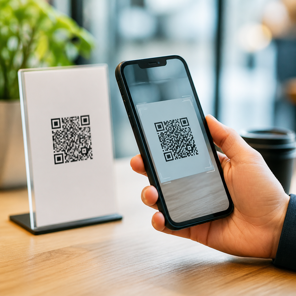
Designing mobile landing pages for QR code scans requires a different mindset than designing a standard mobile webpage, because the visitor arrives with immediate intent, limited patience, and a device already in hand. A QR code scan creates a compact journey: someone notices a code on packaging, signage, print, or a screen, scans it with a phone camera, and expects a relevant page to load fast and work perfectly. In practice, that means the landing page must match the scan context, reduce friction, and guide the next action without confusion. I have worked on QR campaigns for retail displays, restaurant tables, product packaging, trade show booths, and direct mail, and the same pattern appears every time: if the mobile experience is slow, cluttered, or misaligned with the promise near the code, conversion drops sharply.
To design well, it helps to define the core terms. A QR code landing page is the destination page opened after a scan. Mobile UX refers to the usability, speed, readability, accessibility, and ease of action on a phone-sized screen. Conversion can mean a purchase, sign-up, form completion, app download, coupon save, store visit, or content view, depending on campaign goals. This topic matters because QR scanning usually happens in moments of partial attention: in a store aisle, on a sidewalk, in a restaurant, at an event, or while opening a package. Users are often standing, moving, multitasking, or on cellular data. That environment makes mobile-first design nonnegotiable. A good QR experience respects context, answers immediate questions, and removes barriers between curiosity and action.
This article serves as a hub for best practices in mobile UX for QR code scans. It covers message match, page speed, layout, forms, accessibility, trust, analytics, and testing, with specific guidance you can apply across campaigns. The goal is simple: when someone scans, the page should feel like the obvious next step.
Match the Landing Page to the Scan Context
The first rule of designing mobile landing pages for QR code scans is message continuity. The page must clearly reflect what the user expected when scanning the code. If a poster promises a menu, show the menu immediately. If packaging offers setup instructions, load setup content above the fold. If a flyer advertises a discount, present the offer first, not a generic homepage. I have seen campaigns lose performance because teams reused one destination URL everywhere. A code on a shipping box, a code on an event badge, and a code on an in-store shelf tag should not all send users to the same catchall page.
Context includes location, timing, user intent, and urgency. A restaurant table scan should prioritize menu readability, dietary filters, and ordering. A product package scan after purchase should prioritize onboarding, warranty registration, or support. A museum label scan should prioritize quick educational content, not aggressive lead capture. Good mobile UX starts by identifying the user’s likely question at the moment of scan and answering it in the first screen.
Clarity also depends on tight copy. The page title, hero text, and primary button should confirm destination relevance in plain language. Avoid brand slogans that hide meaning. Use direct labels such as “View Ingredients,” “Activate Warranty,” “Download Event Schedule,” or “See Assembly Steps.” When the first screen reduces uncertainty, users stay.
Prioritize Speed, Stability, and Mobile Performance
QR traffic is unforgiving of delay. Because the action starts offline and moves online, any lag feels longer than it does in ordinary browsing. Performance should be treated as a conversion feature, not a technical afterthought. In audits I have run, the biggest mobile losses usually came from oversized hero images, tag-heavy pages, render-blocking scripts, and unnecessary popups. The destination page should load fast on midrange phones over variable mobile networks.
Core performance targets are well established. Largest Contentful Paint should ideally stay under 2.5 seconds, Interaction to Next Paint should remain responsive, and Cumulative Layout Shift should be close to zero. Compress images using modern formats such as WebP or AVIF, lazy-load noncritical media, minimize third-party scripts, and preload essential assets like primary fonts sparingly. If the page is built in a CMS, test templates on real devices, not only desktop emulators.
Stability matters as much as raw speed. Nothing erodes trust faster than buttons shifting while the page loads or a cookie banner covering the main action. Use fixed-height containers for images and embeds, keep the top of the page uncluttered, and make interactive elements large enough for thumbs. A QR visitor is often operating one-handed, so a stable layout supports both usability and completion.
Design the First Screen for Immediate Action
The first screen on a mobile landing page for QR code scans should answer three questions instantly: Where am I, what can I do here, and why should I do it now? That means a concise headline, a short supporting line, and one dominant call to action. Do not force users to scroll to discover value. If there are multiple possible actions, prioritize one primary path and place secondary links beneath it with lighter styling.
Visual hierarchy should favor legibility over decoration. Use strong contrast, body text that is easy to read without zooming, and generous spacing between tappable elements. Apple Human Interface Guidelines and Google Material Design both reinforce the value of touch-friendly targets and clear navigation patterns; those standards are practical benchmarks, not just aesthetic preferences. In the QR context, they directly reduce input errors and hesitation.
A strong first screen often includes trust signals relevant to the task. For a payment page, show accepted payment methods and security cues. For a healthcare form, explain privacy briefly and clearly. For a product registration page, mention estimated completion time. These small signals lower anxiety and support completion, especially when the user did not plan a long mobile session.
Simplify Navigation, Forms, and Conversion Paths
Most QR landing pages should behave like focused task pages, not miniature websites. Navigation should be limited, purposeful, and secondary to the primary action. If global site navigation is required, collapse it cleanly and keep the main CTA visible. Every extra branch creates exit risk. This is especially true for campaigns tied to print, packaging, out-of-home media, and point-of-sale placements, where the user intent is narrow and immediate.
Forms deserve special attention because they are often the highest-friction element. Ask only for essential information, enable autofill, use the correct mobile keyboard for each field type, and break long processes into clear steps with progress indicators. Labels should remain visible when users type, error messages should be specific, and validation should happen inline rather than after submission. If a task can be completed without account creation, allow guest completion.
| Mobile UX element | Best practice for QR scans | Why it improves results |
|---|---|---|
| Headline | Mirror the promise near the QR code | Confirms relevance immediately |
| Primary CTA | Show one main action above the fold | Reduces decision fatigue |
| Form fields | Request only essential data | Lowers abandonment on mobile |
| Images | Compress and size for mobile screens | Improves load speed on cellular |
| Trust signals | Place privacy, security, or policy cues near action points | Increases confidence before tapping |
When conversion paths are simple, analytics also become clearer. You can measure tap-through rates, form starts, form completions, add-to-wallet saves, click-to-call events, and location opens without untangling unnecessary page complexity. Simplicity helps users and marketers at the same time.
Make Accessibility and Readability Core Requirements
Accessible mobile UX is not optional for QR code landing pages. Scans happen across age groups, lighting conditions, device types, and physical contexts, so readable and operable design benefits everyone. Use sufficient color contrast, semantic headings, descriptive link text, alt text for meaningful images, and forms that work with screen readers. Buttons should be easy to activate without precision tapping, and content should remain understandable in portrait orientation.
Readability is especially important because many scans happen in glare, dim restaurants, transit stations, and outdoor environments. Keep paragraphs short, use plain language, and avoid walls of text before the main action. If legal or technical information is necessary, summarize key points first and provide expandable detail below. For multilingual audiences, route users to localized versions automatically when appropriate, but always allow language switching manually.
Accessibility also intersects with motion and media. Avoid autoplay video with sound, provide captions, and ensure that any animation does not distract from the primary task. A QR destination should feel calm and controllable. The best pages reduce cognitive load, which is one reason they convert better.
Build Trust Through Relevance, Privacy, and Measurement
Because QR codes can hide destination URLs until after the scan, trust is a critical part of mobile landing page design. The page should immediately reassure users that they reached a legitimate destination connected to the physical item they scanned. Brand consistency helps, but relevance helps more. If a skincare bottle QR code opens to a page that names the exact product, lot-specific information, or routine steps, the experience feels credible. If it opens to a generic homepage with a promotional carousel, confidence drops.
Privacy and permissions should be handled carefully. If location, camera, notifications, or personal data are requested, explain why before the prompt appears. Permission timing matters. Asking too early suppresses acceptance rates. For example, a store finder can first present value, then request location when the user taps “Find nearby stores.” That sequence is more respectful and more effective.
Measurement should connect scan source to business outcomes. Use distinct campaign URLs or dynamic QR codes with source parameters, but keep visible URLs clean when they appear in promotional materials. Track by placement, creative, geography, and audience segment. Then test copy, layout, CTA wording, and page length. On one packaging program I supported, changing the first button from “Learn More” to “Start Setup” increased completion because it matched post-purchase intent more precisely. That is the broader lesson: the best practices for mobile UX are not abstract rules. They are methods for helping a real person complete a real task after a scan.
Designing mobile landing pages for QR code scans works best when every decision supports context, speed, clarity, accessibility, and trust. The visitor has already taken an action in the physical world, so the digital follow-through must feel immediate and effortless. Match the page to the promise beside the code, keep performance fast on mobile networks, design the first screen around one clear next step, remove form and navigation friction, and make readability and accessibility part of the baseline standard.
As the hub for mobile QR code design and UX, this guidance should shape every related page in your content structure, from scan tracking to CTA copy, form optimization, localization, and post-scan analytics. Strong mobile UX is the difference between curiosity and conversion. Audit your current QR destinations on real phones, fix the first-screen experience first, and build each landing page around the user’s immediate intent.
Frequently Asked Questions
What makes a mobile landing page for QR code scans different from a standard mobile webpage?
A mobile landing page for QR code scans serves a visitor who is already in the middle of an action. They have noticed a code, decided it is worth scanning, opened their camera, and expect an immediate payoff. That level of intent is much stronger than a typical mobile browse session, but patience is also much lower. The user is often standing in a store aisle, walking through an event, looking at packaging, or viewing a poster in a public place. They are not arriving to explore broadly. They are arriving to complete a very specific next step.
Because of that, the page should feel like a continuation of the QR code experience rather than a generic website entry point. The headline, imagery, offer, and call to action should closely match whatever the person scanned. If the code appeared on product packaging promising setup instructions, the landing page should immediately present setup guidance, not a general brand homepage. If the code was on a restaurant table for a menu, the menu should load first, not a splash screen asking users to navigate further.
Design priorities also shift. Speed becomes essential, navigation can be simplified dramatically, and every element should support clarity and completion. Large tap targets, readable text, minimal form friction, and fast-loading content matter more than decorative features. In short, standard mobile web design often supports discovery, while QR code landing page design should support instant relevance, confidence, and action.
How can I make sure the landing page matches the context of the QR code scan?
The best way to match scan context is to design from the physical moment backward. Start by asking where the QR code appears, what the user is doing when they see it, and what promise or expectation the code creates. A code on retail packaging suggests product-specific information. A code on event signage may suggest schedules, directions, tickets, or registration. A code on a direct mail piece might imply a limited-time offer or a continuation of a campaign message. The landing page should reflect that exact scenario without making the visitor interpret what to do next.
Message continuity is critical. The wording around the QR code, the visual style of the printed or displayed asset, and the landing page itself should feel connected. Consistent headlines, supporting copy, product names, and promotional language reassure users they landed in the right place. This is especially important because some people remain cautious about scanning unknown codes. Strong continuity reduces hesitation and increases trust.
Context matching also includes technical and situational factors. If users are likely to scan in low-connectivity environments, keep the page lightweight. If they are scanning while standing, prioritize quick interactions over long reading sessions. If they are scanning from packaging after purchase, offer usage help, registration, or support before trying to upsell. If they are scanning before purchase, lead with benefits, proof, or an offer that supports conversion. The more precisely the landing page reflects the reason for the scan, the better the engagement and completion rate will be.
What are the most important design elements to prioritize on a QR code landing page?
The first priority is a clear, immediate value proposition above the fold. Users should understand within seconds what the page is for and what they should do next. A concise headline, brief supporting text, and one prominent call to action usually outperform pages that present too many competing options. This is not the place for cluttered navigation, multiple banners, or dense introductions. Clarity wins.
The second priority is usability on an actual handheld device. That means large tap-friendly buttons, legible font sizes, sufficient contrast, and layouts that do not force zooming or precise finger movements. Forms should be short and easy to complete. If data entry is required, ask only for what is absolutely necessary. Use mobile-friendly input types, autofill support, and clear validation to reduce frustration. Every extra field adds friction, and QR visitors are especially likely to abandon if the experience feels slow or tedious.
The third priority is performance. Compress images, minimize scripts, remove unnecessary pop-ups, and avoid heavy interactive elements that delay access to the core content. A QR scan often happens in a moment of interrupted attention, so even small delays can hurt outcomes. Beyond speed, trust signals are also valuable. Brand identifiers, secure connection indicators, recognizable product imagery, concise reassurance copy, and transparent privacy messaging can all help confirm that the page is legitimate and safe to use. When these essentials are combined, the page feels fast, relevant, and reliable.
How do I reduce friction and increase conversions after someone scans a QR code?
Reducing friction starts with respecting the visitor’s intent. Do not force them through unnecessary steps before delivering the thing they expected. If they scanned for a coupon, show the coupon. If they scanned for installation instructions, surface those instructions immediately. If they scanned to buy, bring them directly to the product or checkout path. One of the most common mistakes is routing QR traffic to a general homepage or an overly broad landing page that asks users to hunt for the next step.
It also helps to simplify choices. Too many links, sections, or calls to action can weaken momentum. A focused page with one primary action and perhaps one secondary fallback option usually performs better. For example, a product page might prioritize “Buy Now” while also offering “Learn More” below it. This structure supports both ready-to-convert users and those who still need reassurance without overwhelming either group.
Trust and convenience play major roles in conversion. Include concise social proof, testimonials, ratings, product benefits, or FAQs if they help users decide quickly. Keep forms short, support mobile wallets or streamlined checkout where relevant, and eliminate any element that interrupts the journey, such as intrusive interstitials or mandatory account creation too early in the process. If analytics show drop-off points, refine those sections relentlessly. QR code traffic is often high-intent traffic, so even modest friction reductions can produce meaningful conversion gains.
How should I measure the performance of mobile landing pages designed for QR code scans?
Measurement should begin with the purpose of the QR code itself. Different campaigns require different success metrics. If the code is meant to drive purchases, track conversion rate, checkout completion, revenue per visit, and cart abandonment. If the goal is engagement, track time to key action, click-through rate on the primary button, scroll depth where useful, and content completion. If the QR code supports customer service or onboarding, look at task completion, support deflection, repeat visits, and whether users resolve their need without escalation.
It is especially important to connect performance data to scan context. Segment by QR code placement, campaign source, product line, geographic location, or creative version when possible. A code on packaging may behave very differently from one on a window display or trade show booth. Dynamic QR codes and tagged URLs can help you attribute results accurately and compare outcomes across placements. This level of segmentation often reveals that the landing page itself is not the only variable; the environment, audience intent, and promise made by the code also influence performance.
Finally, evaluate both technical and behavioral signals. Page load speed, bounce rate, device-specific issues, broken deep links, and form errors can all undermine otherwise strong campaigns. Pair those diagnostics with user behavior data such as tap patterns, exit points, and CTA engagement. Then test improvements systematically. Shorter copy, stronger headlines, alternate CTAs, fewer form fields, and different content hierarchies can all make a measurable difference. The strongest QR landing page strategies are built on continuous optimization, where design decisions are informed by real scan behavior rather than assumptions.





