QR codes have moved from novelty to core marketing infrastructure, yet many campaigns still underperform because brands treat the square pattern as a tactic instead of a customer journey tool. In digital marketing, a QR code is a scannable bridge between an offline or on-screen touchpoint and a digital destination such as a landing page, app download, coupon, video, form, or payment screen. I have implemented QR programs for retail stores, events, packaging, direct mail, restaurant menus, and out-of-home media, and the pattern is consistent: results depend less on the code itself than on strategy, context, and measurement. When marketers ask why a QR campaign failed, the answer is usually not “people do not scan anymore.” Smartphone cameras now support native scanning on iPhone and Android, and consumer behavior changed permanently during the pandemic, when touchless menus, payments, and check-ins became routine. The real problem is avoidable execution errors. Understanding common QR code marketing mistakes matters because QR codes sit at the intersection of mobile experience, creative design, analytics, privacy, and conversion optimization. A code can increase response rates from print, connect social traffic to owned channels, shorten checkout friction, and tie physical assets to measurable digital outcomes. It can also waste paid media spend if the destination is slow, irrelevant, or impossible to use. This hub explains the mistakes that undermine performance and how to prevent them, so every scan supports a broader digital marketing goal.
Using QR Codes Without a Clear Conversion Goal
The most common mistake is launching a QR code without defining what success looks like. A QR code should map to one primary action: subscribe, buy, book, redeem, register, watch, review, or learn. If the destination asks users to do five things, conversion rates drop because intent gets diluted. In one retail campaign I audited, shelf talkers linked to the brand homepage rather than the product page. Scan volume looked healthy, but revenue impact was nearly impossible to trace because users had to search again after landing. Replacing that destination with a product-specific mobile page and a visible “add to cart” button improved conversion efficiency immediately. Effective QR marketing starts with campaign architecture. Set a single objective, match the landing experience to the scan context, and define metrics before launch. For awareness, track engaged sessions and video completion. For lead generation, track form completion rate and cost per lead. For commerce, track revenue per scan, assisted conversions, and coupon redemptions. If the code appears on packaging, the goal might be product education or replenishment. If it appears in email or social graphics, the goal might be app adoption or event registration. Clear goals prevent vague reporting and make optimization possible.
Sending Scanners to a Poor Mobile Experience
Every QR scan is a mobile interaction, so a weak mobile landing page ruins the campaign. Marketers often spend heavily on packaging, posters, mailers, or display creative, then send users to a generic page that loads slowly, buries the offer, or forces unnecessary navigation. Core Web Vitals matter here because QR traffic is highly intent-driven and highly impatient. If the page stalls on mobile data, people abandon within seconds. The fix is straightforward: build dedicated mobile-first landing pages with concise copy, prominent calls to action, compressed images, and minimal form fields. Use responsive design, test on multiple devices, and check the full flow on both Wi-Fi and cellular networks. When I review QR campaigns, I look for three friction points first: page speed, message match, and tap ergonomics. Message match means the promise near the code should be the first thing users see after scanning. If a sign says “Scan for 20% off,” the landing page should open with that exact offer, not a generic hero banner. Tap ergonomics means buttons must be easy to hit one-handed, autofill should work, and checkout or signup should require as few steps as possible. A QR code does not rescue a bad mobile funnel; it magnifies it.
Ignoring Placement, Size, Contrast, and Context
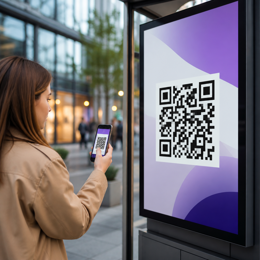
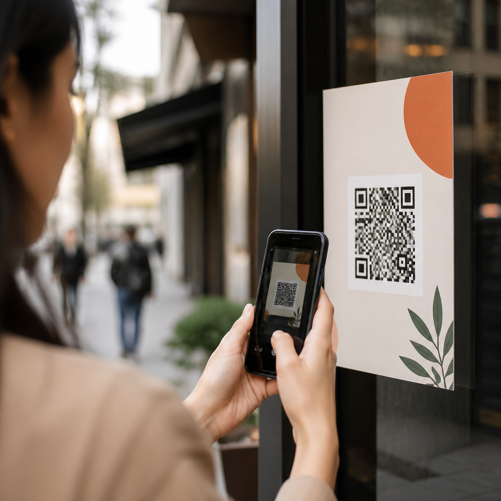
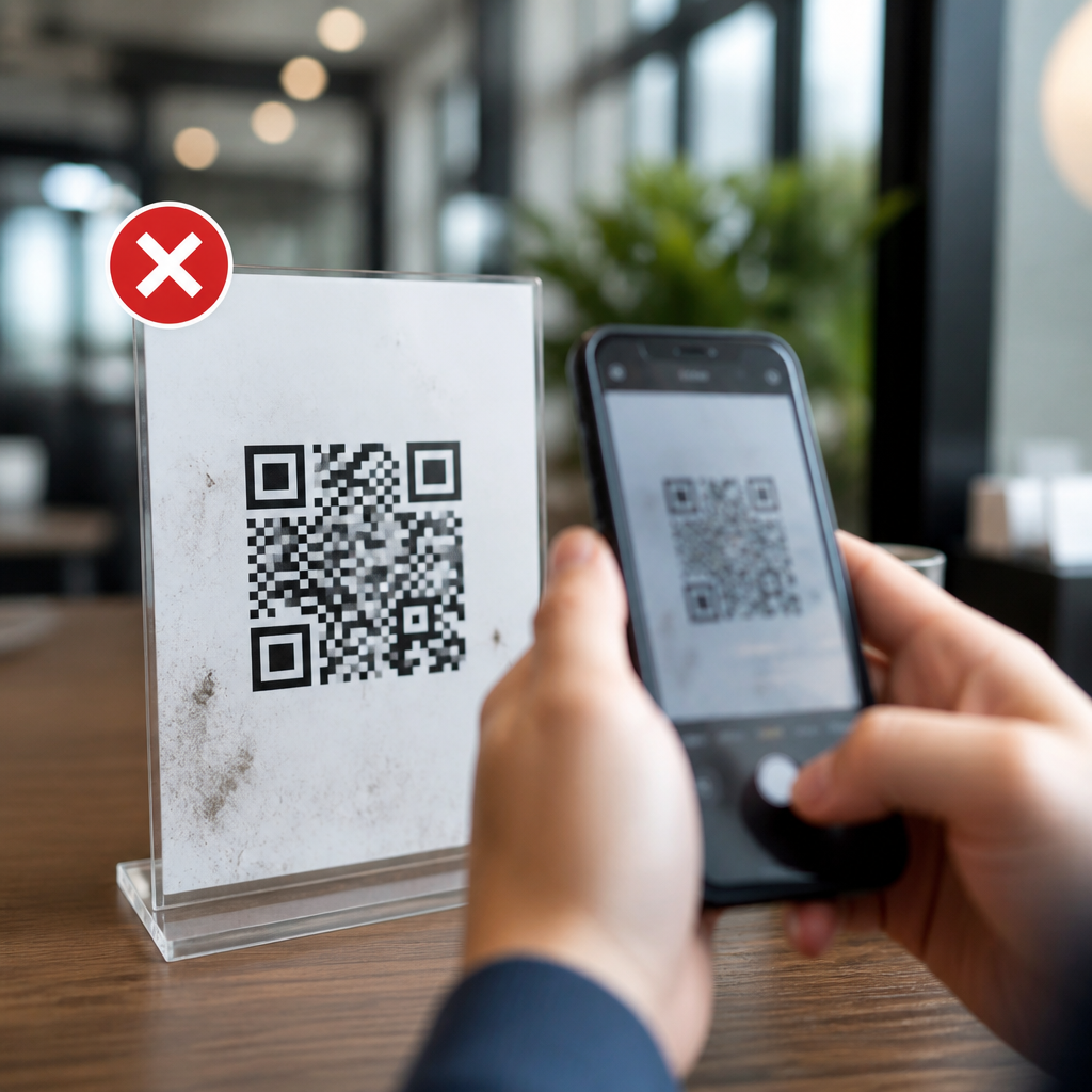
Many QR code failures are physical design failures. A code can be technically valid and still practically unusable if it is too small, low contrast, curved around packaging seams, placed behind reflective glass, or shown where people cannot stop and scan safely. Good QR placement begins with scanning distance. As a working rule, the farther away the audience stands, the larger the code must be. A tiny code on a transit poster is wasted because commuters cannot approach it easily. Contrast is equally important: dark modules on a light background scan best, while reversed colors, busy textures, and low-contrast brand palettes reduce reliability. Quiet zone spacing around the code must remain intact; crowding it with logos, copy, or borders can break detection. Context also matters. A restaurant table tent supports immediate action because diners are stationary. A highway billboard does not, because scanning while driving is unsafe and unrealistic. On product packaging, place the code where hands naturally hold the item without creasing the pattern. In-store, pair codes with concise instructional copy such as “Scan to compare sizes” or “Scan for ingredient details.” People scan more when the benefit is explicit and the code is easy to access in the moment.
Failing to Track, Test, and Govern QR Campaigns
Untracked QR codes create blind spots in attribution. Static codes that point directly to final URLs may work for simple evergreen use cases, but most marketing teams need dynamic QR codes, UTM parameters, and analytics integration to measure performance and update destinations without reprinting assets. In practice, I recommend governance before scale: define naming conventions, campaign taxonomy, redirect rules, and ownership. If one team names sources “poster,” another uses “ooh,” and a third leaves tags blank, reporting becomes unreliable. Dynamic platforms such as Bitly, QR Code Generator PRO, Flowcode, and Beaconstac can centralize redirects and scan data, though organizations should still reconcile those numbers with Google Analytics 4, Adobe Analytics, or CRM conversion records. A/B testing is often overlooked. Test call-to-action language, offer framing, destination format, and placement. Even small changes, like “Scan to claim your sample” versus “Learn more,” can materially affect response. The table below shows common campaign choices and their likely effect.
| Campaign choice | Better option | Why it performs better |
|---|---|---|
| Homepage destination | Dedicated landing page | Improves message match and shortens the path to conversion |
| Static QR code | Dynamic QR code | Allows edits, testing, and scan tracking after print production |
| No UTM tagging | Standardized campaign parameters | Enables channel attribution in analytics platforms |
| Small code in branded colors | High-contrast code sized for distance | Increases scan reliability across devices and lighting conditions |
| Vague CTA | Specific value-led CTA | Clarifies the benefit and raises scan intent |
Governance also includes expiration management and link integrity. I have seen expensive packaging runs point to discontinued pages because nobody assigned a URL owner. Maintain a redirect inventory, review destinations regularly, and document what happens if an offer ends early. Measurement is not optional; it is the difference between a scannable graphic and a manageable acquisition channel.
Overcomplicating the User Journey After the Scan
Another costly mistake is assuming the scan itself is the conversion. It is only the entry point. After scanning, users should encounter the shortest possible path to value. Long forms, forced app downloads, age gates with poor usability, irrelevant pop-ups, cookie banners that obscure the call to action, and account creation walls all reduce completion rates. This problem appears often in lead generation. A code on a trade show banner may attract strong intent, but if the form asks for ten fields and sends users to a desktop-style confirmation page, most will abandon. A better approach is progressive profiling: ask for email first, collect additional data later, and connect the form to marketing automation such as HubSpot, Marketo, or Salesforce. For commerce, mobile wallet support, autofill, and guest checkout matter more than elaborate design. For content marketing, consider whether the user really needs a PDF download or whether a fast, readable web page would perform better. The right journey depends on intent, but the principle is universal: each extra step must earn its place. If a scan is motivated by convenience, the post-scan experience must preserve that convenience from start to finish.
Neglecting Trust, Accessibility, and Compliance
People are more cautious online, and they should be. A QR code hides the destination until after the scan, so trust signals must be visible around it and on the landing page. Brands make mistakes when they use unlabeled codes, unfamiliar short links, or aggressive data collection without explanation. Tell users what they will get, who is providing it, and whether any download is required. On the page, use HTTPS, recognizable branding, privacy links, and concise consent language where needed. Accessibility is just as important. Provide nearby text alternatives, avoid placing critical information only behind the code, and ensure destination pages work with screen readers, keyboard navigation, adequate color contrast, and readable font sizes. Compliance requirements vary by sector. Healthcare, finance, alcohol, and promotions each bring extra constraints, from age verification to consent and recordkeeping. International campaigns may also trigger GDPR or regional privacy obligations. Marketers who ignore these details risk more than low conversion rates; they risk complaints, mistrust, and regulatory exposure. A QR code campaign performs best when users feel safe scanning and confident completing the next step.
The best QR code marketing is not flashy; it is intentional, measurable, and easy to use. Avoid the mistakes that hurt performance most: unclear goals, weak mobile destinations, poor physical design, missing analytics, overlong journeys, and absent trust signals. When those basics are handled well, QR codes become one of the most efficient tools in digital marketing because they connect physical attention to digital action with very little friction. They can support product education, lead capture, app growth, loyalty, payments, reviews, and sales, but only when the scan experience is planned end to end. Treat each code as part of a larger conversion system, not a standalone graphic. Start with one clear objective, build a fast mobile page, use dynamic links and standardized tracking, test creative and placement, and review destinations regularly. If you are building out a broader mobile QR strategy, use this article as your hub and audit every live code against these standards before the next campaign launches.
Frequently Asked Questions
What is the most common QR code marketing mistake brands make?
The most common mistake is treating the QR code itself as the campaign instead of treating it as the entry point to a larger customer journey. A QR code is not the value proposition; it is simply the bridge between a physical or visual touchpoint and a digital experience. When brands place a code on packaging, signage, direct mail, menus, event displays, or advertisements without thinking through what happens after the scan, performance usually suffers. People do not scan because a code exists. They scan because they expect something useful, convenient, exclusive, or relevant on the other side.
In practice, this mistake shows up in several ways: linking to a generic homepage, sending all traffic to the same destination regardless of context, failing to match the landing page to the offer shown near the code, or making the next step unclear. For example, if a shopper scans a QR code on a retail shelf expecting product details and lands on a broad corporate website, that disconnect creates friction and reduces trust. The same is true if someone scans a restaurant table code and has to dig through multiple pages before finding the menu or payment option.
The fix is to build the experience backward from user intent. Ask what the customer wants in that exact moment, what problem they are trying to solve, and what action you want them to take next. Then create a destination designed for that scenario, whether that is a mobile-optimized product page, coupon redemption page, video demo, event registration form, app install page, loyalty sign-up flow, or payment screen. The strongest QR campaigns feel seamless because the code, message, placement, and landing experience all work together as one journey.
Why do so many QR code campaigns fail to generate scans or conversions?
Most underperforming QR code campaigns fail because they do not give people a compelling reason to scan, and they often introduce friction at the exact moment curiosity is highest. A QR code by itself does not communicate value. If the surrounding copy, design, and placement do not answer the question “Why should I scan this right now?” many people will ignore it. This is especially true in crowded retail environments, busy event spaces, direct mail pieces competing for attention, and out-of-home placements where viewers have only seconds to decide.
Another major reason is weak placement and poor usability. Codes may be too small, placed too high or too low, printed with inadequate contrast, distorted by curved packaging, hidden in visually noisy layouts, or displayed where internet access is weak. Sometimes campaigns rely on indoor signage or event booths where attendees have limited connectivity, making the post-scan experience slow or unreliable. In other cases, the code leads to a landing page that loads slowly, is not mobile-friendly, or requires too many steps to complete the intended action. Every extra second and every unnecessary field in a form can hurt conversion rates.
Successful QR campaigns solve both the motivation and execution sides of the equation. They present a clear call to action, such as “Scan to see today’s offer,” “Scan for setup instructions,” or “Scan to watch a 30-second demo.” They also reduce friction by using mobile-first destinations, fast-loading pages, concise forms, and strong visual hierarchy around the code. In short, people scan when there is immediate perceived value, and they convert when the post-scan experience is easy, relevant, and fast.
Should a QR code send users to a homepage or to a dedicated landing page?
In most cases, a QR code should send users to a dedicated landing page rather than a homepage. Homepages are designed to serve broad audiences with many different goals, but QR code traffic is usually context-specific and intent-driven. If someone scans a code on product packaging, a point-of-sale display, a flyer, a menu, or an event badge, they are signaling interest in something very particular. Sending them to a homepage forces them to navigate, search, and interpret where to go next, which adds friction and lowers the odds of conversion.
A dedicated landing page performs better because it can match the exact context of the scan. It can continue the message from the physical asset, repeat the offer, reinforce trust, and present one clear next step. For example, a packaging QR code might lead to assembly instructions, recipes, product authentication, warranty registration, or replenishment ordering. A direct mail QR code might open a personalized offer page. An event QR code might launch a session schedule, lead capture form, or digital brochure. When the destination reflects the reason the person scanned in the first place, the experience feels intentional rather than random.
There are also measurement benefits. Dedicated landing pages make it easier to attribute performance by campaign, audience, placement, geography, or creative variation. That lets marketers test calls to action, compare print placements, optimize offers, and understand where conversions are actually coming from. Dynamic QR codes make this even more useful because the destination can be updated without reprinting the code. The bottom line is simple: if you care about user experience, conversion rate, and analytics quality, a purpose-built landing page is usually the smarter choice.
How important is testing and tracking in a QR code marketing campaign?
Testing and tracking are essential. One of the biggest mistakes brands make is launching QR codes into the market without validating scan reliability, destination performance, device compatibility, and measurement setup. Because QR codes often connect offline media to digital outcomes, they can create the false impression that performance is hard to measure. In reality, with the right setup, QR campaigns can be highly trackable. The problem is not that measurement is impossible; it is that many campaigns are deployed without a clear analytics plan.
Before launch, every code should be tested under real-world conditions. That includes different smartphone models, camera apps, lighting conditions, distances, print materials, and display sizes. A code that scans perfectly on a desktop proof may fail on reflective packaging, low-contrast signage, or small-format print. The destination should also be tested for page speed, responsive design, browser behavior, form completion, app deep-linking, and fallback experiences if an app is not installed. If the QR code leads to payments, downloads, or registrations, those conversion paths need end-to-end quality assurance.
Tracking matters just as much. At a minimum, campaigns should use analytics parameters, event tracking, conversion goals, and reporting segmented by placement or channel. Dynamic QR platforms can provide scan data such as time, location, device type, and repeat scan patterns, while website analytics can show bounce rate, engagement, and downstream conversions. That combination helps marketers identify whether a problem is happening before the scan, at the scan, or after the scan. Without testing and tracking, teams are forced to guess. With them, QR marketing becomes an optimization discipline rather than a one-time print tactic.
What are the best ways to avoid customer frustration when using QR codes in marketing?
The best way to avoid customer frustration is to design for convenience, clarity, and trust at every step. People use QR codes because they expect speed. If scanning leads to confusion, delays, or extra work, the experience feels like a broken promise. Common frustration points include unclear instructions, irrelevant destinations, slow loading pages, forms that ask for too much information, content that is not optimized for mobile, and experiences that require users to download an app before receiving value. These issues are especially damaging in environments where the scan is meant to solve an immediate need, such as restaurant ordering, event check-in, product setup, coupon redemption, or in-store product research.
To reduce frustration, make the purpose of the code obvious. Add a direct call to action and set expectations clearly, such as “Scan to view ingredients,” “Scan to reorder in 10 seconds,” or “Scan for event map and schedule.” Use a clean, high-contrast code that is easy to scan, and place it where people can comfortably access it. The landing page should load quickly, reflect the message near the code, and make the next action simple. If you need data collection, ask only for the minimum required information. If a code leads to a video, menu, coupon, or instruction guide, users should reach that asset immediately.
Trust is another major factor. Users are increasingly cautious about where codes may lead, so brands should reinforce legitimacy with recognizable branding, secure pages, and consistent visual cues. Whenever possible, use branded short links or preview text near the code to give users confidence. Also consider accessibility and edge cases: provide fallback URLs for people who cannot scan, ensure pages are readable on smaller screens, and avoid experiences that break on older devices. The strongest QR programs feel intuitive because they respect the user’s time and remove obstacles rather than adding them.