
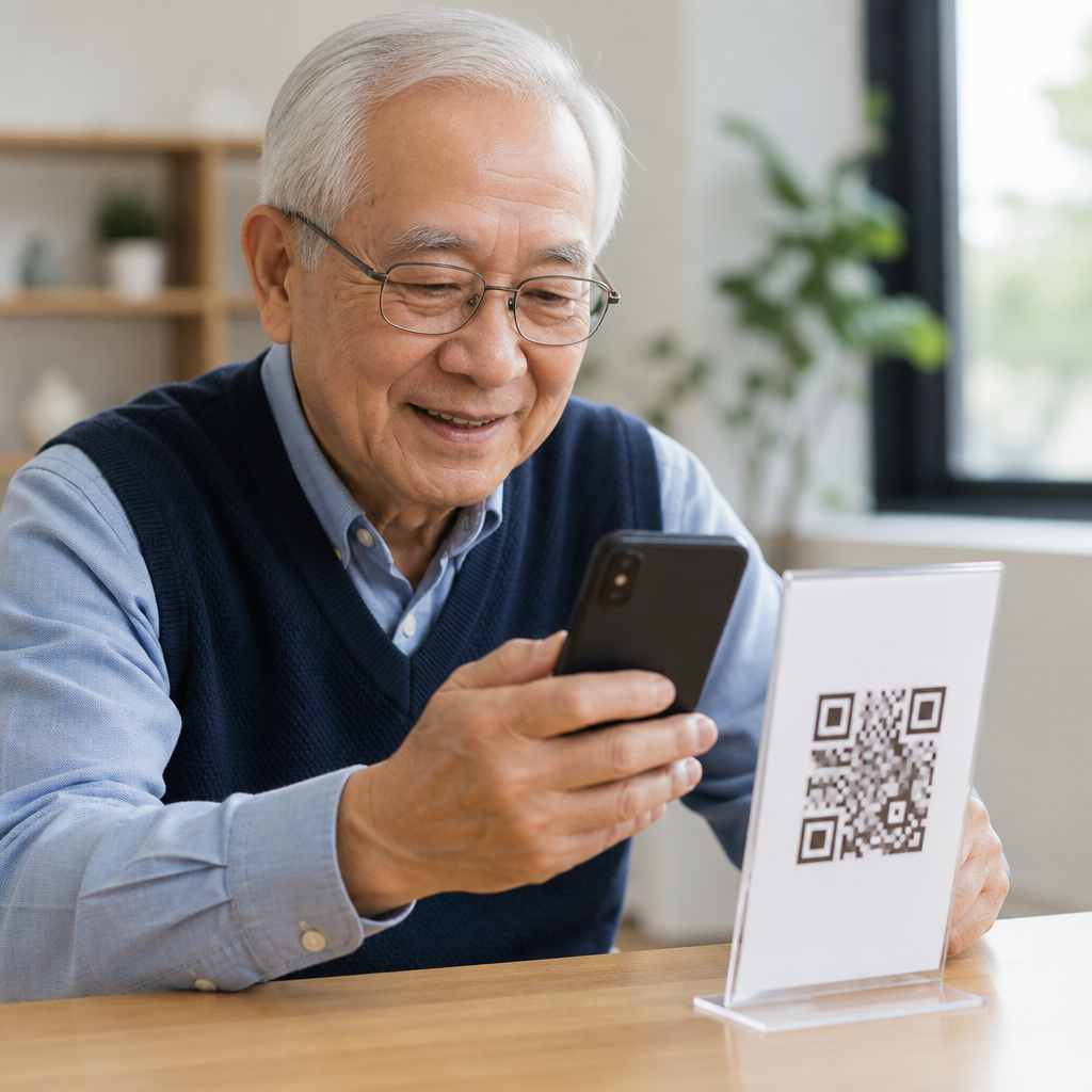
QR codes are now part of everyday services, from restaurant menus and appointment check-ins to prescription instructions and transit tickets, yet many older adults still face preventable barriers when asked to scan one. Improving QR code usability for seniors means designing the code, the surrounding instructions, and the mobile experience so that age-related changes in vision, dexterity, cognition, hearing, and confidence do not turn a simple action into a failed task. In practice, accessibility considerations include code size, contrast, placement, lighting, instruction clarity, error recovery, device compatibility, and the availability of non-QR alternatives. I have seen well-intentioned campaigns fail because the code was technically valid but practically unusable: printed too small on glossy paper, mounted too high, paired with tiny text, or linked to a page with cluttered navigation. When organizations address these issues early, scan success rises, support calls drop, and seniors gain more independent access to health information, community services, payments, and communication tools.
For seniors, “usable” does not simply mean that a smartphone camera can detect the code. It means the full journey works under realistic conditions: noticing the code, understanding what it does, opening the camera or scanner, holding the phone steadily, trusting the destination, reading the landing page, and completing the next step without frustration. Older adults are not a single group. Some are daily smartphone users with strong digital habits, while others use mobile devices only for calls, photos, or messaging. Design therefore must reduce cognitive load, support slower interaction speed, and make outcomes predictable. Accessibility considerations matter commercially and ethically because populations are aging, service delivery is increasingly digital, and exclusion often starts with small design decisions. A senior-friendly QR code experience benefits everyone, especially users in bright sunlight, with limited literacy, or under time pressure.
Start with physical design that can actually be scanned
The first requirement is simple: the code must be easy to see and easy for a camera to capture. For seniors, that usually means printing larger than teams expect. A practical baseline for posters, signs, brochures, medication inserts, and countertop displays is at least 1.2 to 1.5 inches square for close-range scanning, and larger when the viewing distance increases. The code also needs a clean quiet zone, the empty margin around it, because surrounding graphics can interfere with detection. High contrast is essential; black on white remains the safest choice. Light gray, pastel, metallic finishes, and transparent overlays reduce reliability, particularly in dim environments or for users with low vision. Avoid glossy lamination where overhead lighting creates glare. If the code must sit behind glass, test it under actual lighting conditions.
Placement affects usability as much as size. I recommend mounting codes between chest and eye level whenever possible so users do not need to crouch, bend, or raise a shaky arm overhead. Leave enough physical space for a person using bifocals, a walker, or a wheelchair to stop and aim a phone steadily. On printed mailers, do not place the code near folds, curved bottle surfaces, or page gutters where distortion can break scan recognition. Seniors also benefit from a short distance cue such as “Scan from 6–10 inches away” because many unsuccessful users hold the phone too close. If the environment is noisy or busy, repeat the code in more than one location rather than forcing users to queue and rush. Basic physical ergonomics often determine whether any digital accessibility improvement will matter.
Write instructions that remove uncertainty
Many seniors hesitate not because they cannot scan, but because they are unsure what will happen next. Clear microcopy increases trust and completion rates. The text beside a code should answer three questions directly: what to do, what the code opens, and whether the destination is safe. “Open your phone camera and point it at the square. Tap the link to view your appointment details on Mercy Clinic’s secure site” is better than “Scan me.” When a dedicated app is required, say so before the scan. When no app is needed, state that plainly. This reduces abandonment among users who assume they must download unfamiliar software.
Instructions should use large type, plain language, and strong visual hierarchy. A minimum print size around 14 to 16 points for nearby reading is a reasonable floor, with larger sizes for signage. Pair text with a simple icon showing a phone scanning a code. Numbered steps help users who process information sequentially, especially when anxiety is high. If the code leads to sensitive actions such as payment, identity verification, or medical records, add reassurance by naming the organization and the exact purpose. Trust matters because seniors are often, correctly, cautious about scams and phishing. I have seen scan rates improve when teams replaced clever marketing phrases with direct language and included the visible destination domain. Predictability reduces fear, and lower fear improves task completion.
Design the destination page for aging-related needs
A QR code is only the doorway; accessibility fails most often on the landing page. Seniors need pages that load fast, present one primary action, and avoid clutter. Use responsive design, large tap targets, clear labels, and high color contrast that aligns with WCAG guidance. Body text should usually be at least 16 pixels, but larger text often performs better for older audiences, especially when instructions are procedural. Buttons should be comfortably tappable, ideally with ample spacing to prevent accidental presses from tremor or reduced fine motor control. Forms should ask for the minimum necessary information and support autofill where appropriate.
Cognitive accessibility is equally important. Break tasks into short steps, keep terminology consistent, and avoid disappearing instructions. If users must sign in, explain why. If a verification code is sent by text, tell them what to expect and how long it takes. Error messages should say what went wrong and how to fix it in plain terms, such as “The birth date must use month/day/year.” For video or audio content, provide captions and transcripts. For maps or event check-ins, offer a text alternative. Seniors often use browser zoom; layouts should remain functional at 200 percent. The best mobile QR code design and UX work treats the linked page as part of the scan experience, not a separate project.
Support different devices, habits, and confidence levels
Older adults use a wide mix of phones, operating systems, and camera behaviors. Some rely on the native camera app, others use Google Lens, and some still have devices where scanning behavior is inconsistent. Because of that variability, instructions should avoid assuming one exact interface. Say “Open your camera” rather than “Tap the Lens icon” unless your audience uses a managed device fleet with standardized settings. Test on recent iPhones, older Android devices, budget phones, and tablets. Watch for autofocus delays, weak low-light performance, and browser incompatibilities after the scan.
Confidence is another usability variable. Seniors who have had one bad scanning experience may approach future codes cautiously. Build recovery paths into the design. Always print a short, easy-to-type URL near the code. For critical services, also provide a phone number and, when practical, an NFC or SMS option. The goal is access, not forcing one channel. The table below summarizes the accessibility considerations that most often improve outcomes in real deployments.
| Area | Recommended practice | Why it helps seniors |
|---|---|---|
| Code size | Use at least 1.2–1.5 inches for close-range print | Improves visibility and camera detection |
| Contrast | Prefer black code on white background | Supports low vision and weak lighting |
| Placement | Position between chest and eye level | Reduces strain and shaky aiming |
| Instructions | State what happens after scanning | Builds trust and lowers confusion |
| Fallbacks | Add short URL and phone support | Prevents dead ends when scanning fails |
| Landing page | Use large text and simple actions | Helps reading, tapping, and comprehension |
Address visual, motor, and cognitive accessibility directly
Accessibility considerations for seniors become clearer when mapped to common age-related changes. For vision, prioritize larger codes, larger text, high contrast, matte materials, and adequate lighting. Avoid relying on color alone to convey meaning. For motor accessibility, reduce the need for precision by leaving generous whitespace around the code and ensuring the next on-screen steps use large controls. If scanning happens in a standing environment, provide a shelf, ledge, or stable surface nearby. For cognition, keep instructions short, avoid jargon, and preserve a linear path from scan to completion. Every extra branch raises the chance of abandonment.
Hearing may also be relevant when the destination includes spoken guidance or support. Captions, transcripts, and readable summaries ensure equal access. Trust and security are part of accessibility too. Seniors are frequent targets of QR phishing, sometimes called quishing, so organizations should use branded domains, HTTPS, and recognizable page titles. If the page requests payment or personal information, explain why and display support contact details prominently. In healthcare, finance, and government settings, this transparency is indispensable. The most accessible experience is one users can understand, operate, and believe.
Test with seniors in real environments, then iterate
The most reliable way to improve QR code usability for seniors is to observe them using the experience in the place it will actually appear: a pharmacy counter, bus stop, waiting room, bulletin board, or mailed letter. Lab-only testing misses glare, noise, rushed interactions, weak connectivity, and the hesitation people feel when they think they may “do it wrong.” Run moderated tests with adults across different ages, device types, and digital skill levels. Measure more than scan success. Track time to first successful scan, need for staff assistance, completion of the destination task, and confidence afterward.
Use findings to refine both print and digital elements. If users squint, enlarge type and increase contrast. If they scan successfully but stop at the page, simplify the content and call to action. If they mistrust the code, make the organization name and domain more prominent. When analytics show many scans but low conversions, the issue is rarely the code itself; it is usually the page, the instructions, or the expectation mismatch. Teams managing a sub-pillar hub on Mobile QR Code Design & UX should connect this accessibility page to deeper guidance on QR code size, instruction writing, mobile form usability, error prevention, and scam-resistant design. Start with one audit of your highest-traffic QR touchpoints, test with seniors, and fix the barriers that block independence first.
Frequently Asked Questions
Why do many seniors have trouble using QR codes in the first place?
Many older adults do not struggle with QR codes because they are unwilling to use technology, but because the experience often ignores common age-related changes and everyday context. Scanning a code can require several steps at once: noticing the code, understanding what it is for, opening the correct app or camera, holding the phone steadily, getting close enough for the camera to focus, trusting the result, and then navigating whatever website or form appears next. If any one of those steps is poorly designed, the entire interaction can fail.
Vision changes are a major factor. Smaller QR codes, low color contrast, glossy surfaces, poor lighting, and cluttered backgrounds can make a code physically hard to see or scan. Dexterity and mobility also matter. Arthritis, tremors, limited hand strength, and reduced shoulder or neck mobility can make it difficult to hold a phone at the right angle, especially if the code is posted too high, too low, or behind glass. Cognitive load plays a role as well. If the instructions are vague, full of jargon, or presented in tiny text, users may not know whether to use the camera, a QR reader app, or a browser.
Confidence and trust are equally important. Some seniors are understandably cautious about scams, so they may hesitate to scan an unfamiliar code without reassurance about where it will lead. Others may worry that pressing the wrong button will break something, create a charge, or expose personal information. In many cases, the problem is not the QR code itself but the lack of accessible design around it. Clear labeling, larger code sizes, better placement, plain-language instructions, and a predictable mobile destination can dramatically improve success rates.
What makes a QR code itself easier for seniors to scan successfully?
A senior-friendly QR code begins with physical usability. The code should be large enough to scan comfortably without requiring precise positioning. As a practical rule, avoid tiny codes squeezed into corners or printed as an afterthought. Provide generous sizing based on viewing distance, and leave enough clear space around the code so the camera can detect it easily. High contrast is essential: a dark code on a light matte background is usually best. Avoid low-contrast color combinations, decorative patterns, gradients, or busy backgrounds that interfere with recognition.
Placement matters just as much as print quality. Put the code at a natural standing or seated viewing height, with enough room for someone to approach and hold a phone steadily. Codes placed on the floor, behind reflective plastic, on curved surfaces, or in dim hallways create unnecessary difficulty. Good lighting helps the camera focus and helps the user see what they are doing. If the code is displayed on a screen, make sure it is bright, stable, and not partially obscured by glare or animation.
It also helps to give the QR code clear context. Label it with a short explanation such as “Scan to view prescription instructions” or “Scan to check in for your appointment.” That reduces uncertainty and makes the purpose immediately understandable. If the code opens something time-sensitive or important, the destination should load quickly and display content that is readable without pinching and zooming. In other words, the usability of the code depends not only on scan accuracy but on whether the entire experience is easy, reassuring, and forgiving from start to finish.
How should instructions be written so seniors know exactly how to use a QR code?
The best instructions are short, specific, and written in plain language. Instead of assuming everyone knows what to do, tell users exactly what action to take. For example: “Open your phone camera, point it at the square code, and tap the link that appears.” That is far more helpful than simply writing “Scan here.” Good instructions remove guesswork, especially for people who may not use QR codes often or who have had inconsistent experiences across different devices.
Typography and layout are important. Use large, legible text, strong contrast, and enough spacing so the instructions can be read comfortably without strain. Avoid technical terms unless they are truly necessary. If there are device differences, acknowledge them simply. For instance, some users may need to open the camera app, while others may use a built-in scanner or accessibility feature. If the environment allows it, include a small visual sequence showing the steps. A straightforward visual cue can help users who process information better through images than text alone.
Instructions should also address trust and expectations. Tell users what will happen after they scan, such as “A webpage with today’s menu will open” or “You will be taken to the appointment check-in page.” If the process involves entering personal information, say so clearly. When possible, add a backup option such as a short web address, phone number, or staff assistance. That way, the QR code is offered as a helpful path, not the only path. Seniors are much more likely to succeed when the instructions are readable, the next step is obvious, and alternative support is visible nearby.
What should happen after the scan to make the experience more accessible for older adults?
The post-scan experience is where many accessibility efforts break down. A QR code may scan perfectly, but if it opens a page with tiny text, confusing navigation, pop-ups, auto-playing media, or time-limited forms, the interaction still fails. For seniors, the destination should be mobile-friendly, fast to load, and easy to understand immediately. Important information should appear near the top of the page, with clear headings, large touch targets, and readable text that does not require zooming.
Accessibility should be built into the digital destination from the beginning. Use plain language, high-contrast text, and simple page structures. Buttons should be large enough for users with limited dexterity, and forms should ask for only essential information. Avoid unexpected redirects, aggressive consent banners, or clutter that can overwhelm users. If audio or video is included, provide captions, transcripts, and obvious playback controls. If a task is critical, such as viewing medication directions or transit details, the page should not depend on perfect hearing, fast reactions, or advanced technical confidence.
It is also important to create reassurance. Clearly identify the organization, explain the purpose of the page, and make it obvious that the user has landed in the right place. If there are next steps, guide them one at a time. Confirmation messages should be easy to see and easy to interpret. Whenever possible, include alternatives such as print-friendly pages, click-to-call support, or in-person help. A senior-friendly QR experience does not end at the scan; it continues until the user has completed the task comfortably, accurately, and without unnecessary stress.
What are the best ways to test QR code usability for seniors before rolling it out widely?
The most effective approach is to test with older adults directly, not to assume that a design works because it seems simple to younger or more tech-savvy teams. Observe seniors with different levels of smartphone experience as they try to complete realistic tasks using the QR code. Ask them to find the code, interpret the instructions, scan it, and use the resulting page. Watch where they pause, what they misunderstand, and what physical barriers they encounter. Small issues that experts overlook, such as glare on the sign or uncertainty about which app to open, can become obvious in live testing.
Testing should cover a range of real-world conditions. Try different lighting, seating positions, device types, screen sizes, and internet speeds. Include people with low vision, limited dexterity, hearing loss, and mild cognitive challenges where appropriate. Check whether the QR code remains usable when someone is wearing bifocals, using one hand, or standing in a busy environment. Evaluate not just scan success but completion success: Can users actually read the page, understand the content, and finish the task without outside help?
Finally, treat testing as an ongoing improvement process rather than a one-time signoff. Gather feedback from frontline staff, customer service teams, caregivers, and seniors themselves. Look for patterns in support requests and abandonment points. If many users ask for help, the design likely needs adjustment. Often, the best improvements are straightforward: larger code placement, stronger instructions, a shorter form, or a clear backup option. When organizations test thoughtfully and revise based on real user behavior, QR codes become far more usable, inclusive, and dependable for older adults.





