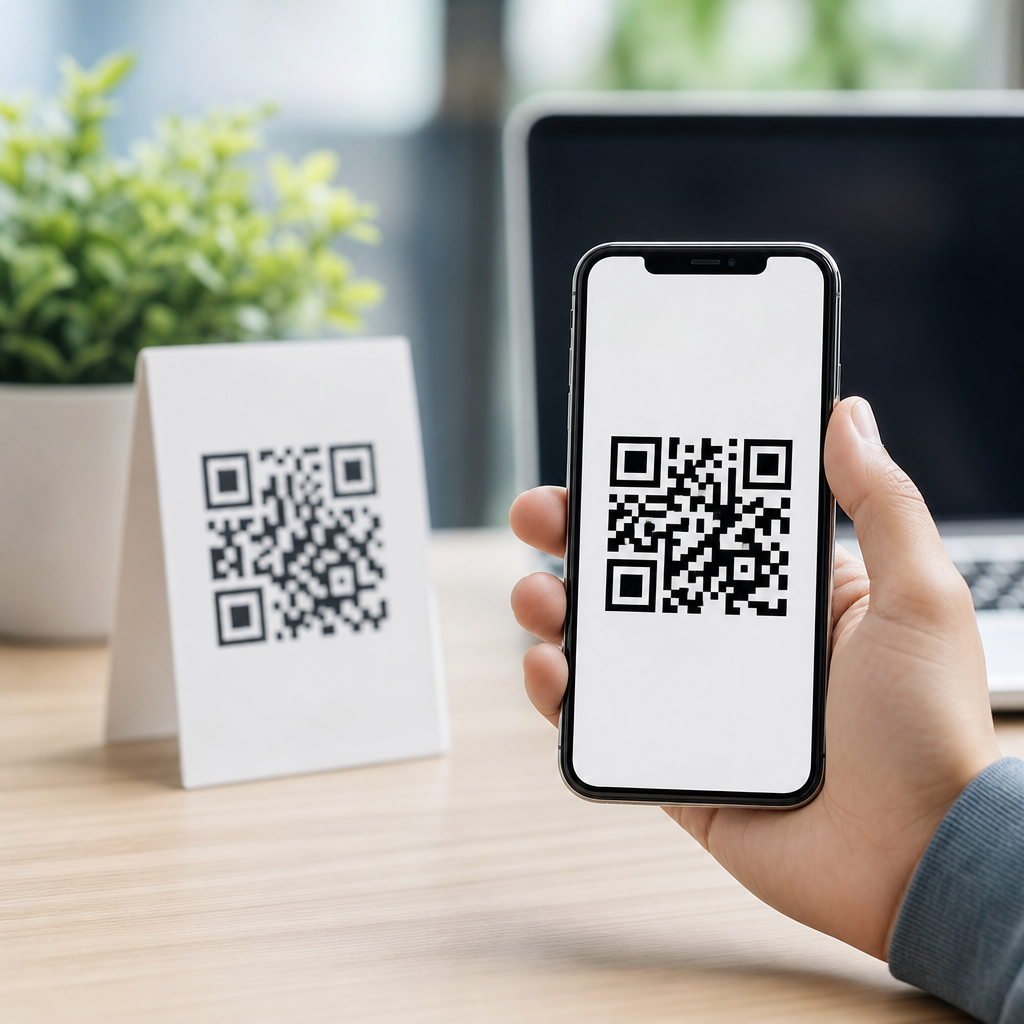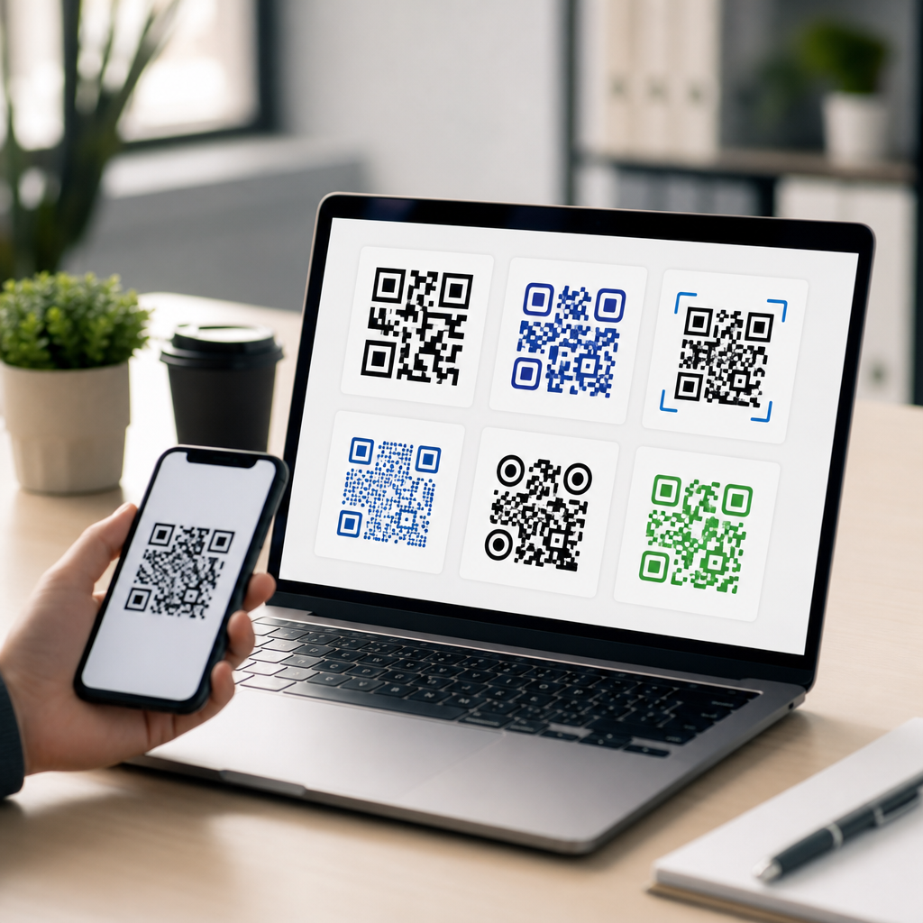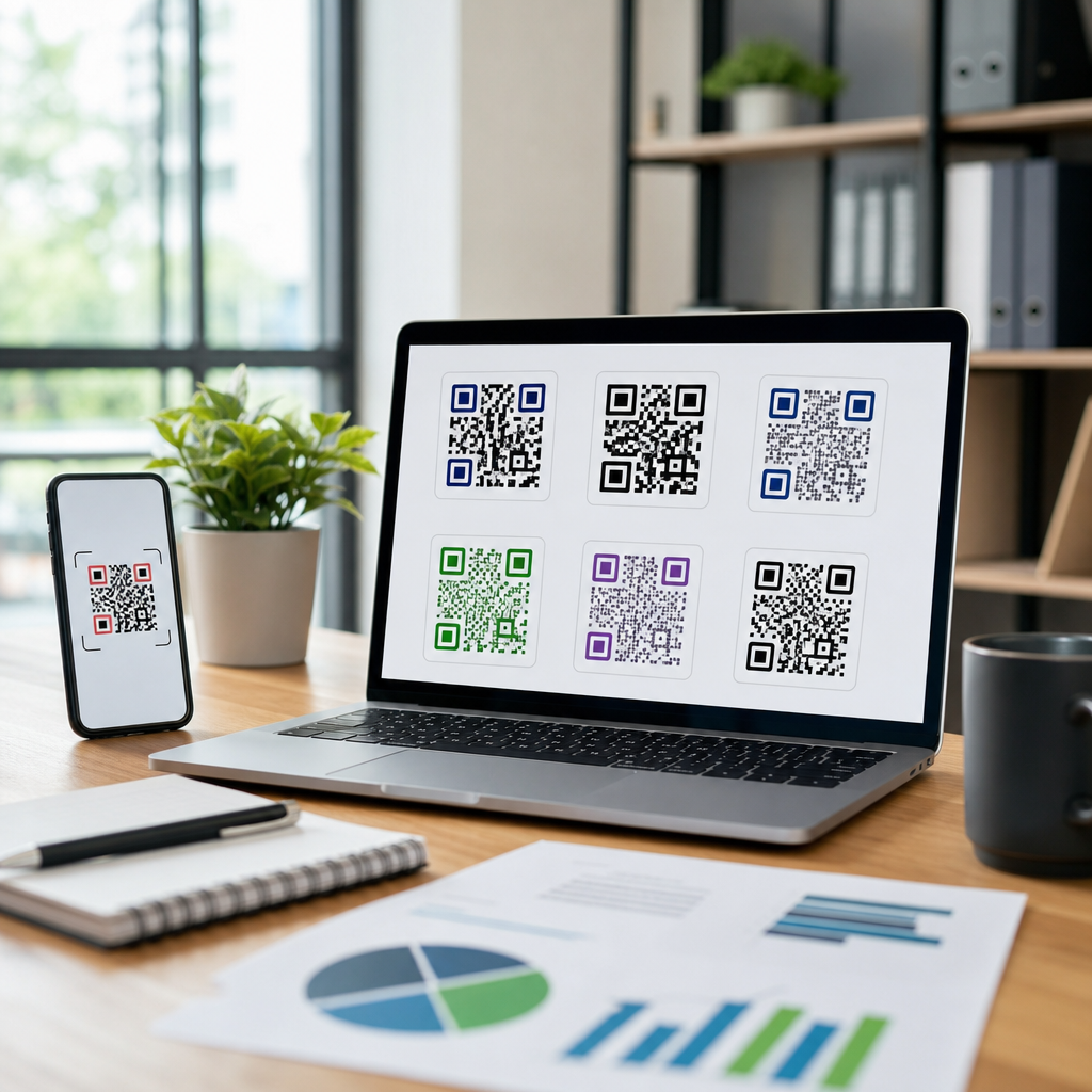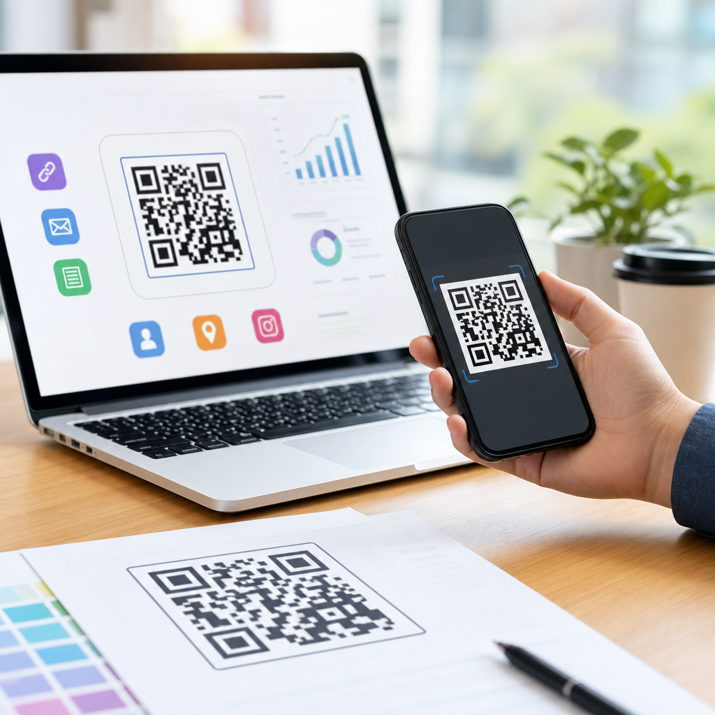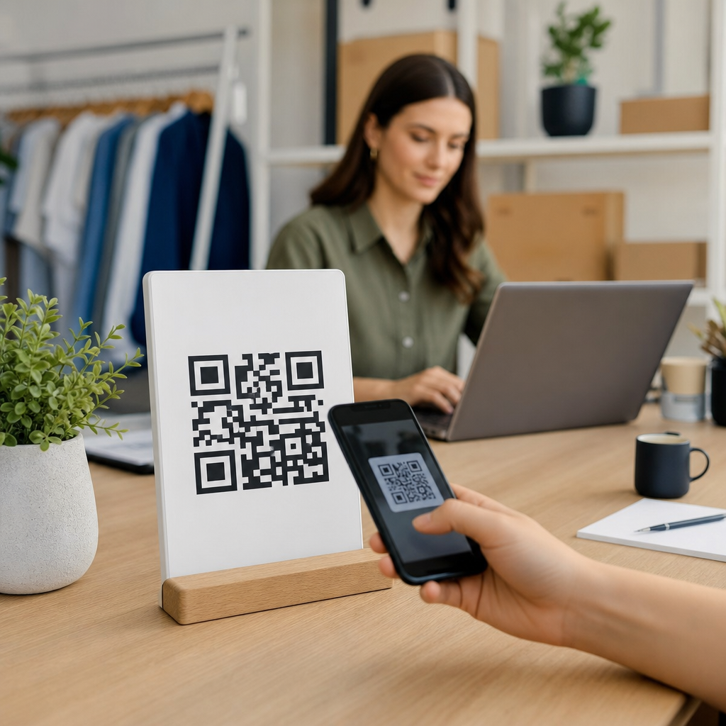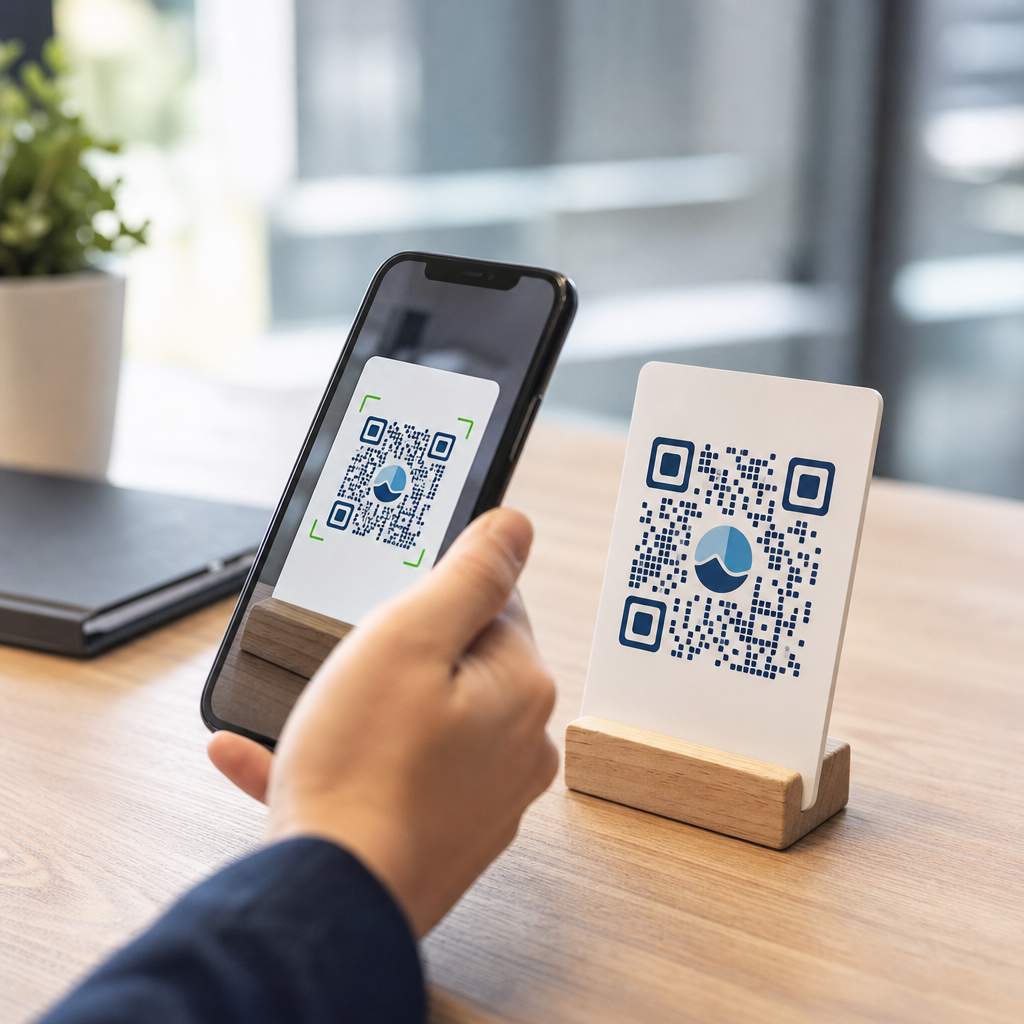
Custom QR codes can scan just as well as standard ones, but only when design choices respect the technical rules that make QR decoding possible. In practical terms, a standard QR code is the familiar black-on-white square matrix generated with default settings, while a custom QR code changes colors, adds logos, reshapes modules, or applies branded frames to match a campaign. The key question is not whether customization is inherently bad. It is whether the design preserves contrast, error correction, quiet zone spacing, and readable finder patterns. That distinction matters because QR codes now sit on packaging, menus, direct mail, retail displays, event signage, and mobile landing pages where a failed scan means lost traffic, missed conversions, and wasted print spend. I have tested branded codes across phones, print stocks, storefront windows, and social graphics, and the pattern is consistent: well-designed custom codes perform reliably, while decorative codes that ignore scanning fundamentals break fast. For teams building mobile-first campaigns, designing effective QR codes is not a cosmetic task. It is a usability decision tied directly to user experience, analytics quality, and revenue.
What makes a QR code scan reliably?
A QR code scans when a camera and decoder can quickly detect the three corner finder patterns, interpret the alignment of the grid, separate dark modules from light background, and reconstruct the encoded data. Reliable scanning depends on four factors. First is contrast. Dark modules on a light background remain the most dependable combination because most scanner libraries, including ZXing-based readers and native smartphone camera decoders, look for strong luminance differences. Second is the quiet zone, the empty margin around the code. The ISO/IEC 18004 standard specifies a four-module quiet zone, and shrinking it is one of the most common reasons decorative codes fail in print. Third is size and output quality. A code that looks sharp on a laptop can blur when reduced on packaging or printed on textured material. Fourth is error correction. QR codes support levels L, M, Q, and H, allowing progressively more damage or obstruction, but higher error correction also increases module density, which can make very small codes harder to scan.
In everyday use, standard QR codes outperform poor custom designs because they keep these variables intact by default. That does not mean standard always wins. I have seen branded restaurant menu codes with center logos, dark navy modules, and generous white margins scan faster than default generator outputs because the designer chose an appropriate size, tested them under indoor lighting, and linked them to a lightweight mobile page. Scan performance is a system, not a single design trick.
How customization affects scan performance
Customization changes the visual properties scanners rely on, so every modification carries risk. Color is the most obvious example. A deep blue code on white often scans well, while pastel yellow on cream usually does not because the contrast ratio is too low. Gradient fills are especially risky when one end becomes too light. Shape changes can also hurt performance. Rounded modules may still work if the overall geometry stays clear, but extreme transformations into dots, diamonds, or decorative icons reduce the decoder’s ability to distinguish module boundaries. Logos can be safe when they cover only the center area and the code uses adequate error correction, yet oversized logos often interfere with data reconstruction.
Frames, calls to action, and branded backgrounds create additional issues. A frame that intrudes on the quiet zone can make the code unreadable. Background photos are common in social campaigns, but they frequently introduce texture behind the modules that confuses camera autofocus and binarization. Print variables matter too. Gloss coatings can reflect overhead lighting, and low-resolution export from design tools can soften edges. In my own campaign work, the biggest drop in scan rate usually comes not from adding a logo but from exporting a code as a small raster image, then scaling it up for print. Vector output in SVG, EPS, or high-resolution PDF is the safer route for most production workflows.
Design rules for effective custom QR codes
If the goal is a custom QR code that scans as well as a standard one, a few rules should be treated as non-negotiable. Use high contrast, preserve a four-module quiet zone, keep the finder patterns prominent, and test at the final display size. For print, many practitioners use a minimum of around 0.8 inches for close-range scanning, but larger is better when the code appears on posters, shelf talkers, or windows. A practical sizing rule is ten to one: the ideal scanning distance is roughly ten times the code width. A two-inch code is comfortable at around twenty inches; for a poster viewed from six feet away, the code should be significantly larger.
Choose error correction based on the design and environment. Level M is often enough for straightforward print applications. Level Q or H is useful when adding a logo or expecting some wear, such as on product packaging or outdoor signage. Avoid inverting the classic color scheme unless you test thoroughly. Light modules on a dark background can work with modern phones, but compatibility is less predictable across older scanners and lower-light conditions. Keep destination URLs short when using static codes because denser data creates smaller modules. Better yet, use dynamic QR codes through reputable platforms so the encoded string stays short and the destination can change without reprinting.
| Design choice | Best practice | Common failure |
|---|---|---|
| Color | Dark foreground on light background | Low-contrast pastels or busy gradients |
| Logo | Small centered logo with higher error correction | Large logo covering critical data areas |
| Quiet zone | Maintain clear margin on all sides | Frame, text, or artwork touching the code |
| Output format | Vector export or high-resolution print file | Low-resolution raster scaled up |
| Module styling | Subtle rounding only | Extreme decorative shapes that blur the grid |
Testing methods that reveal real scan quality
The only reliable answer to whether custom QR codes scan well is testing across devices and contexts. Start with multiple phones, at minimum recent iPhone and Android models, because native camera apps use different decoding pipelines. Then test third-party scanners, since some retail or enterprise environments still depend on dedicated apps. Evaluate the code in bright daylight, typical indoor lighting, and lower-light conditions. Check scan time, not just pass or fail. A code that resolves in half a second is meaningfully better for users than one that requires several seconds of hunting and refocusing.
Physical testing matters more than on-screen previews. Print the code at final size on the actual substrate if possible: matte label, corrugated box, menu laminate, poster stock, or acrylic sign. Verify performance after finishing processes such as lamination, varnish, or embossing. Test viewing angles for placements on windows or countertop displays where glare appears. If the campaign will drive mobile traffic, also test the landing page speed after scan using PageSpeed Insights or Lighthouse. Many teams blame the code when the real friction starts after the scan because the mobile page is heavy, pop-up laden, or blocked by geolocation prompts. For ongoing optimization, use dynamic QR platforms that log scans by time, device, and location. Scan analytics will not diagnose every design flaw, but they can highlight underperforming placements that need redesign.
When custom QR codes outperform standard ones
Custom QR codes can beat standard ones when branding improves recognition and trust without compromising readability. On crowded packaging, a code that visually matches the brand can attract more attention than a plain black square. That can increase scan volume even if raw decoder performance is equal. I have seen this in retail displays where a colored code with a clear “Scan to see sizing video” frame drew significantly more engagement than an unframed default code nearby. The increase did not come from the code being more machine-readable. It came from better human readability and a stronger value proposition.
This is the core tradeoff in designing effective QR codes. Machine readability determines whether the scan can happen. Human-centered design determines whether people want to scan at all. The best results come from balancing both. A travel poster, for example, might use brand colors, a subtle border, and a short call to action, while still preserving contrast and quiet zone spacing. A restaurant menu might integrate a logo to reassure guests they are opening the official ordering page, not a spoofed link. In security-sensitive settings, custom branding can reinforce legitimacy, though it should be paired with a recognizable domain and HTTPS destination. Good customization is purposeful, not ornamental.
Building a hub for designing effective QR codes
As a hub page within Creating Mobile QR Codes, this topic should guide readers to the core decisions behind scan success. The most useful supporting articles usually break out into color selection, logo placement, QR code sizing for print, dynamic versus static QR codes, testing QR codes on packaging, and fixing QR codes that will not scan. Those subtopics all connect back to the same principle: design starts with the scanner, then expands to the user, the context, and the conversion path. If you treat customization as a brand layer placed on top of technical compliance, custom QR codes can perform extremely well.
The practical answer is clear. Custom QR codes do scan as well as standard ones when they maintain contrast, quiet zone, finder pattern clarity, adequate size, and appropriate error correction. They fail when aesthetics override those requirements. For marketers, designers, and product teams, the benefit of getting this right is substantial: stronger brand presentation without sacrificing usability. Start with a technically sound code, customize conservatively, test it on real devices in real conditions, and measure the result. Then use this hub to explore each design variable in more depth and build mobile QR codes that people can scan instantly and trust immediately.
Frequently Asked Questions
Do custom QR codes scan as well as standard QR codes?
Yes, custom QR codes can scan just as well as standard QR codes when the design still follows the technical rules that scanners rely on. A standard QR code usually uses black modules on a white background with a familiar square pattern, so it naturally meets the conditions most cameras and decoding software expect. A custom QR code, by contrast, may change colors, add a logo, round the modules, or include a branded frame. None of those changes automatically make it worse. What matters is whether the code remains easy for a scanner to recognize and interpret.
The biggest factors are contrast, quiet zone, module clarity, and error correction. The scanner must be able to distinguish the dark data modules from the lighter background quickly and accurately. It also needs the blank margin around the code, known as the quiet zone, so it can detect where the symbol begins and ends. If design elements interfere with finder patterns, alignment patterns, or the underlying grid, scanning reliability drops. In other words, customization is not the problem by itself. Poor customization is the problem. A well-designed branded QR code can perform at the same level as a standard one, while a heavily stylized code that ignores these rules may fail in real-world conditions.
What design choices have the biggest impact on QR code scanability?
Several design decisions have an outsized effect on whether a custom QR code scans consistently. First is color contrast. Dark foreground elements placed on a light background tend to scan best because cameras and QR readers look for clear separation between modules and background. Using two mid-tone colors, metallic finishes, gradients with low contrast, or light modules on a dark background can make detection less reliable, especially in poor lighting or on lower-quality phone cameras. If branding requires color, it is usually safest to keep the code pattern dark and the background very light.
Second is preserving the structure of the QR code itself. The three large corner finder patterns, the alignment elements, and the module grid should not be obscured, distorted, or blended into decorative artwork. Rounded corners and subtle stylistic adjustments are often fine, but excessive reshaping can make modules too ambiguous for scanners to read correctly. Third is the quiet zone. This blank space around the code is not optional decoration; it is part of what helps the scanner isolate the symbol from surrounding content. Frames, busy backgrounds, or text too close to the edges can interfere with recognition.
Size and output quality also matter. A QR code that looks sharp on a desktop screen may become difficult to scan when reduced for packaging, posters, labels, or social posts. If the data density is high, the individual modules become smaller, which means any decorative changes carry more risk. Exporting the code at low resolution, compressing it heavily, or printing it on reflective or textured material can also reduce performance. The most reliable custom QR codes are designed with realistic use conditions in mind, then tested on multiple devices before launch.
Does adding a logo to the center of a QR code reduce scanning reliability?
Adding a logo does not necessarily reduce scanning reliability, but it does introduce risk if it is done without regard for the QR code’s built-in tolerance limits. QR codes use error correction, which allows some portion of the symbol to be damaged, obscured, or altered while still remaining readable. That is why many branded QR codes can place a logo in the middle and continue to scan successfully. However, error correction is not unlimited, and it should not be treated as permission to block a large area without testing.
The size, placement, and surrounding design of the logo all matter. A small, centered logo that stays clear of critical patterns and is paired with an appropriate error correction level is often fine. A large logo that covers too many modules, sits unevenly across key areas, or blends into the surrounding code can make decoding inconsistent. Even when a QR code still scans on a few modern smartphones, it may fail on older devices, in low light, at a distance, or when printed at a smaller size. That is why successful logo integration depends on balancing branding with technical restraint.
It is also important to remember that a logo is only one part of the overall design. If the logo is combined with low contrast colors, missing quiet zone, decorative backgrounds, or unusually shaped modules, the cumulative effect can push the code beyond what error correction can compensate for. The best practice is to use a moderate logo, choose a higher error correction level when appropriate, and test the final code in the exact contexts where people will scan it, such as signage, packaging, menus, or direct mail.
Are standard black-and-white QR codes always the safest option?
Standard black-and-white QR codes are generally the safest option because they naturally align with best practices for readability. They offer strong contrast, predictable geometry, and broad compatibility across scanning apps, smartphone cameras, and printed environments. If the goal is maximum reliability with the least design risk, the default black-on-white format remains the benchmark. That is one reason it is still so widely used in payments, logistics, authentication, and operational settings where scan failures create friction.
That said, “safest” does not mean “only effective.” A custom QR code can be nearly as reliable, and in some marketing contexts it can perform better overall because branding increases trust, recognition, and engagement. People are often more willing to scan a code that clearly looks connected to a known business or campaign. A well-executed custom design can improve visual appeal without sacrificing technical function. The key is that branding should support the code, not overpower it.
So the practical answer is that standard codes are the low-risk default, but custom codes are completely viable when produced carefully. Businesses do not have to choose between branding and usability. They need to choose a design approach that protects contrast, structural integrity, print clarity, and adequate spacing. If those fundamentals are maintained, custom QR codes can deliver both strong aesthetics and dependable scanning performance.
How can you test whether a custom QR code will scan reliably before using it in a campaign?
The best way to test a custom QR code is to treat it like a real-world asset rather than just a design file. Start by scanning it on multiple devices, including iPhones, Android phones, newer and older models, and both native camera apps and common third-party scanners. A code that works instantly on one flagship device may be slow or inconsistent on another. Testing should include different distances, angles, and lighting conditions because users rarely scan in perfect studio environments.
Next, test the code in its final production format. If it will appear on packaging, print it at the actual packaging size and on the intended material. If it will be used on a storefront poster, test it from realistic standing distances. If it is going into email or social media, check how it renders after platform compression and resizing. Reflective surfaces, textured labels, poor print resolution, and glossy coatings can all affect performance even when the original digital file looks flawless. This is why on-screen testing alone is not enough.
It is also smart to compare the custom version against a standard version carrying the same data. If the standard code scans instantly and the custom one scans more slowly or inconsistently, the design likely needs adjustment. Common fixes include increasing contrast, restoring a larger quiet zone, reducing logo size, simplifying module styling, or increasing the physical size of the code. The goal is not merely to get a successful scan once or twice. The goal is to create a code that scans quickly, repeatedly, and under normal user conditions. That level of testing is what separates a visually attractive QR code from one that is truly campaign-ready.