
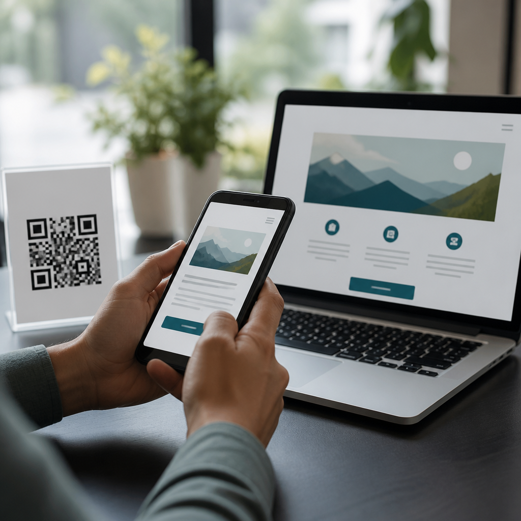
Accessible landing pages for QR code traffic turn a quick scan into a usable mobile experience for everyone, including people with visual, auditory, motor, and cognitive disabilities. A QR code landing page is the destination a user reaches after scanning a printed, on-screen, or product-based code with a phone camera. Accessibility considerations are the design, content, and technical choices that make that destination perceivable, operable, understandable, and robust across devices and assistive technologies. In practice, that means readable text, predictable navigation, strong color contrast, descriptive headings, touch targets that work on small screens, and forms that do not trap users in avoidable errors.
This matters because QR code traffic is unusually fragile. Users often arrive in distracting physical environments such as stores, transit stations, events, lobbies, packaging aisles, restaurant tables, or medical offices. They may have one hand free, a weak connection, glare on the screen, low battery, a cracked display, limited language fluency, or temporary impairments caused by motion and noise. I have seen otherwise well-designed campaigns fail because the code scanned perfectly but the page depended on tiny type, autoplay media, a slow hero image, or a pop-up that blocked keyboard focus. For accessibility, mobile usability and conversion quality are inseparable.
Accessible design also protects business performance. If a person cannot read the offer, activate the button, hear the video, or complete the form, the scan is wasted. Clearer pages reduce abandonment, improve task completion, and limit customer support burden. They also reduce legal and reputational risk. Teams commonly align landing pages with WCAG 2.2 Level AA because it is the most widely recognized benchmark for digital accessibility, and because many issues that affect disabled users also hurt every other mobile visitor. A practical hub on accessibility considerations therefore needs to connect standards, mobile constraints, and QR-specific behavior in one place.
Design for the scan context, not an ideal browsing session
People who arrive from QR codes usually have strong intent but little patience. They expect the page to match the physical prompt that triggered the scan: “see menu,” “claim coupon,” “watch setup video,” or “register warranty.” The first screen should confirm that intent immediately with a specific heading, a short explanation, and one primary action. Avoid vague headlines like “Welcome” or “Discover more.” Instead use direct labels such as “Download the assembly guide” or “Start event check-in.” This reduces cognitive load and helps screen reader users orient quickly through headings and landmarks.
Layout decisions should assume thumb use, variable lighting, and interrupted attention. Keep the reading width comfortable, body text at a legible size, and spacing generous enough that users do not tap the wrong control. Make targets at least 24 by 24 CSS pixels at minimum, with more space strongly preferred, consistent with current guidance. Maintain visible focus indicators for keyboard and switch users, and never remove outline styles without replacing them with an obvious alternative. If the page opens a modal, focus must move into it, remain constrained while it is open, and return to the triggering control when closed.
Content hierarchy matters more on QR traffic than on many other landing pages because visitors often reach the page without browsing a site first. Use semantic headings in proper order, concise paragraphs, and plain-language labels. If a scan appears on packaging in a pharmacy, for example, the page should not bury dosage PDF links behind carousel slides. If a museum label links to an audio tour, the transcript and language options should be reachable before promotional content. Every decorative flourish should be tested against the main task: can the user complete it quickly and independently?
Make content perceivable across vision, hearing, and cognition needs
Perceivable content begins with text that can be read in real conditions. Use sufficient color contrast, especially for buttons, disclaimers, and text over images. WCAG 2.2 Level AA requires a contrast ratio of at least 4.5:1 for normal text and 3:1 for large text, and these thresholds are a floor, not a creative target. I routinely recommend dark text on a plain background for QR destination pages because glossy packaging, outdoor light, and midrange phone screens punish low-contrast design. Do not convey meaning through color alone; error states, required fields, and availability labels need text or icons as well.
Images, icons, and video need alternatives that preserve meaning. Product instructions linked from a QR code should include alt text for functional images, empty alt attributes for decorative ones, captions for video, and transcripts for audio. If a restaurant menu uses image-heavy cards, item names, prices, allergens, and modifiers must remain available as text, not baked into graphics. Motion should be limited and respectful of user settings such as reduced motion preferences. Autoplay audio is especially harmful on QR pages because people often scan in public places where sudden sound is disruptive and inaccessible.
Cognitive accessibility is frequently overlooked. Keep copy concrete, labels consistent, and interactions predictable. Explain what happens next before users tap. A healthcare intake page reached from a waiting-room QR code should say “This form takes about three minutes” and “You can save and continue later” if that option exists. Chunk long tasks into short sections, reveal progress clearly, and avoid memory-dependent steps such as “enter the code from the previous page” when the user cannot easily go back. Error messages should identify the field, state the problem in plain language, and explain how to fix it.
Build robust mobile interactions and forms
Accessible landing pages succeed or fail on forms more than on visuals. QR campaigns often aim for signups, payments, registrations, support requests, app downloads, or gated content, which means forms are central. Use explicit labels tied to inputs, helpful autocomplete tokens, and input types that trigger the right mobile keyboard, such as email, tel, or numeric where appropriate. Do not rely on placeholder text as a label; it disappears on entry and often has poor contrast. Group related controls with fieldset and legend, especially for shipping options, contact preferences, or symptom checklists.
Validation should support completion instead of policing users. Inline validation can help if it is announced correctly to assistive technology and does not interrupt typing. Server-side validation remains essential because client-side checks can fail or be bypassed. When errors occur, summarize them at the top, link to each field, and preserve the user’s previous input. CAPTCHAs are a common failure point on mobile QR pages. Prefer risk-based spam protection, honeypots, or accessible challenge alternatives. If identity verification is necessary, offer multiple paths, not a single visual puzzle that excludes users.
| Element | Common QR landing page mistake | Accessible implementation |
|---|---|---|
| Primary CTA | Small button below a large hero image | High-contrast button near the top with clear action text |
| Form label | Placeholder-only field | Persistent label, hint text, and autocomplete attribute |
| Error handling | Red border with no message | Text explanation, error summary, and focus to first error |
| Video | Autoplay promo without captions | User-initiated playback with captions and transcript |
| Navigation | Hamburger menu hiding key tasks | Short page with direct links to top tasks |
Robustness also means compatibility with assistive technology and browser variation. Test with VoiceOver on iPhone and TalkBack on Android, not only desktop screen readers. Confirm that reading order matches visual order, ARIA is used sparingly and correctly, and custom components expose proper names, roles, and states. A coupon page that uses a custom dropdown for store selection must announce expanded and collapsed states and work with touch exploration and external keyboards. Native controls are usually more reliable than heavily scripted widgets, especially on short campaign timelines.
Performance, testing, and governance for accessible QR campaigns
Performance is an accessibility issue because delays increase abandonment and disproportionately affect users on older devices or slow networks. QR scans often happen away from reliable Wi-Fi, so the landing page should load fast, prioritize meaningful content, and avoid layout shifts that move buttons under a user’s finger. Compress images, defer nonessential scripts, use responsive image sizes, and preload only what improves the first screen. Core Web Vitals are useful indicators here: poor Largest Contentful Paint or Interaction to Next Paint often correlates with frustrating mobile experiences. If a page must include a PDF, provide an accessible HTML summary and a clearly labeled file size.
Testing should combine automation, manual review, and real-device checks. Automated tools such as Axe, WAVE, Lighthouse, and Accessibility Insights catch missing alt text, contrast failures, unlabeled controls, and structural issues, but they do not judge whether the page is understandable in a busy physical setting. I prefer testing from the actual scan source: poster, receipt, shelf tag, badge, package, or tabletop sign. Scan under glare, with one hand, in low bandwidth conditions, and with screen reader gestures enabled. This reveals issues that component reviews miss, such as sticky banners obscuring headings, poor focus order after consent dialogs, or impossible date pickers.
Governance keeps accessibility from becoming a one-time cleanup. Create a launch checklist for every QR destination page covering contrast, text resizing, keyboard access, captions, form labels, error handling, language declaration, link purpose, and analytics events for assistive paths such as transcript downloads or help requests. Define ownership across marketing, design, engineering, and legal teams so that campaign speed does not bypass review. When you publish supporting articles under this accessibility hub, link them to concrete topics like accessible forms, video captions, color contrast, screen reader testing, and multilingual mobile UX. That structure helps teams solve issues systematically instead of treating each failed scan as an isolated bug.
Accessible landing pages for QR code traffic work because they respect the reality of mobile scanning: users are busy, environments are imperfect, and barriers compound quickly. The essentials are straightforward: match the scan intent, keep the first screen clear, use semantic structure, maintain strong contrast, provide text alternatives, support captions and transcripts, build forgiving forms, and test on real phones with assistive technology. Standards such as WCAG 2.2 Level AA provide the baseline, but the best results come from designing around the physical context in which the scan happens, not just the screen in front of you.
For teams building a sub-pillar hub under Mobile QR Code Design and UX, accessibility considerations should guide every related article and every campaign brief. When the destination page is easier to perceive, operate, and understand, more people complete the task the QR code promised. That means better conversion quality, fewer support issues, and a stronger brand experience for all users. Audit your current QR landing pages, prioritize the top scan journeys, and fix the barriers on the first screen first. That one step will improve accessibility faster than any redesign deck.
Frequently Asked Questions
What is an accessible landing page for QR code traffic?
An accessible landing page for QR code traffic is a mobile-friendly destination page designed so that as many people as possible can use it successfully after scanning a QR code. That includes people who use screen readers, voice control, keyboard navigation, screen magnification, captions, switch devices, and other assistive technologies. Because QR scans often happen in fast, real-world contexts such as packaging, posters, menus, event signage, receipts, or product labels, the landing page needs to work immediately and clearly without creating barriers. Accessibility in this context means the page is perceivable, operable, understandable, and robust across devices, browsers, screen sizes, and assistive tools.
In practice, that means the page should load quickly, use readable text, maintain strong color contrast, support zooming, provide clear headings, include descriptive links and buttons, and avoid interactions that depend on precise gestures or tiny tap targets. If the page contains video, it should include captions and ideally transcripts. If it contains forms, labels, instructions, and error messages should be easy to understand and properly associated with each field. Users should never be forced through confusing pop-ups, auto-playing media, inaccessible carousels, or time-limited interactions just to reach the information promised by the QR code.
Accessibility also starts before the user ever lands on the page. The QR code should lead to a URL that is stable, secure, and predictable, and the surrounding printed context should explain what the scan is for. When people know what to expect and the landing page is simple to navigate, they are much more likely to complete the intended action. An accessible landing page is not just a compliance checkbox; it improves usability, trust, completion rates, and overall experience for everyone scanning the code.
Why is accessibility especially important for people arriving from a QR code?
QR code visitors often arrive with less context and less patience than users who navigated through a full website journey. They may be standing in a store aisle, walking through a transit station, attending an event, opening a package, or viewing a sign in bright sunlight. In many cases, they are using one hand, a small screen, and variable mobile connectivity. For users with disabilities, these environmental and device constraints can magnify existing barriers. If the landing page is cluttered, slow, unlabeled, or difficult to operate, the experience can fail almost instantly.
Accessibility is especially important because scanning a QR code is usually a direct-response action. The user has already shown intent by scanning, so the landing page should make it easy to complete that next step. For someone with a visual disability, that might mean headings and controls are announced correctly by a screen reader. For someone with motor limitations, it means buttons are large enough to tap and the page does not require complex gestures. For someone who is deaf or hard of hearing, it means media content includes captions. For someone with cognitive disabilities, it means the page has a clear structure, plain language, and minimal distractions.
There is also a trust factor. QR codes can already feel opaque because the destination is not always visible before scanning. If the user lands on a page that is confusing, aggressive, or hard to use, confidence drops quickly. Accessible design reduces friction and reassures users that they are in the right place. From an SEO and performance standpoint, many accessibility improvements overlap with quality signals such as mobile usability, content clarity, page speed, and clean structure. That makes accessibility a strong strategic choice, not just an ethical or legal one.
What accessibility features should every QR code landing page include?
Every QR code landing page should begin with a strong mobile foundation. That means responsive design, fast loading assets, readable font sizes, support for portrait orientation, and layouts that do not break when users zoom in. Text should have sufficient contrast against the background, and important information should never rely on color alone. Headings should follow a logical structure so screen reader users can navigate quickly, and interactive elements such as buttons, links, menus, accordions, and forms should have clear labels and accessible names.
Navigation and interaction deserve special attention. Tap targets should be large enough for people with limited dexterity, and the page should be operable without requiring precise swipes, dragging, or multi-touch gestures. If there is a form, each input needs a visible label, helpful instructions, and clear error handling that explains what went wrong and how to fix it. If the landing page includes downloadable files such as menus, brochures, or manuals, those files should also be accessible rather than forcing users into inaccessible PDFs or image-only documents.
Multimedia content should include captions for video and, when possible, transcripts for audio and video material. Images should have meaningful alternative text when they convey information, while decorative visuals should not create noise for assistive technologies. Time-sensitive content should be avoided unless absolutely necessary, and any motion, animation, or autoplay should be used carefully so it does not distract users or trigger vestibular issues. Finally, the page should be tested with real devices and common assistive technologies, because a page that looks polished visually may still fail in practical use if focus order, labels, semantics, or touch behavior are not implemented correctly.
How can I make sure a QR code landing page is accessible on mobile devices and assistive technology?
The best approach is to combine accessible design, accessible code, and real-world testing. Start by building the page with semantic HTML, properly nested headings, labeled form fields, and buttons that behave like buttons rather than clickable generic elements. Make sure interactive controls are reachable and understandable for screen readers, keyboard users, and voice control users. Use responsive layouts that adapt cleanly to different screen widths and zoom levels, and verify that content remains usable in both default mobile view and magnified views. Avoid fixed elements that block content or overlays that trap focus.
Then test the page with mobile accessibility features. On iPhone, review the experience with VoiceOver, zoom, larger text settings, and reduced motion enabled. On Android, test with TalkBack and built-in display adjustments. Confirm that headings are announced properly, buttons are named clearly, forms are understandable, and focus moves in a logical order. Check that users can complete the primary task without getting stuck in pop-ups, cookie banners, chat widgets, or sticky elements. If users need to call, download, register, watch, buy, or read, each of those paths should be fully operable with assistive technology.
Automated testing tools can help identify issues such as missing labels, weak contrast, or structural problems, but they are not enough on their own. Manual testing is essential because many common failures, including confusing link text, poor reading order, gesture-dependent interactions, and vague instructions, are usability issues as much as technical ones. It is also smart to test under realistic conditions: slower networks, glare, small screens, one-handed use, and interrupted sessions. The more closely your testing matches actual QR scan scenarios, the more reliable your landing page will be for all users.
Does an accessible QR code landing page help SEO, conversions, and business results?
Yes. Accessibility improvements often strengthen the same qualities that help search visibility, user satisfaction, and conversion performance. A landing page that is fast, structured, readable, and easy to navigate tends to perform better for both users and search engines. Clear headings help with content organization. Descriptive links and buttons improve scanability and action completion. Captions and transcripts can add keyword-rich supporting text. Clean semantic markup helps machines understand the page while also improving the experience for assistive technologies.
From a conversion perspective, accessibility reduces friction at the exact moment users are trying to take action. If someone scans a QR code to view a menu, redeem an offer, register for an event, access instructions, or complete a purchase, every barrier increases the chance they will abandon the page. Larger tap targets, simpler forms, better contrast, plain language, and predictable navigation help more people finish what they started. That includes users with permanent disabilities, temporary impairments such as a broken hand or lost glasses, and situational limitations such as bright light, noise, or unstable connectivity.
Accessible landing pages also support brand trust and risk reduction. They show that your organization has considered a wider range of users and usage contexts, which matters for customer experience and reputation. Depending on your market and jurisdiction, accessibility can also reduce legal exposure by aligning your digital experiences more closely with recognized accessibility expectations and standards. Ultimately, accessible QR code landing pages are a practical business asset: they make traffic from scans more usable, more inclusive, and more likely to convert.





