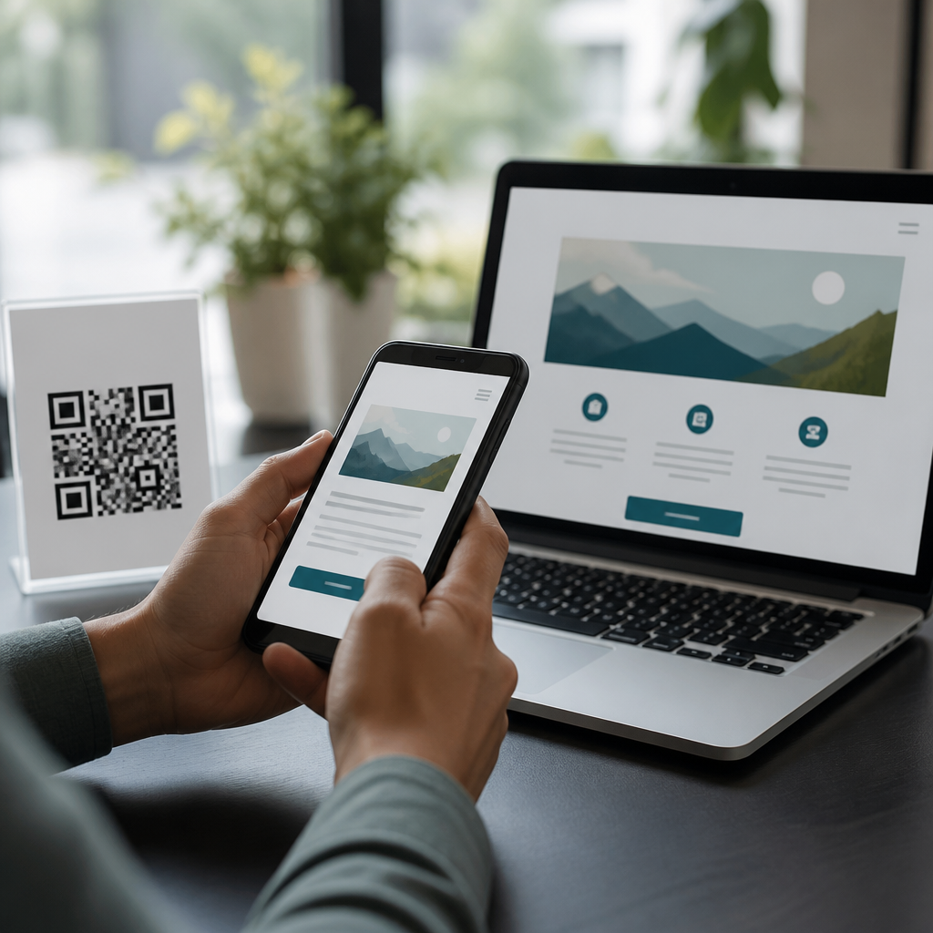
QR codes can make information, services, and physical spaces easier to access, but only when they are designed and deployed with inclusion in mind. In inclusive design, the goal is not to create a single experience for an average user; it is to ensure that people with different abilities, devices, languages, and contexts can complete the same task with dignity and minimal friction. A QR code is simply a machine-readable matrix barcode that opens a digital destination, triggers a download, stores contact data, or initiates an action such as payment or check-in. Accessibility considerations are the practical requirements that make that interaction usable for people with visual, motor, cognitive, hearing, and situational limitations.
I have worked on QR code campaigns for retail packaging, hospital wayfinding, museum exhibits, event registration, and restaurant ordering, and the same lesson appears every time: the code itself is rarely the main barrier. The barriers usually come from weak contrast, poor placement, inaccessible landing pages, missing instructions, aggressive timeouts, or assumptions that every user has a current smartphone, stable internet, and full vision. Inclusive QR code design matters because these codes increasingly act as gateways to essential information. If the gateway fails, users are excluded from menus, forms, transit updates, patient resources, product instructions, and public services. Done well, QR codes support independence. Done badly, they shift effort onto the user and create avoidable inequity.
This hub article explains how to use QR codes in inclusive design, with a focus on accessibility considerations across the full journey: discovery, scanning, comprehension, and task completion. It covers what to do before printing, where to place codes, how to write instructions, what technical choices improve reliability, and why the linked mobile experience is as important as the code symbol. It also serves as a foundation for deeper work across the broader mobile QR code design and UX topic, because accessibility is not a final compliance check. It is the operating standard that determines whether QR experiences work in the real world.
Design the full QR journey, not just the square
The most important principle is that a QR code is one step in a journey, not the product itself. A user must first notice the code, understand its purpose, physically reach it, align a camera, receive a system prompt, and use the destination page. Each step can introduce exclusion. In practice, I map these touchpoints before any visual design begins. For example, a poster in a train station may be easy to scan for a standing adult in bright light with unlimited data, yet difficult for a wheelchair user if mounted too high, impossible for a low-vision user if the instruction text is tiny, and frustrating for a commuter with one hand occupied.
Inclusive design starts by asking direct questions. Who needs the information? Is scanning optional or required? What happens if the user cannot scan? Is the content urgent, such as medication guidance or building access, or merely convenient? If the answer involves essential access, the QR code cannot be the only route. This is the first rule I enforce on teams: never make a QR code the sole path to critical information or service completion. Pair it with a short URL, NFC when appropriate, printed essentials, or staff assistance. Redundancy is not clutter; it is equitable access and operational resilience.
Task clarity also matters. Users should know exactly what happens when they scan. “Scan for menu” is better than “Scan here.” “Scan to hear audio directions in English, Spanish, or French” is better than a decorative callout with no explanation. Clear expectations reduce cognitive load and increase trust, especially in public environments where people are deciding quickly whether an interaction is worth their attention.
Make the printed code perceivable and reachable
Perceivability begins with size, contrast, quiet zone, and placement. A QR code needs sufficient module size for the expected scanning distance. In field testing, I generally start with at least 2 by 2 centimeters for close-range packaging and much larger for signs viewed at arm’s length or beyond. The standard rule of thumb is roughly ten times the scanning distance, but real environments demand testing because camera quality, glare, print texture, and movement change outcomes. Always preserve the quiet zone, the blank margin around the code, because busy backgrounds and decorative frames often break scanning reliability.
Contrast should be high, with dark modules on a light background. Brand teams often want inverted, gradient, metallic, or low-contrast codes; these choices repeatedly underperform, especially under poor lighting or on older devices. If aesthetics matter, test the exact artwork on multiple phones before production. Matte finishes usually scan more reliably than glossy surfaces because they reduce reflections. On curved packaging, keep the code away from seams and folds. On glass, windows, and polished signage, account for glare and changing daylight.
Placement is an accessibility issue, not just a merchandising decision. Mount codes where seated and standing users can approach them comfortably, without awkward twisting or extended reach. Avoid placing codes behind counters, too close to floor level, or in crowds where users must block circulation to scan. In healthcare and transportation, I also avoid placing critical QR codes only in fast-moving zones, because people need time to aim, read, and decide. If a user must hold a bag, cane, stroller, or mobility aid, the code should still be reachable and legible.
Write instructions that reduce friction
Many users know how to scan a QR code, but not all do, and even experienced users benefit from better guidance. Good instructions are short, explicit, and adjacent to the code. State the purpose, expected result, fallback path, and any requirements such as internet access or app download. This is especially important for older adults, first-time users, and visitors using unfamiliar devices or languages. In multilingual settings, provide concise translations for the action text and the destination description.
Instruction design also supports users with cognitive disabilities. Plain language works best: use common verbs, avoid jargon, and break complex actions into simple steps. If there is a deadline, fee, login, or data collection step after scanning, disclose it before the scan. Surprises erode trust and increase abandonment. For public-sector and healthcare use, I recommend adding a short URL beneath the code in readable type so users can type the address manually or share it with assistive support if scanning fails.
| Inclusive element | What to do | Why it matters |
|---|---|---|
| Purpose label | Use direct text such as “Scan to open accessible event schedule” | Sets expectations and reduces uncertainty |
| Fallback access | Add a short URL, phone number, or printed summary | Prevents exclusion when scanning is difficult or impossible |
| Readable typography | Use clear sans serif type, strong contrast, and adequate size | Supports low-vision users and fast comprehension |
| Placement guidance | Position code and text at reachable height with space to pause | Helps users with mobility constraints or crowded environments |
| Disclosure | State if login, payment, download, or personal data is required | Builds trust and lowers cognitive load |
Ensure the mobile destination is accessible
A perfectly scannable QR code can still fail if the landing page is inaccessible. In audits, this is the most common breakdown. The destination must support screen readers, keyboard and switch navigation, zoom up to 200 percent or more, sufficient color contrast, descriptive headings, and predictable forms. Follow WCAG 2.2 guidance and test on actual mobile devices with VoiceOver on iPhone and TalkBack on Android. Automated tools such as axe, WAVE, and Lighthouse help catch obvious issues, but they do not replace manual testing.
Performance is part of accessibility. Heavy pages, autoplay video, cookie banners that trap focus, and unnecessary pop-ups create friction for users on older phones or weak connections. Keep the page lightweight, compress images, avoid layout shifts, and make primary actions prominent. If the QR code links to a PDF, verify that the file is tagged correctly, readable on small screens, and not the only format available. In many cases, an accessible HTML page is a better primary destination than a document download.
Forms deserve special attention because QR codes often lead to registration, payment, check-in, or feedback workflows. Use clear labels, error prevention, logical input types, and visible focus states. Avoid short session timeouts, especially for healthcare, education, or government tasks. If authentication is required, support password managers and offer alternatives to SMS-only verification when possible. Inclusion depends on completion, not just arrival.
Plan for diverse contexts, devices, and limitations
Accessibility considerations extend beyond disability categories. Situational limitations affect everyone: bright sunlight, cracked screens, poor bandwidth, low battery, one-handed use, language barriers, and camera restrictions on managed devices. I treat these as first-class design constraints because they frequently overlap with permanent or temporary disabilities. A museum visitor may be holding a child. A delivery worker may have gloves on. A patient may be anxious, medicated, or processing information slowly. Good QR design respects these realities.
Device diversity matters too. Not every phone has the same camera sensitivity, browser support, or operating system behavior. Test across current and older iPhone and Android models, using native camera apps and common scanning apps where relevant. Confirm that the link opens securely over HTTPS, that redirects are minimal, and that app deep links fail gracefully to web content when the app is not installed. Dynamic QR platforms can help maintain destinations over time, but governance is essential. Broken links, expired campaigns, and unmonitored redirects are accessibility failures because they waste effort and deny access.
Privacy and security are also part of inclusive practice. Users are increasingly cautious about scanning unknown codes because phishing via QR codes has grown. Use recognizable branding near the code, explain the destination domain, and avoid unnecessary personal data collection. In workplaces and schools, publish verification guidance so users know which codes are official. Trust improves adoption, and adoption is necessary for access.
Test with real users and maintain the experience
The final step is validation. Inclusive QR code design cannot be confirmed in a design file alone. Print prototypes at actual size, place them in realistic environments, and observe people completing real tasks. Include participants with low vision, screen reader experience, limited dexterity, cognitive differences, and varied device familiarity. Time the interaction from first glance to task completion. Note where people hesitate, reposition themselves, ask for help, or abandon the flow. Those moments reveal the true usability barriers.
After launch, monitor analytics and operations together. Scan rate alone is not enough; look at completion rate, error rate, bounce rate, device breakdown, and support requests. A code that gets scans but no successful submissions is failing. Establish ownership for content updates, link management, accessibility regression testing, and physical maintenance. Codes on sun-faded signs, scratched labels, or moved displays often degrade long before anyone notices. Inclusive design is continuous stewardship.
QR codes support inclusive design when they are easy to notice, easy to scan, clear in purpose, backed by accessible mobile content, and never treated as the only route to essential information. The practical accessibility considerations are straightforward: use strong contrast, adequate size, reachable placement, plain-language instructions, fallback options, accessible landing pages, and real-world testing. These decisions improve outcomes for disabled users, older adults, multilingual audiences, and people navigating everyday constraints. If you are building within mobile QR code design and UX, make accessibility your starting point rather than your retrofit. Audit one existing QR touchpoint this week, fix the weakest link in the journey, and use that improvement to set a better standard across every future campaign.
Frequently Asked Questions
How can QR codes support inclusive design in real-world settings?
QR codes can support inclusive design by giving people multiple ways to access the same information, service, or action without forcing everyone into a single format. In practice, that means a QR code can link to content in large text, plain language, multiple languages, audio, video with captions, screen-reader-friendly webpages, maps, forms, or step-by-step instructions. This flexibility is especially useful in places like hospitals, transit systems, museums, campuses, retail spaces, government offices, and events, where users may have different mobility needs, sensory preferences, literacy levels, and device capabilities.
That said, a QR code is only inclusive when it removes friction instead of adding it. If the printed code is too small, poorly placed, low contrast, damaged, or the linked page is inaccessible, then the QR code becomes a barrier rather than a bridge. Good inclusive design treats the QR code as one access method among several. Users should still be able to complete the same task through visible text, spoken assistance, printed instructions, accessible signage, a short URL, or human support. The goal is not to make people scan a code; the goal is to help them succeed with dignity, whether they scan it or not.
What makes a QR code itself accessible and easy to use?
An accessible QR code starts with physical usability. The code should be large enough to scan comfortably from the expected distance, printed sharply, and placed where users can reach or view it without awkward movement. It should have strong contrast against the background, ample quiet space around the code, and no distortion from glossy surfaces, folds, or poor lighting. Placement also matters. A code mounted too high, too low, behind glass glare, on a moving object, or in a crowded visual environment can make scanning difficult for wheelchair users, people with low vision, users with tremors, or anyone trying to scan quickly in a busy environment.
Clear instructions are equally important. People should know what the code does before they scan it, such as “Scan to hear an audio guide,” “Scan for allergen information,” or “Scan to request assistance.” This reduces uncertainty and helps users decide whether scanning is worth the effort and data usage. It also supports people who are cautious about security. Whenever possible, pair the QR code with a short, readable fallback URL and a concise explanation of the destination. That simple step improves usability for people whose devices do not scan easily, whose cameras are restricted, or who simply prefer typing a link instead.
What should the destination page include to make a QR code experience inclusive?
The destination page is where inclusion is truly won or lost. Even if the QR code scans perfectly, the experience breaks down if the page is cluttered, inaccessible, slow, or confusing. A strong destination page should be mobile-friendly, lightweight, keyboard accessible, compatible with screen readers, and easy to understand on a small screen. Use clear headings, readable font sizes, sufficient color contrast, descriptive links, labeled buttons, and logical navigation. Avoid auto-playing media, pop-ups that block content, and complex forms that are hard to complete on touch devices.
Inclusive destination pages also respect differences in language, literacy, cognition, and bandwidth. Provide plain-language summaries, translation options where relevant, captions and transcripts for audio or video, and alternatives to visually dense layouts. If the QR code supports a task such as booking, ordering, requesting access, or reading instructions, keep the journey short and focused. Remove unnecessary steps and make the next action obvious. In many cases, the most inclusive choice is not the most feature-rich page, but the simplest page that helps users complete the task quickly, confidently, and independently.
Should QR codes ever be the only way to access information or services?
No, in most inclusive design scenarios, QR codes should not be the only access method. Relying exclusively on a code assumes users have a working smartphone, a camera, enough battery, internet access, digital confidence, and the physical ability to scan in that moment. It also excludes people who use older devices, assistive technologies that do not interact well with camera-based workflows, or people who are in urgent, stressful, or low-connectivity situations. A single-channel experience is fragile; an inclusive experience provides options.
The better approach is to treat QR codes as a convenience layer rather than a mandatory gateway. Include printed text, staff assistance, accessible websites, phone numbers, NFC where appropriate, short URLs, and tactile or audible wayfinding tools depending on the environment. If a user cannot scan the code, they should still be able to get the same information or complete the same task without penalty or embarrassment. This principle is central to inclusive design: different users may take different paths, but they should arrive at the same outcome with roughly the same level of dignity, clarity, and control.
How can organizations test whether their QR code implementation is truly inclusive?
Testing should cover both the physical code and the full user journey after scanning. Start by checking practical conditions: Can the code be scanned in bright light, low light, from a seated position, with one hand, on older phones, and in spaces with weak connectivity? Is it easy to locate visually? Are the instructions clear before scanning? Does the code still work after printing, resizing, or long-term exposure? These basic checks catch many real-world failures that are often missed in ideal office conditions.
Beyond technical testing, the most valuable step is usability testing with diverse participants, including people with disabilities, older adults, non-native speakers, and users with different levels of digital confidence. Observe whether they can discover the code, understand its purpose, scan it, and complete the intended task without confusion. Also review analytics carefully: high scan rates with low completion rates may signal a poor destination experience. Finally, revisit QR code deployments over time. Inclusive design is not a one-time checklist; it is an ongoing practice of maintenance, feedback, and improvement to ensure the experience remains usable as devices, environments, and user needs change.