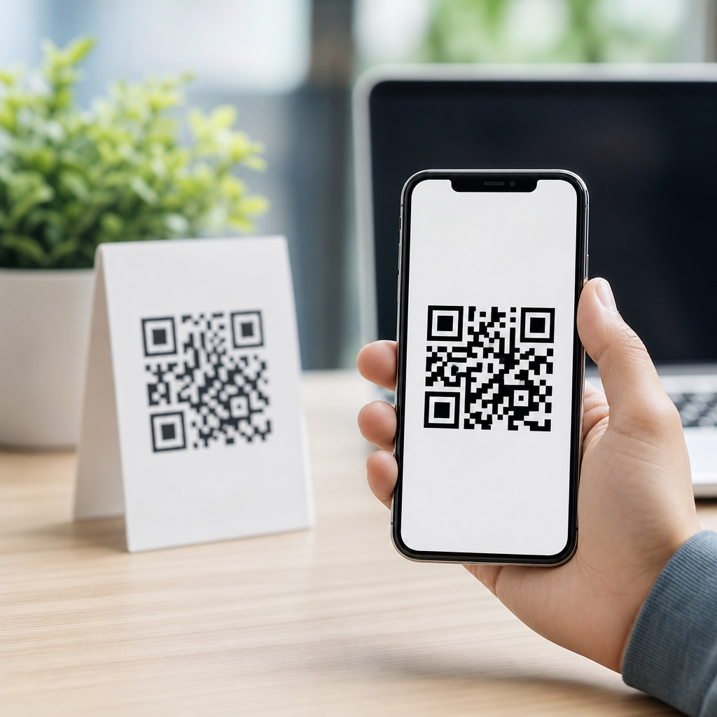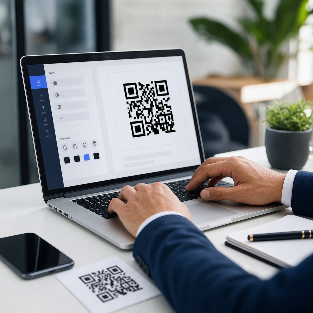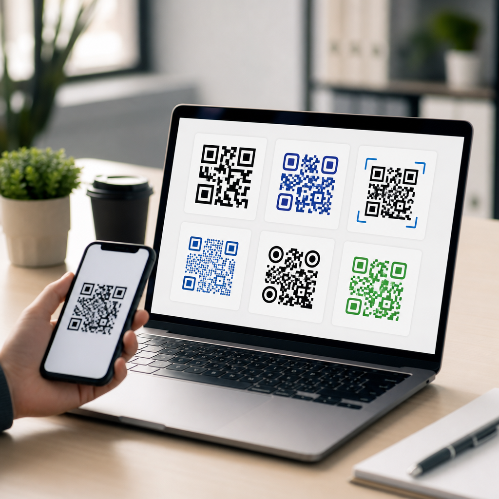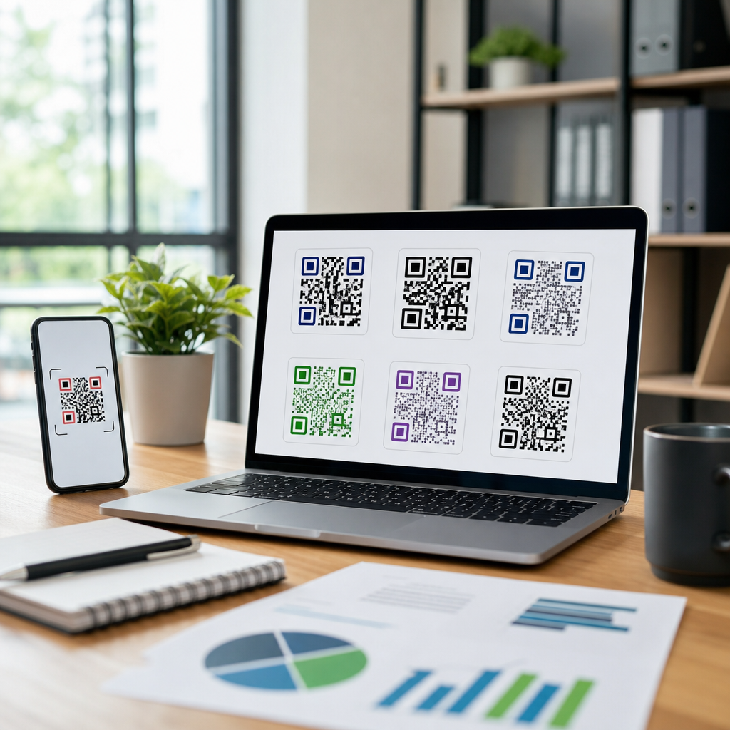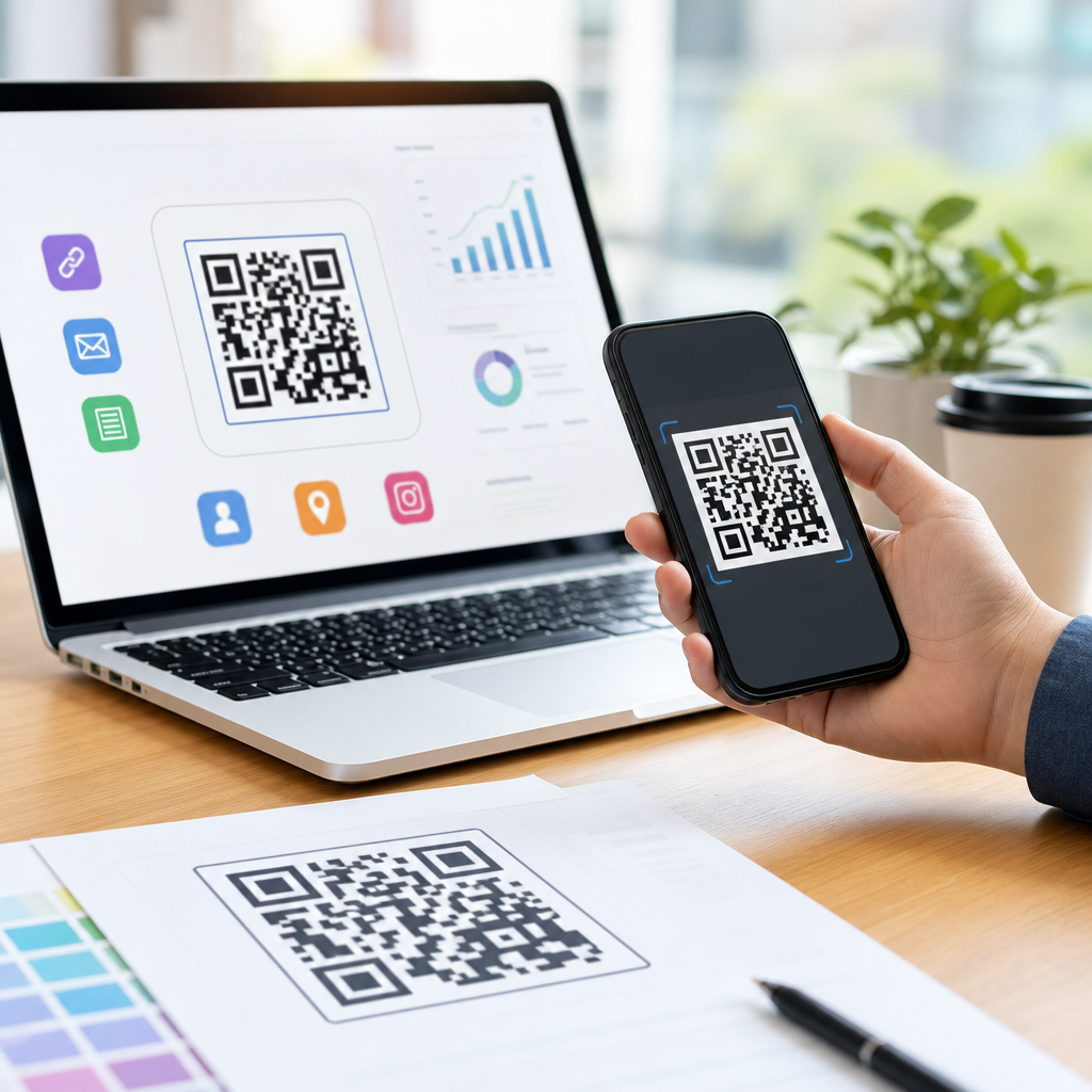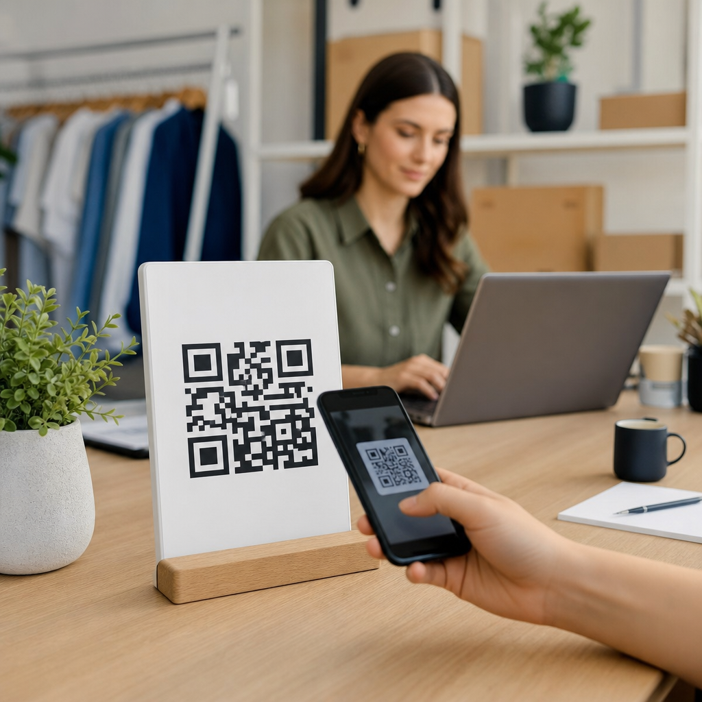
Creating a mobile QR code looks simple, but the most expensive failures usually come from small decisions made too early: the wrong content type, poor contrast, oversized data, weak testing, or a destination that breaks on phones. A QR code is a two-dimensional barcode that stores information a smartphone camera can read instantly. In practice, mobile QR codes are used to open landing pages, app download screens, payment links, Wi-Fi credentials, contact cards, maps, menus, support forms, and authentication flows. Because they sit at the point where print, packaging, signage, and digital experience meet, they deserve the same planning you would give any conversion path.
When I build QR campaigns for posters, product packaging, event badges, and retail displays, I treat the code itself as only one part of the system. The destination matters as much as the image. So does scan distance, lighting, error correction, analytics, and whether the code is static or dynamic. If the goal is to learn how to create a mobile QR code, the process is straightforward: choose the right QR type, prepare a mobile-friendly destination, generate the code with appropriate settings, test it across devices, then deploy it at a size and placement that matches real scanning conditions. The mistakes happen when teams skip one of those steps.
This hub article explains the most common QR code mistakes and how to avoid them while showing the full process for creating a mobile QR code that actually works in the field. If you want reliable scans, cleaner attribution, and fewer failed customer journeys, start with fundamentals and build from there.
Choose the Right QR Code Type Before You Generate Anything
The first mistake is creating the code before deciding what the scan should do. “How to create a mobile QR code” begins with intent, not software. A restaurant menu QR code should open a lightweight mobile webpage. A trade show badge may need a vCard. A storefront window code often works best with a location page, click-to-call option, and business hours. If the destination can change later, use a dynamic QR code that points to a short redirect URL you control. If the content will never change, a static QR code may be enough.
Static codes permanently encode the final content. They are simple and often cheaper, but any mistake means reprinting the asset. Dynamic codes route through a managed URL, which allows destination edits, campaign tracking, device-based routing, expiration controls, and scan analytics. In client work, I use dynamic codes for packaging, outdoor signage, paid media, and anything with a print run. Static codes are acceptable for internal labels, temporary operations use, or fixed information like Wi-Fi credentials in a controlled environment.
Another frequent error is encoding too much data directly into the QR code. Putting a full vCard, long URL with tracking parameters, or dense text block into the matrix increases complexity and can reduce scan reliability at smaller sizes. A cleaner method is to encode a short URL that leads to the full mobile experience. Tools such as Bitly, QRCode Monkey, Beaconstac, QR TIGER, Flowcode, and Adobe Express can generate codes, but the platform matters less than the decision framework: choose the scan action first, then the code type, then the destination.
Build the Mobile Destination Before Designing the Code
A QR code cannot fix a weak mobile experience. One of the biggest mistakes is generating the code first and linking it to a desktop-oriented page. The destination should load quickly, fit common screen sizes, and make the next action obvious within seconds. If the scan lands on a page with tiny text, intrusive pop-ups, or a slow script-heavy layout, the QR code may scan perfectly and still fail commercially.
For most campaigns, the best destination is a dedicated mobile landing page, not a generic homepage. That page should match the context of the scan. A product package should open to the exact product, not the catalog. An in-store display should open to the promotion shown on the sign. A service van QR code should open to a booking page with phone, hours, and service area. In analytics reviews, I repeatedly see better conversion rates when the destination aligns with the physical context and reduces taps.
Performance standards are practical here. Compress images, minimize JavaScript, use responsive layouts, and test on both iPhone and Android devices over cellular data, not only office Wi-Fi. Include clear calls to action such as “Order now,” “Download the app,” “Save contact,” or “Get directions.” If app deep linking is involved, confirm fallback behavior for users who do not have the app installed. A good mobile QR code experience is not just scannable; it is immediately usable.
Avoid Design Choices That Hurt Scan Reliability
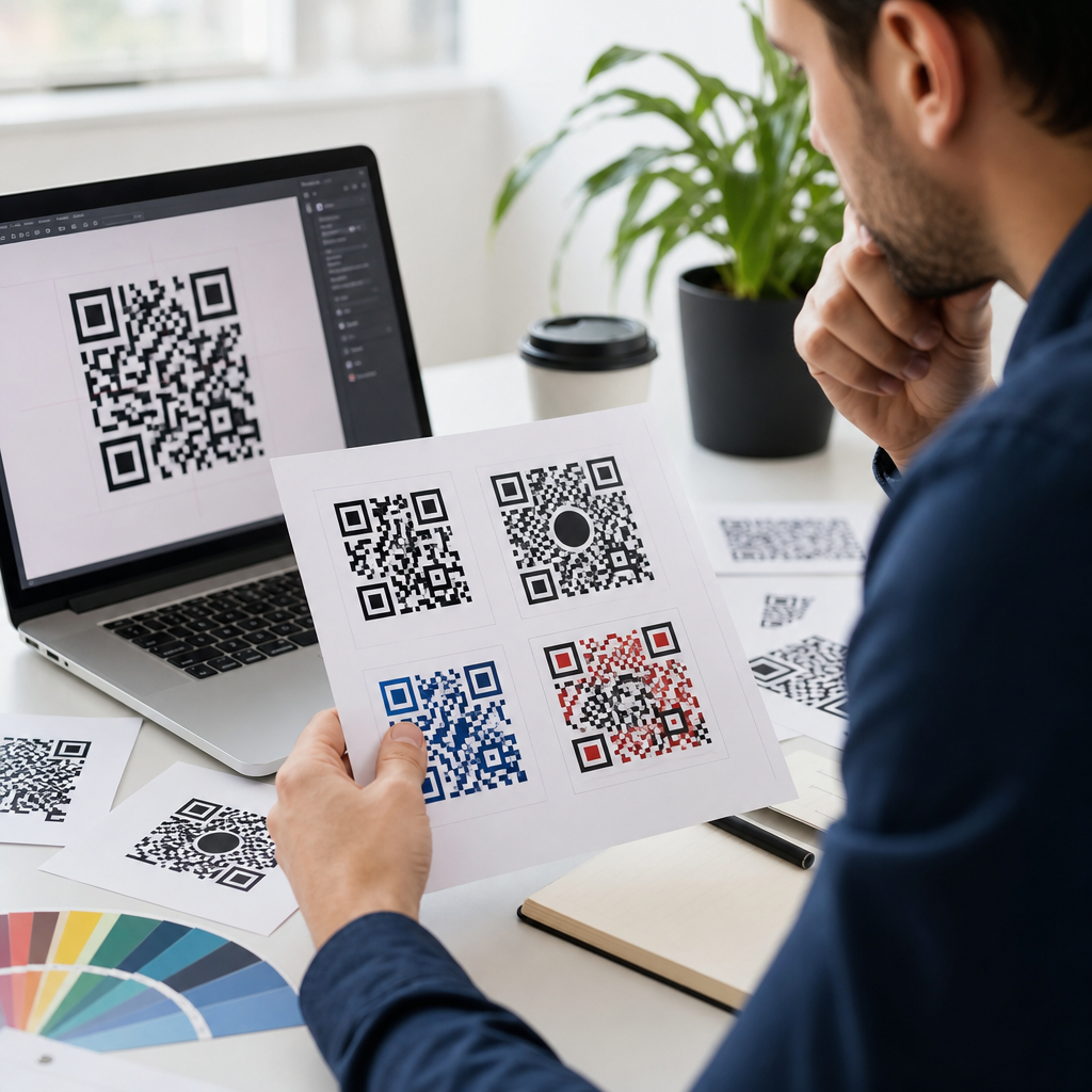
Many brands over-customize QR codes and accidentally make them unreadable. A QR code is functional artwork, not freeform artwork. Cameras need strong contrast, a clear quiet zone around the code, and modules that are not distorted beyond recognition. The safest design is still black modules on a white background with no visual noise behind the symbol.
Common design mistakes include reversing colors, using low-contrast brand palettes, placing the code over photography, trimming the margin, stretching the code non-proportionally, or inserting a large logo that covers too much of the pattern. Error correction can compensate for some damage, but it is not permission to ignore fundamentals. If you add a logo, keep it modest and use a higher error correction level only after testing. ISO/IEC 18004 defines the QR Code standard, and the standard exists for a reason: predictable readability.
Size also matters. A simple field rule is a scan distance-to-code-size ratio of roughly 10:1. A code intended to be scanned from 20 inches away should be about 2 inches wide. For posters, shelf talkers, menus, and vehicle graphics, calculate realistic distance rather than guessing. Matte finishes often outperform glossy ones under bright light because glare interferes with camera detection.
| Mistake | Why It Fails | Better Approach |
|---|---|---|
| Long URL encoded directly | Dense pattern reduces small-size readability | Use a short dynamic URL |
| Low-contrast brand colors | Camera struggles to separate modules | Keep dark-on-light contrast high |
| Homepage as destination | Adds friction and weak intent match | Link to a dedicated mobile landing page |
| Oversized center logo | Obscures data modules | Use a smaller logo with tested error correction |
| No quiet zone | Scanner cannot isolate code boundary | Preserve a clear margin on all sides |
| Print without testing | Real devices reveal missed issues | Test across phones, lighting, and angles |
Test Across Real Devices, Real Lighting, and Real Use Cases
Another major mistake is assuming that one successful office scan means the code is ready. Testing should mimic how people will actually encounter the QR code. I test native iPhone Camera, Google Camera when available, and at least one third-party scanning app because decoding behavior can vary. I also test under bright sunlight, dim indoor light, and angled scans because packaging, windows, and glossy signage introduce reflections.
Device diversity matters. Older phones have weaker cameras and slower autofocus. Cracked screens, dirty lenses, and accessibility settings can also affect scanning and landing-page use. If your audience includes warehouse staff, delivery drivers, trade show attendees, or older consumers, test in those conditions. A code on a moving shuttle sign, curved bottle, or small hangtag behaves very differently from a code on a flat monitor.
Do not stop at the scan. Validate redirects, UTMs, cookie consent behavior, form completion, app store routing, and page speed. Check whether the destination works inside in-app browsers from Instagram, Facebook, WeChat, or Gmail, because some users scan and open links inside embedded webviews. Good testing is full-path testing: detect, decode, load, complete action, measure result.
Set Up Tracking, Governance, and Print Production Correctly
Organizations often miss the operational side of QR code creation. If you cannot measure scans, update destinations, or retire broken campaigns, the code becomes a liability. Dynamic QR management solves much of this, but only when naming conventions, ownership, and analytics are defined in advance. I recommend a simple governance model: standardized campaign names, documented destinations, expiration rules, and one owner responsible for redirects.
For measurement, connect QR traffic to Google Analytics 4 or your preferred analytics stack using consistent UTM parameters. Separate channel, placement, and creative variables so you can distinguish scans from packaging, direct mail, countertop displays, and out-of-home placements. For high-value uses, create unique QR codes per location or asset version. That makes attribution clearer and helps identify where scan rates and conversions are strongest.
Print production introduces another layer of failure. Export vector files such as SVG, EPS, or PDF for professional printing whenever possible. Raster images can blur at scale or after repeated edits. Confirm bleed, trim, substrate, and final printed size with the vendor. Avoid placing codes near folds, bottle seams, curved edges, or perforations. If the code appears on dark packaging, use a white underprint panel. If it appears outdoors, consider weathering, UV fade, and vandalism. A technically correct QR code can still fail if production ignores physical realities.
How to Create a Mobile QR Code That Works Consistently
The practical process is simple. First, define the user outcome: visit a page, download an app, save contact information, send a message, join Wi-Fi, or pay. Second, build the mobile destination and make it fast, responsive, and context-specific. Third, choose dynamic or static structure based on whether you may need edits, analytics, or routing later. Fourth, generate the QR code with high contrast, a proper quiet zone, and restrained branding. Fifth, test across devices, distances, and lighting conditions. Sixth, export production-ready files and confirm final placement size. Seventh, monitor scan data and improve the destination after launch.
The main benefit of avoiding common QR code mistakes is reliability. Reliable scans reduce customer friction, protect print budgets, and turn physical touchpoints into measurable digital journeys. That is why this page serves as the hub for creating mobile QR codes: every subtopic, from landing-page design to print specifications and analytics, supports the same outcome. Use these standards on your next QR code project, test before you print, and treat every scan like a conversion opportunity.
Frequently Asked Questions
What is the most common mistake people make when creating a QR code?
The most common mistake is treating the QR code itself as the entire project, when in reality the destination and user experience matter just as much. Many people generate a code quickly, link it to whatever URL or file they have available, and assume the job is done. That shortcut often leads to expensive problems later. For example, a code may scan perfectly, but if it opens a slow page, a desktop-only form, a broken app link, or a cluttered landing page that is hard to use on a phone, the campaign still fails.
Another frequent issue is choosing the wrong content type from the start. A direct PDF download, a long raw URL, or an outdated landing page may technically work, but it may not be the best option for mobile users. In many cases, a simple mobile landing page, dynamic QR code destination, or shortened, well-managed link is the smarter choice. The right setup depends on the goal: app installs, payments, Wi-Fi access, contact sharing, menus, support requests, maps, or promotions all have different user expectations.
To avoid this mistake, start by defining exactly what the user should do after scanning. Ask whether the destination is mobile-friendly, fast to load, easy to understand, and still likely to be relevant weeks or months from now. Then generate the QR code only after that decision is clear. A QR code should be the bridge to a smooth action, not just a scannable square placed on a poster, product, or screen.
Why do some QR codes fail to scan even when they look fine?
A QR code can look clean in a design file and still perform poorly in the real world. Scanning problems usually come down to contrast, size, quiet zone, distortion, or over-styling. The safest QR codes use dark modules on a light background with strong contrast. If the colors are too similar, too light, metallic, glossy, or transparent, smartphone cameras may struggle to detect the pattern quickly. This is especially true in dim lighting, bright sunlight, or when the code is printed on reflective packaging.
Size is another major factor. A code that is too small for the expected scanning distance becomes difficult to read. A code on a business card might work at a small size because the phone is held close, while a code on a poster, storefront sign, or event banner needs to be much larger. The quiet zone matters too. That is the blank space around the QR code, and without enough of it, scanners may not recognize where the code begins and ends. Designers also run into trouble when they stretch a QR code, crop its edges, round too many elements, add heavy logos, or place it over busy backgrounds.
The best way to avoid scan failures is to follow practical design rules and test under realistic conditions. Keep the code high-contrast, preserve the proper proportions, maintain clear spacing around it, and avoid decorative changes that interfere with readability. Then test it on multiple phones, from different distances, in different lighting, and on the actual material where it will appear. A QR code is successful only if ordinary users can scan it instantly without effort.
How does too much data inside a QR code create problems?
Many people assume a QR code can hold unlimited information without consequences, but adding too much data makes the pattern denser and harder to scan. The more characters, parameters, tracking tags, or embedded information you put directly into the code, the more complex the symbol becomes. Dense QR codes require better camera focus, stronger print quality, and often a larger physical size to remain readable. That can become a serious issue on labels, packaging, table tents, receipts, or any format with limited space.
This often happens when someone uses a very long URL with multiple campaign parameters, or tries to encode too much content directly, such as full text blocks or complex contact records. Technically, the code may still work, but performance becomes less reliable, especially when printed small or viewed in less-than-ideal conditions. Dense codes are also more vulnerable when combined with branding changes like embedded logos or custom shapes, because the design has less margin for error.
The best solution is to keep the encoded data as lean as possible. Use short, well-structured links, and consider dynamic QR codes when appropriate so the destination can be updated later without reprinting the code. If the use case involves app downloads, support flows, menus, or promotions, a lightweight mobile landing page is often better than stuffing too much logic into the QR itself. In short, simpler data usually produces a cleaner code, and cleaner codes scan more reliably.
Why is testing so important before publishing or printing a QR code?
Testing is critical because a QR code can pass a basic scan test and still fail in real-world use. Many costly mistakes happen when teams verify only that the code opens once on one device, then move straight to printing thousands of labels, flyers, signs, menus, or packages. That is not enough. A code should be tested across different phones, camera apps, operating systems, screen conditions, and network environments. A destination that works well on a current flagship phone may load poorly on an older device or behave differently inside an in-app browser.
Real-world testing should also match the final environment. If the QR code will appear on a window, test it with glare. If it will be on a curved bottle or small carton, test it on the actual surface. If it will be scanned from a sidewalk, test distance and angle. If it leads to a payment page, support form, or app store listing, go through the full user flow and confirm the experience is fast, intuitive, and complete. Even small issues like a slow redirect, blocked pop-up, broken mobile layout, or regional app store mismatch can reduce conversions dramatically.
To avoid surprises, create a simple pre-launch checklist. Confirm scan speed, readability, mobile friendliness, page load time, analytics tracking, redirect behavior, and final destination accuracy. Then test again after placement or printing, not just before. QR code success depends on execution in context, and thorough testing is what turns a technically valid code into a dependable user experience.
What should you check about the mobile destination before sharing a QR code?
The mobile destination deserves as much attention as the QR code design itself. Since most users scan with smartphones, the linked experience must be optimized for smaller screens, touch navigation, and variable connection speeds. One of the biggest mistakes is sending users to a page that was built primarily for desktop, where buttons are too small, text is difficult to read, forms are frustrating, or important information sits below too many banners and distractions. If the page is slow or confusing, users often leave immediately.
You should also check whether the destination matches the user’s intent. If someone scans for a menu, they should see the menu right away. If they scan for Wi-Fi access, payment, directions, a contact card, app download, or support, the next step should be obvious and immediate. Extra clicks, irrelevant navigation, mandatory logins, intrusive pop-ups, or pages that force users to pinch and zoom all create friction. In app-related campaigns, confirm users are routed correctly based on device type and operating system. In local campaigns, check that maps, store information, and opening hours are accurate and current.
The safest approach is to review the destination from the perspective of a first-time mobile user. Load it on multiple phones, test on cellular as well as Wi-Fi, and make sure the core action can be completed quickly. If the content might change over time, use a destination you can update without replacing the printed QR code. A QR code is only as effective as the page, form, app screen, or service it opens, so mobile usability should never be an afterthought.