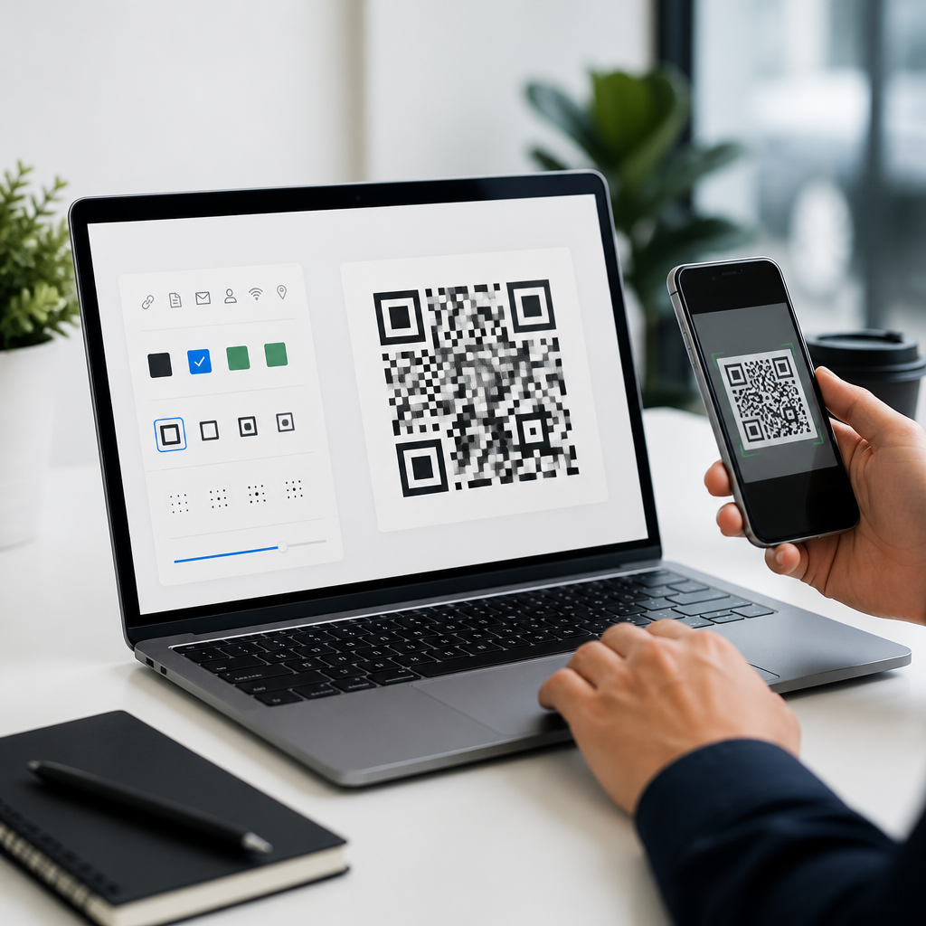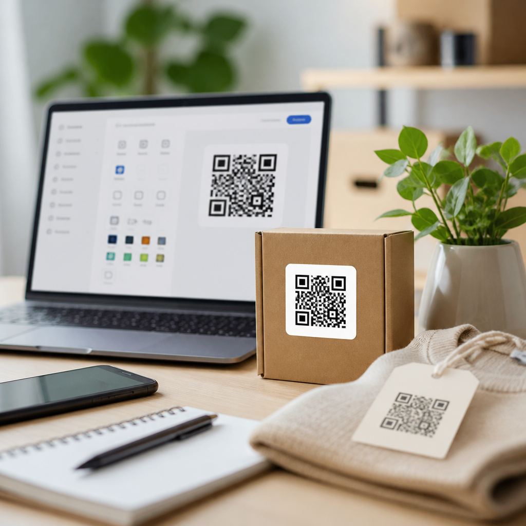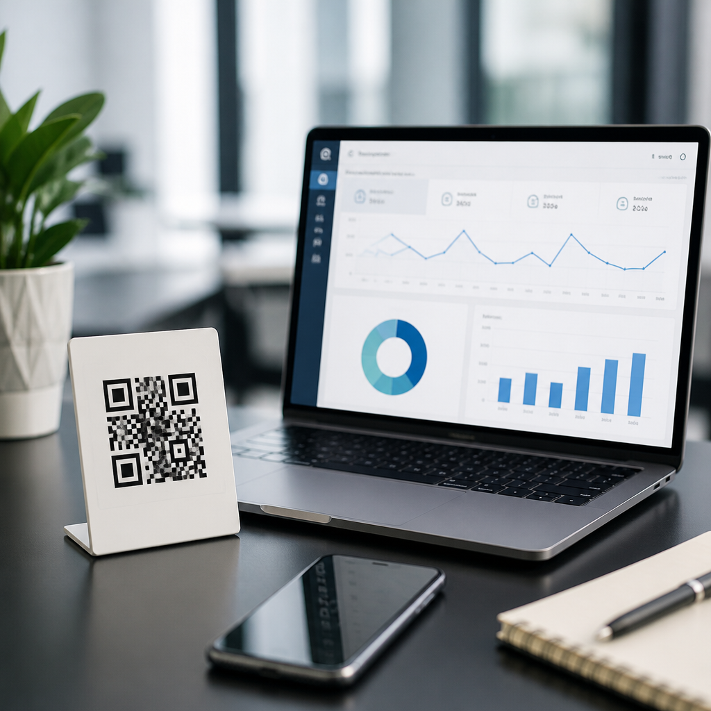
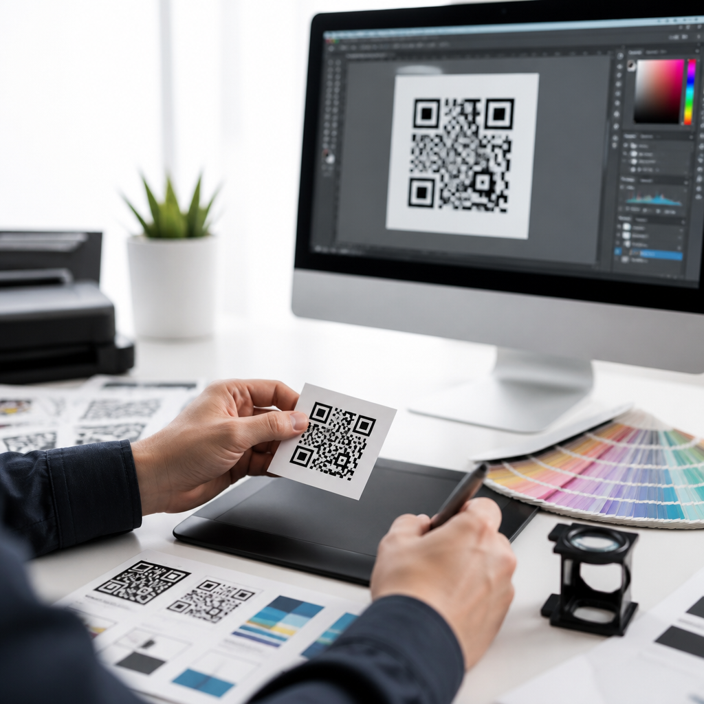
QR code design tools for print optimization help teams create scannable, brand-safe codes that survive real production conditions, from coated packaging and window decals to direct mail, menus, posters, and product labels. A QR code is a two-dimensional matrix barcode that stores data such as a URL, vCard, Wi-Fi credential, payment link, or app deep link, while print optimization means adjusting the code’s size, contrast, error correction, quiet zone, and export settings so scanners can read it reliably after ink, paper, lamination, and viewing distance affect the final piece. I have tested QR codes on offset sheets, thermal labels, corrugated boxes, and retail signage, and the same lesson repeats: attractive design matters, but scannability matters first. This topic matters because a failed scan turns paid print space into wasted budget, broken attribution, and avoidable customer friction. The best QR code design tools combine creative controls with technical safeguards, allowing marketers, designers, and production teams to customize colors and shapes without violating barcode rules. As the hub for QR code design tools, this guide explains which features matter most, how to evaluate software, how to prepare files for press, and where different tools fit across campaign, packaging, and enterprise workflows.
What QR code design tools should include
The strongest QR code design tools do more than generate a code from a URL. They include dynamic code support, vector export, error correction controls, logo placement guidance, frame templates, batch generation, scan analytics, and file outputs suited to Adobe Illustrator, InDesign, Canva, Figma, and print vendors. Dynamic QR codes are especially valuable in print because the destination can be updated after production, preserving the printed asset while letting teams change landing pages, UTMs, or regional routing. Good tools also show live scan testing and flag risky combinations such as pale foreground colors, oversized logos, rounded modules that close gaps, or insufficient quiet zone. In practice, I look for SVG, EPS, and PDF exports first, because raster PNG files can degrade when scaled for large-format work. Some teams also need API access for catalogs, serialized packaging, or franchise systems. If a tool cannot support brand styling and production discipline at the same time, it is not a serious print optimization platform.
How print changes QR code performance
A QR code that scans perfectly on a screen can fail on paper because print introduces distortion, dot gain, glare, texture, and distance. Dot gain causes dark ink to spread slightly, reducing separation between modules. Uncoated stock can soften edges; glossy laminate can create reflections; flexible packaging can wrinkle; and small labels may force designers below the minimum practical size. A useful planning rule is to set the scanning distance at roughly ten times the code width. A 1 inch code is comfortable at about 10 inches, while a poster meant to scan from 6 feet needs a much larger symbol. High contrast remains nonnegotiable: dark modules on a light background outperform decorative inversions in almost every environment. Quiet zone matters just as much. Most standards-based guidance expects a clear margin around the symbol so phone cameras can isolate it quickly. Reliable QR code design tools surface these constraints early, before art approval or press proofing locks in a bad decision.
Core design controls that balance branding and scannability
Most brands want QR codes that look intentional rather than generic black squares. That is reasonable, but customization must follow technical boundaries. The safest path starts with standard square modules, dark foreground, light background, and a clean quiet zone. From there, tools can add brand color, a call-to-action frame, subtle corner styling, and a centered logo. Error correction helps here. QR codes typically use L, M, Q, or H levels, with H tolerating the most damage or obstruction, often useful when a logo covers part of the symbol. However, higher error correction increases density, which can reduce readability at small print sizes. In my production checks, the most common failure is not color alone; it is stacking too many aesthetic edits at once. Rounded modules, gradient fills, low contrast, thin quiet zones, and large logos can each be survivable separately, but together they push the code beyond tolerance. Good tools make these tradeoffs visible before export.
Best tool categories for print-focused teams
Different organizations need different QR code design tools. A local restaurant may prioritize speed and simple menu updates, while a consumer packaged goods brand may need serialized codes tied to inventory, compliance, and multilingual destinations. The table below shows how common tool categories fit print optimization work.
| Tool category | Best use case | Print strengths | Limits to watch |
|---|---|---|---|
| Browser-based QR platforms | Campaigns, flyers, menus, retail signage | Fast setup, dynamic links, analytics, templates, SVG export | May have limited prepress controls or brand governance |
| Design-suite plugins or app features | Creative teams already working in Illustrator, InDesign, or Canva | Easy placement inside layouts, faster iteration with brand assets | Analytics and dynamic management may be weak |
| Enterprise QR management systems | Packaging programs, franchises, multi-market campaigns | Batch generation, roles, API, governance, audit trails | Higher cost and longer implementation |
| Label and industrial marking software | Thermal labels, warehouses, manufacturing | Precise sizing, variable data, printer calibration support | Brand customization is usually basic |
For real-world examples, QR Code Generator Pro, QR TIGER, Bitly, Uniqode, and Beaconstac are common web platforms used for dynamic campaigns and analytics. Adobe Express and Canva simplify branded layouts for nontechnical teams, though print validation still needs care. ZebraDesigner and BarTender are stronger when variable data and label printers are involved. Large packaging workflows may combine a QR management platform with Esko prepress tools, DAM systems, and proofing software.
Preparing files for commercial printing
Print optimization succeeds or fails in prepress. Export vector files whenever possible so the code scales without introducing blurry edges. Keep the QR code on a solid, uncluttered area of the layout rather than over photography or patterns. If the printer requests CMYK files, verify that your dark foreground remains sufficiently dense after color conversion; rich black is not always necessary, but washed-out dark gray is risky. Avoid hairline knockout effects and unnecessary transparency. For packaging, request a hard proof or contract proof, then test scans under actual lighting, not just studio conditions. I also recommend checking the code after every transformation in the chain: after export, after placement in layout software, after PDF creation, and on the final proof. If a QR code is knocked out of a metallic foil, embossed area, or varnish-heavy surface, run extra tests because reflectivity and texture can confuse cameras. Reliable QR code design tools reduce risk, but they do not replace proofing discipline.
Testing methods that catch failures before launch
The best testing process is boring, repeatable, and ruthless. Scan the code with both iPhone and Android devices, using native camera apps first because that is how most people scan in the wild. Test under bright light, low light, glare, and angles. Check minimum and maximum expected distances. Print samples on the actual substrate, including the final laminate or finish. If the piece folds, creases, or curves around a bottle, test on the finished structure, not a flat proof. For direct mail, test after addressing and postal handling if the code sits near variable data or barcodes. For store signage, walk the aisle and scan from realistic shopper positions. Tools with analytics can help validate post-launch performance, but they cannot tell you whether the quiet zone is being clipped by a die line or whether a glossy coating creates hotspots at noon. Operationally, I treat a QR code like a functional component, not decoration: it needs QA, version control, and signoff criteria.
Governance, analytics, and internal workflow considerations
Because this page serves as a hub for QR Code Design Tools, it should also guide decisions beyond visual styling. Governance features become important as more teams publish codes across packaging, field sales materials, event collateral, and local marketing. A strong platform supports folders, naming conventions, user roles, approval states, and domain consistency so expired or off-brand links do not spread. Analytics should report scans over time, location by IP approximation, device type, and campaign-level UTM data, while still respecting privacy obligations and regional rules. Internal workflow matters too. In mature teams, marketing owns destination strategy, design owns appearance, production owns print validation, and operations or IT owns platform administration. Tools that support this division reduce chaos. They also make internal linking between related resources easier, such as pages on dynamic versus static codes, packaging QR best practices, label sizing, analytics setup, and QR code testing checklists. That connected structure improves discoverability and keeps decisions consistent across programs.
QR code design tools for print optimization deliver value when they unite creative flexibility, standards-based construction, and disciplined production testing. The essentials are clear: choose software that supports dynamic codes, vector export, strong contrast, quiet zone protection, and realistic customization limits. Match the tool to the job, whether that means a lightweight browser platform for posters and menus, a design-app workflow for fast brand adaptation, or an enterprise system for large packaging programs. Then validate every code in context, on the final substrate, at the expected distance, and with common phone cameras. Teams that treat QR codes as operational assets, not decorative afterthoughts, see better scan rates, cleaner attribution, and fewer costly reprints. As the central guide within the QR Code Tools & Software category, this hub should anchor your evaluation process and point to deeper resources on sizing, testing, analytics, packaging, and dynamic code management. Review your current QR workflow, identify weak spots in design or proofing, and upgrade the tools that directly improve print reliability today.
Frequently Asked Questions
What are QR code design tools for print optimization, and why do they matter?
QR code design tools for print optimization are software platforms or design features that help teams create QR codes that are not only visually on-brand, but also reliably scannable after they are printed on real materials. A QR code is a two-dimensional matrix barcode that can store information such as a website URL, digital menu, payment link, app deep link, contact card, or Wi-Fi login. Print optimization refers to the practical adjustments that make that code survive the realities of production, including size, contrast, error correction level, quiet zone spacing, export format, ink spread, and placement on the final piece.
These tools matter because a QR code that looks good on a screen can fail when transferred to packaging, labels, decals, posters, or direct mail. Coated stock can introduce glare, textured surfaces can break up module edges, small labels may force the code below a safe scanning size, and low-contrast brand colors can reduce readability. Print-focused QR code design tools help prevent these issues by giving users better control over production variables before files go to press.
They also streamline collaboration between marketers, designers, packaging teams, and printers. Instead of treating the QR code as an afterthought, teams can test different sizes, color combinations, export settings, and correction levels during the design process. That reduces costly reprints, improves scan rates, protects the customer experience, and ensures the code still performs whether it appears on a restaurant menu, a product carton, a retail sign, or a window decal viewed in bright daylight.
What design settings have the biggest impact on QR code scannability in print?
The most important settings are size, contrast, quiet zone, error correction, and output quality. Size is critical because the scanner needs enough visual information to distinguish the code’s square modules. If the code is printed too small for the intended viewing distance, users may struggle to scan it quickly. A small product label may need a compact but carefully tested code, while a poster or trade show sign usually requires a larger code that can be scanned from farther away.
Contrast is equally important. In most print scenarios, dark modules on a light background perform best because scanners depend on strong separation between foreground and background. Brand customization is possible, but pale colors, gradients, reflective finishes, and busy photographic backgrounds can interfere with readability. A design tool built for print optimization should help users maintain safe contrast levels rather than allowing decoration to overpower function.
The quiet zone is the clear margin around the QR code. This empty space helps scanners identify where the code begins and ends. If logos, text, borders, die lines, or background graphics crowd that area, performance can drop sharply. Many scanning issues that appear to be “bad codes” are actually layout issues caused by insufficient quiet zone in the final printed artwork.
Error correction determines how much damage or visual alteration the code can tolerate while remaining readable. Higher error correction can be useful when a code includes a logo, may be exposed to wear, or will appear on surfaces prone to scratches or folds. However, it also increases code density, which can make very small printed codes harder to scan. Good tools help balance durability against simplicity.
Finally, output quality matters. Vector exports such as SVG, EPS, or PDF usually preserve crisp edges better than low-resolution raster files. Clean edges are especially important when codes are resized for packaging, labels, or large-format signage. The right design tool will support production-ready exports and help users avoid blurry, compressed, or distorted artwork that can undermine an otherwise well-designed QR code.
How can teams customize QR codes for branding without hurting print performance?
The safest approach is to treat branding as a controlled enhancement rather than a full redesign. Teams can usually customize color, add a logo, adjust corner styles, or frame the code with a call to action, but every change should be evaluated against print readability. The core rule is simple: a branded QR code still has to behave like a scanner-friendly machine-readable symbol first and a design element second.
Color customization works best when there is strong contrast between the code and its background. Dark brand colors on white or very light backgrounds are typically reliable. Problems often arise when teams use metallic inks, pastel tones, transparent overlays, or color combinations that look elegant in mockups but scan poorly under real lighting conditions. If a code will be printed on glossy packaging or displayed behind glass, glare and reflections can further reduce usable contrast.
Adding a logo in the center is common, but it should be done carefully. A well-designed tool will account for the space occupied by the logo and help apply an appropriate error correction level so the code remains readable. Oversized logos, aggressive module reshaping, or decorative interruptions near key detection patterns can create avoidable failures. Branding should never interfere with the finder patterns, alignment structure, or quiet zone.
Teams should also test branded QR codes in the context of the final application, not just as isolated graphics. A code may work perfectly on a white artboard but perform differently when placed on a textured label, curved bottle, window cling, folded mailer, or menu with heavy background graphics. The best workflow is to create a visually aligned design, export it in production-ready formats, and then verify scans using printed proofs under realistic conditions before approving the final run.
What file formats and production practices are best for printing QR codes on packaging, labels, menus, posters, and mailers?
For most professional print workflows, vector formats are the preferred choice. SVG, EPS, and print-ready PDF files preserve sharp module edges and scale cleanly across different applications, from tiny product labels to large posters. Because QR codes depend on precise geometric structure, vectors are generally safer than low-resolution PNG or JPEG files, which can become soft, compressed, or pixelated when resized. If raster output must be used, it should be exported at sufficiently high resolution for the final physical size and print method.
Production teams should also pay attention to how the QR code is handled inside the layout application. Stretching the code disproportionately, applying visual effects, flattening it poorly, or placing it over complex artwork can all create scanning issues. It is best to preserve the original proportions, keep the quiet zone intact, and avoid unnecessary distortions such as skewing, warping, or adding shadows that interfere with edge clarity.
Substrate and finishing choices matter as well. On packaging, ink spread on porous materials can thicken modules and close small gaps. On glossy labels or window decals, reflections may make scanning inconsistent under store lighting or sunlight. On menus and mailers, folds, creases, or trim proximity can affect readability. A print-optimized QR code design process should account for the actual stock, coating, finish, and viewing environment rather than assuming every surface behaves like plain white paper.
It is also smart to maintain a proofing process that includes physical testing. Teams should print samples at actual size, scan them on multiple smartphone models, and evaluate them under normal use conditions. For example, a code intended for a poster in a transit station should be tested at realistic viewing distance, while a code on a bottle label should be tested on the curved container itself. Strong production practices turn a technically valid QR code into a dependable printed experience.
How do you test whether a QR code is truly optimized for print before launch?
The best testing process combines technical verification, physical proofing, and real-world scan validation. Start by checking the code itself: confirm that the destination works, the content is correct, and the code uses appropriate error correction for the design. Then review the visual structure for common risk factors such as low contrast, insufficient quiet zone, tiny module size, crowded placement, or excessive branding modifications.
Next, test printed proofs at actual production size. This step is essential because on-screen previews do not reveal how ink, material, finish, and lighting will affect scannability. Print the code on the same or similar stock, using the intended colors and production method whenever possible. Scan it from the expected user distance and angle. A menu code may be scanned from arm’s length, while a poster code may need to work from several feet away.
It is also wise to test across multiple devices and camera conditions. Different smartphones, operating systems, camera qualities, and scanning apps can produce slightly different results. A QR code that scans instantly on one high-end phone may be slower on an older device if the print size is marginal or the contrast is weak. Broad testing gives teams a more realistic picture of user experience.
Finally, evaluate the code in context. Check whether surrounding design elements compete with it, whether the call to action is clear, and whether environmental factors such as glare, curvature, condensation, or window reflections affect performance. If scan speed is inconsistent, increase the size, strengthen contrast, simplify customization, or improve placement. Print optimization is not just about whether the code scans once; it is about whether it scans quickly and reliably for typical users in normal conditions.